Unlock a world of possibilities! Login now and discover the exclusive benefits awaiting you.
- Qlik Community
- :
- All Forums
- :
- QlikView App Dev
- :
- Re: Bar chart- extra bars?
- Subscribe to RSS Feed
- Mark Topic as New
- Mark Topic as Read
- Float this Topic for Current User
- Bookmark
- Subscribe
- Mute
- Printer Friendly Page
- Mark as New
- Bookmark
- Subscribe
- Mute
- Subscribe to RSS Feed
- Permalink
- Report Inappropriate Content
Bar chart- extra bars?
First day in QlikView and I'm having an issue with a bar chart.
The chart has 3 expressions and 1 dimension. There is an associated listbox for the expressions. If the user does not make a selection, than all three expressions are displayed. If the user selects an item, the intention is for them to only see 1 bar per dimension.
My dimension is Month (Jan-Jun)
My Expressions are Digital Revenue Print Revenue and Expense.
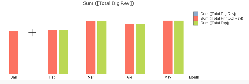
When the user chooses "Expense", the chart displays properly.
When the user chooses either of the other 2 expressions, the chart displays a bar for the selected expression and then a second bar for the same value, in the color assigned to "Expenses". This doesn't happen for the month of Jan, but does for all other months. I've checked the data tables and they're clean. I'm thinking I have a setting wrong somewhere, any ideas?
- Mark as New
- Bookmark
- Subscribe
- Mute
- Subscribe to RSS Feed
- Permalink
- Report Inappropriate Content
Hi Jennifer,
Take a look at the design blog post by Henric Cronstrom...
http://community.qlik.com/blogs/qlikviewdesignblog/2013/04/16/synthetic-keys
Synthetic keys should be resolved in the data model as they can/will give you spurious results in your app. There are a number of resources to help you, including the Qlik training courses. Free on-line training also exists on the Qlik website here.... QlikView Free Training - Business Intelligence (BI) Reporting Software Solutions | Qlik
Cheers.
Adam.
- Mark as New
- Bookmark
- Subscribe
- Mute
- Subscribe to RSS Feed
- Permalink
- Report Inappropriate Content
Thanks everybody! Since ultimately, I will be working with very large data sets, I don't think a Link table will be viable due to the number of combinations involved.
I'm going to look into consolidating my data and try to figure out how to split the display of the data in my chart, somehow.
- Mark as New
- Bookmark
- Subscribe
- Mute
- Subscribe to RSS Feed
- Permalink
- Report Inappropriate Content
Yes it is, that is the synthetic table that qlikview will automatically generate for you.
You can either join or concatenate tables to get rid of them, if they are related values.
If not, you can rename fields if they are distinct sets of values and that will solve the problem as well.
- Mark as New
- Bookmark
- Subscribe
- Mute
- Subscribe to RSS Feed
- Permalink
- Report Inappropriate Content
- Mark as New
- Bookmark
- Subscribe
- Mute
- Subscribe to RSS Feed
- Permalink
- Report Inappropriate Content
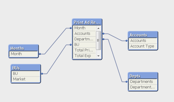
Yeah, I am stuck. Here is my basic structure, I have 3 tables which have identical columns, but different data. I have this set up to allow each set of data to feed a separate expression in charts.
I have three more tables which translates values/consolidates data from each of the data tables into higher-level views
I have a Month table, just to force a custom sort on the Month variable.
If I rename the fields from each of the data tables, they will no longer tie to the consolidation tables.
If I consolidate the data tables, I can't use the 3 sets of data (based on account type, for now) as separate expressions, at least I can't figure out how to do it.
- Mark as New
- Bookmark
- Subscribe
- Mute
- Subscribe to RSS Feed
- Permalink
- Report Inappropriate Content
The easiest thing to do may be to join your tables so that you have one table with all three totals
- Mark as New
- Bookmark
- Subscribe
- Mute
- Subscribe to RSS Feed
- Permalink
- Report Inappropriate Content
oh that is smart. Just reading up on Joins now. Thanks!
- Mark as New
- Bookmark
- Subscribe
- Mute
- Subscribe to RSS Feed
- Permalink
- Report Inappropriate Content
Try outer joining print ad revenues, expenses, and dig ad revenues
- Mark as New
- Bookmark
- Subscribe
- Mute
- Subscribe to RSS Feed
- Permalink
- Report Inappropriate Content
I think you should invest more time in theory 
The best way i think is to have all the 3 measures (in one row) in a fact table if this is possible. Read something about scripting, concetenation, joins, synthetic keys...
Data model is at least so or more important as a visualization layer in an app.
Do you posses basic knowledge of BI theory?
- Mark as New
- Bookmark
- Subscribe
- Mute
- Subscribe to RSS Feed
- Permalink
- Report Inappropriate Content
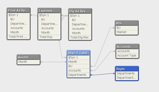
Unfortunately, I have eliminated my Syn table and the bar chart problem still exists.
Here's my Table Viewer
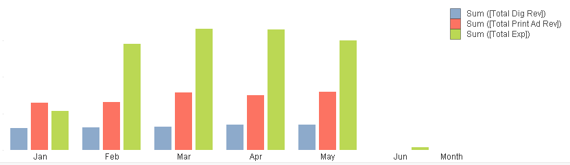
Full chart- this is fine, though it needs formatting cleaned up
Listbox selection chart-