Unlock a world of possibilities! Login now and discover the exclusive benefits awaiting you.
- Qlik Community
- :
- All Forums
- :
- QlikView App Dev
- :
- Re: Bell Curve Problem
- Subscribe to RSS Feed
- Mark Topic as New
- Mark Topic as Read
- Float this Topic for Current User
- Bookmark
- Subscribe
- Mute
- Printer Friendly Page
- Mark as New
- Bookmark
- Subscribe
- Mute
- Subscribe to RSS Feed
- Permalink
- Report Inappropriate Content
Bell Curve Problem
Hello,
I am trying to create one bell curve chart.
Can you please help me this. Almost done i mess something.
I followed the Henric Cronström. Please help me guys.
The graph indicates
X-Axis --> Score
Y-Axis --> is Avg(Score) for bell curve
I want to show only Y-Axis with Auto generated like 0-100 values.
Please help me..
- « Previous Replies
-
- 1
- 2
- Next Replies »
- Mark as New
- Bookmark
- Subscribe
- Mute
- Subscribe to RSS Feed
- Permalink
- Report Inappropriate Content
Are you sure your data follow normal distribution? Henric's example uses NormInv() function to create a normal curve.
- Mark as New
- Bookmark
- Subscribe
- Mute
- Subscribe to RSS Feed
- Permalink
- Report Inappropriate Content
Sunny,
I don;t know about that. That's why i posted here. I am new to Bell curve.
Can you please help me on this.
- Mark as New
- Bookmark
- Subscribe
- Mute
- Subscribe to RSS Feed
- Permalink
- Report Inappropriate Content
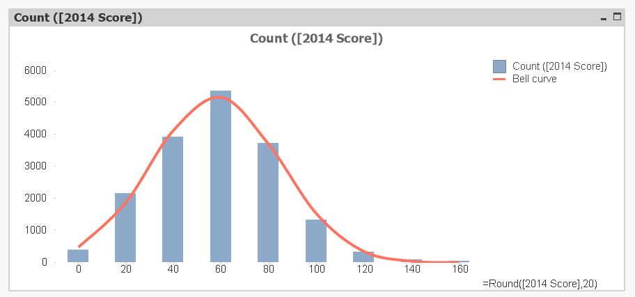
Not sure , Whether you are looking for something like the attached one ??
- Mark as New
- Bookmark
- Subscribe
- Mute
- Subscribe to RSS Feed
- Permalink
- Report Inappropriate Content
Similar to that,
Some changes required
1) X-Axis should be score
2) Y-Axis is normal distribution from 0 to 100
3) Then expression is similar to Avg(Score, [Normal distribution]) like Bell curve which i show the image beside of my image.
- Anil
- Mark as New
- Bookmark
- Subscribe
- Mute
- Subscribe to RSS Feed
- Permalink
- Report Inappropriate Content
You have the data which have scores more than 1000 ....
So If we limit the data in you chart to <= 100 , we can see the possible bell curve as far as I know is attached.
- Mark as New
- Bookmark
- Subscribe
- Mute
- Subscribe to RSS Feed
- Permalink
- Report Inappropriate Content
Vikram,
Yes - Here the curve showing horizontal. How to change this line chart into Vertical. But, i don;t want to effect dim and Expre.
Nice Article.
- Mark as New
- Bookmark
- Subscribe
- Mute
- Subscribe to RSS Feed
- Permalink
- Report Inappropriate Content
If you only select the values around the average, it looks like a normal distribution. But you have outliers, so without this selection it doesn't look as good.
HIC
- Mark as New
- Bookmark
- Subscribe
- Mute
- Subscribe to RSS Feed
- Permalink
- Report Inappropriate Content
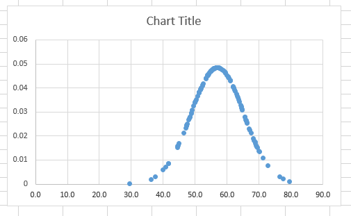
Henric,
Thanks for your response. Here, i want to exclude two values which is from different field. And meantime, Client want to show Y-Axis from 0 to 100 only.
And in my score which mean X-Axis, i have up to 100 only. So, how to achieve this.
I am expecting O/P like this. This graph i created in excel. Is that is possible?
- Mark as New
- Bookmark
- Subscribe
- Mute
- Subscribe to RSS Feed
- Permalink
- Report Inappropriate Content
If you want something like my diagram, but limited to scores under 100, you should use something like
Round([Score],BinWidth)
as dimension, and
Count ({$<[Score]={"<110"}>} [Score])
as measure for the bars. Then you can add a Normal distribution using e.g.
Only({$<[Score]={"<110"}>} Normdist(Round([Score],BinWidth),Avg({$<[Score]={"<110"}>} total [Score]),Stdev({$<[Score]={"<110"}>} total [Score]), 0)) * BinWidth * Count({$<[Score]={"<110"}>}total [Score])
Binwidth could be 10 or 20 or something like that.
I don't understand your graph. What do the y-values correspond to?
HIC
- « Previous Replies
-
- 1
- 2
- Next Replies »