Unlock a world of possibilities! Login now and discover the exclusive benefits awaiting you.
- Qlik Community
- :
- All Forums
- :
- QlikView App Dev
- :
- Box Plot not graphing as expected
- Subscribe to RSS Feed
- Mark Topic as New
- Mark Topic as Read
- Float this Topic for Current User
- Bookmark
- Subscribe
- Mute
- Printer Friendly Page
- Mark as New
- Bookmark
- Subscribe
- Mute
- Subscribe to RSS Feed
- Permalink
- Report Inappropriate Content
Box Plot not graphing as expected
Any help is appreciated.
Quick explanation of my data.
| Customer |
|---|
Acme |
| Bean |
| Crimson |
| Deloitte |
| Segment |
|---|
| Lumber |
| Roofing |
Stone |
| so_id |
|---|
1 |
| 2 |
| 3 |
| 4 |
| 5 |
These are the main tables. I want to use a box plot, to plot a selected company against the performance of their given industry Segment. For example, Bean would be in the Lumber industry.
Performance in this case is # of lines per so_id. For each so_id, such as so_id 1, it can appear many times in the data. So I use a count of the so_id, so if 1 appears 13 times, then we call that the # of lines in so_id 1.
Using the box plot wizard, with segment as dimension and aggregator, I use this as the expression count(so_id)/ count(DISTINCT(so_id))
since as said before, I want # of lines per so_id
Then I click median mode, graph, and this comes up.
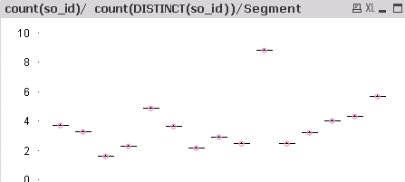
Any help?