Unlock a world of possibilities! Login now and discover the exclusive benefits awaiting you.
- Qlik Community
- :
- All Forums
- :
- QlikView App Dev
- :
- Can 3 different Charts can share the same relative...
- Subscribe to RSS Feed
- Mark Topic as New
- Mark Topic as Read
- Float this Topic for Current User
- Bookmark
- Subscribe
- Mute
- Printer Friendly Page
- Mark as New
- Bookmark
- Subscribe
- Mute
- Subscribe to RSS Feed
- Permalink
- Report Inappropriate Content
Can 3 different Charts can share the same relative ration?
Hi,
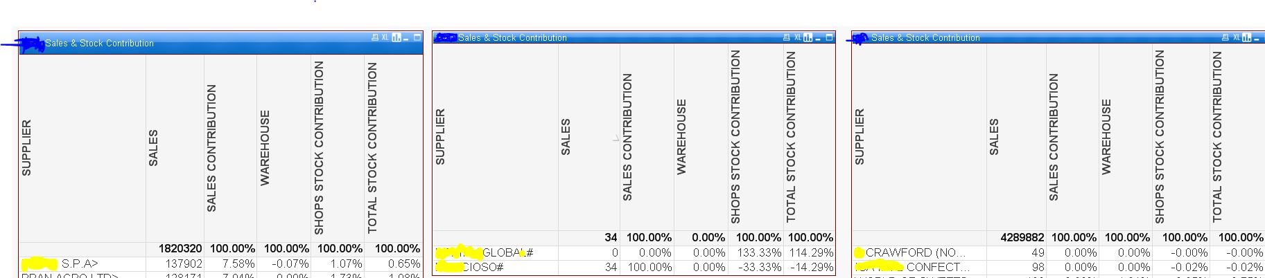
I have 3 charts, they all have Supplier as their calculated dimension,
CHART1==> if(WildMatch(DWH_ITEM_SUPPLIER_NAME,'*>*'),DWH_ITEM_SUPPLIER_NAME)
CHART2==> if(WildMatch(DWH_ITEM_SUPPLIER_NAME,'*#*'),DWH_ITEM_SUPPLIER_NAME)
CHART3==> aggr(if(NOT WildMatch(DWH_ITEM_SUPPLIER_NAME,'*>*','*#*'),DWH_ITEM_SUPPLIER_NAME), DWH_ITEM_SUPPLIER_NAME)
the purpose of the above 3 charts that we filter the supplier the one with ">","#" and all the rest in a separate chart.
here we want to see the sales relative percentage and Stock relative percentage but before when they were all together in the same chart they all were showing the required result where we could see he this supplier sales contribution and current stock contribution but to filter them we had to export the whole list to excel and then filter it out with the above > or #.
but now when we have separated them they only show the total of '>' supplier.
we want all of these 3 charts to show an individual contribution from the but from the total supplier list.
see the attached pictures for an idea.
Please if I could not explain properly ask me the question.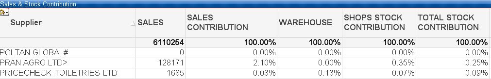
- Mark as New
- Bookmark
- Subscribe
- Mute
- Subscribe to RSS Feed
- Permalink
- Report Inappropriate Content
I think you will need to use set analysis instead of calculated dimension to do this.... what is the expressions that you have been using? Would you be able to share a sample?