Unlock a world of possibilities! Login now and discover the exclusive benefits awaiting you.
- Qlik Community
- :
- All Forums
- :
- QlikView App Dev
- :
- Can Anybody Help me on Charts problems?
- Subscribe to RSS Feed
- Mark Topic as New
- Mark Topic as Read
- Float this Topic for Current User
- Bookmark
- Subscribe
- Mute
- Printer Friendly Page
- Mark as New
- Bookmark
- Subscribe
- Mute
- Subscribe to RSS Feed
- Permalink
- Report Inappropriate Content
Can Anybody Help me on Charts problems?
Hi experts,
I'm fresher on designing the dashboard part in qlikview.
Here I have several charts and graphs, and they all have some problems.
1. Can anybody help me to figure out: the deficiency of these graphs.
2. How to improve it in qlikview?
I'm waiting for your helping hands! Very appreciate!
- « Previous Replies
-
- 1
- 2
- Next Replies »
Accepted Solutions
- Mark as New
- Bookmark
- Subscribe
- Mute
- Subscribe to RSS Feed
- Permalink
- Report Inappropriate Content
Hi Stacy,
You may want to consider a horizontal bar chart instead of a pie chart.
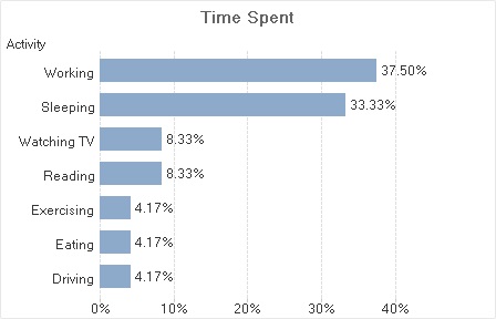
For me pie charts quickly get difficult to make sense of when the number of pie slices gets over three or four. Your eye flits back and forth between the pie and the legend and when you compare different slices you need to remember who's who's. If you have to use more than a very few basic colours it gets very hard. In your chart I think you spent twice as much time reading as you do driving but I'm not sure. And remember there are a significant number of people who have real difficulty with perception of colour. In the bar chart you don't need to fuss about colour because the labels you need are immediately adjacent to the bars.
Also comparing differences in angle or area in a pie chart is just harder to do than comparing bar lengths.
Pie charts do have one thing in their favour - it is obvious that in a pie chart all the parts add up to a whole and this is not obvious with bar charts unless explained.
- Mark as New
- Bookmark
- Subscribe
- Mute
- Subscribe to RSS Feed
- Permalink
- Report Inappropriate Content
I would change the color of the bar chart to more solid -patterns a fine but just distract from the main purpose.
Numbers on the top would also be good feature.
In the line or you have to change the font to smaller or better make a table next to the graph with the numbers.
In the Pie chart change the number to %.
- Mark as New
- Bookmark
- Subscribe
- Mute
- Subscribe to RSS Feed
- Permalink
- Report Inappropriate Content
Hi Robert, thank you so much for your help
- Mark as New
- Bookmark
- Subscribe
- Mute
- Subscribe to RSS Feed
- Permalink
- Report Inappropriate Content
Hi,
I'm new to Qlikview too.
To me, pie chart is not making any sense with the tiny fraction of numbers. Representation in % as Robert has mentioned would be nice.
- Mark as New
- Bookmark
- Subscribe
- Mute
- Subscribe to RSS Feed
- Permalink
- Report Inappropriate Content
Consider sorting the Pie chart on values.
To make it more color blind proof, consider changing the dots in the line charts into different symbols for every line.
You can probably remove the "year" label from the bar chart as it is already obvious the x-axis are years. Also consider adding a grid to the chart so the heights are easier to compare or match against y-axis.
- Mark as New
- Bookmark
- Subscribe
- Mute
- Subscribe to RSS Feed
- Permalink
- Report Inappropriate Content
Hi Stacy,
You may want to consider a horizontal bar chart instead of a pie chart.
For me pie charts quickly get difficult to make sense of when the number of pie slices gets over three or four. Your eye flits back and forth between the pie and the legend and when you compare different slices you need to remember who's who's. If you have to use more than a very few basic colours it gets very hard. In your chart I think you spent twice as much time reading as you do driving but I'm not sure. And remember there are a significant number of people who have real difficulty with perception of colour. In the bar chart you don't need to fuss about colour because the labels you need are immediately adjacent to the bars.
Also comparing differences in angle or area in a pie chart is just harder to do than comparing bar lengths.
Pie charts do have one thing in their favour - it is obvious that in a pie chart all the parts add up to a whole and this is not obvious with bar charts unless explained.
- Mark as New
- Bookmark
- Subscribe
- Mute
- Subscribe to RSS Feed
- Permalink
- Report Inappropriate Content
You are welcome
You can an make of our answers correct or helpful.
Feeling Qlikngry?
- Mark as New
- Bookmark
- Subscribe
- Mute
- Subscribe to RSS Feed
- Permalink
- Report Inappropriate Content
Hi Andrew,
Very appreciate your time and help. Your suggestion is so valuable! Thank you!
- Mark as New
- Bookmark
- Subscribe
- Mute
- Subscribe to RSS Feed
- Permalink
- Report Inappropriate Content
You're most welcome Stacy.
- Mark as New
- Bookmark
- Subscribe
- Mute
- Subscribe to RSS Feed
- Permalink
- Report Inappropriate Content
Hi Stacy,
I meant to say this earlier. If you're interested in dashboard design a great place to begin would be to google Stephen Few. As well as producing books he has a lot of freely available material that I'm sure you'll find really valuable.
- « Previous Replies
-
- 1
- 2
- Next Replies »