Unlock a world of possibilities! Login now and discover the exclusive benefits awaiting you.
- Qlik Community
- :
- All Forums
- :
- QlikView App Dev
- :
- Re: Can I add label to lines inside chart?
- Subscribe to RSS Feed
- Mark Topic as New
- Mark Topic as Read
- Float this Topic for Current User
- Bookmark
- Subscribe
- Mute
- Printer Friendly Page
- Mark as New
- Bookmark
- Subscribe
- Mute
- Subscribe to RSS Feed
- Permalink
- Report Inappropriate Content
Can I add label to lines inside chart?
Hi experts,
I would like to add labels to three lines in my chart. I wanted the label to be in the same distance above corresponding line. for examplem UCL is above the first red line on the left. Is that possible?
I hope I can add sample size to the label of x axis to make the label like 201102(33), 201103(78). I cannot think any idea to make this happen. Can it be done.
Thanks
Longmatch
Accepted Solutions
- Mark as New
- Bookmark
- Subscribe
- Mute
- Subscribe to RSS Feed
- Permalink
- Report Inappropriate Content
- Mark as New
- Bookmark
- Subscribe
- Mute
- Subscribe to RSS Feed
- Permalink
- Report Inappropriate Content
See attached example.
talk is cheap, supply exceeds demand
- Mark as New
- Bookmark
- Subscribe
- Mute
- Subscribe to RSS Feed
- Permalink
- Report Inappropriate Content
I thought it is not possible and acutally it is. Thanks. Could you give me more explanations about how you got this impossible thing done. It looks like that it need a new expression and dual function. What is the logic? Sorry about the ignorance.
- Mark as New
- Bookmark
- Subscribe
- Mute
- Subscribe to RSS Feed
- Permalink
- Report Inappropriate Content
We want a label to be displayed on the left of the chart. We make sure of this with if(Month='Jan', ...) so that only for the first value on the x-axis dimension a value is displayed. And we want the label displayed above (or below) the relevant line. So we calculate a value using the expression of the line + a number: 10000+sum({<Year={2008}>}Sales). Using the column name of the line works too: 10000+[2008]. We enable the option Values on Data Points for the label expression. But this will display the value of 10000+[2008] instead of a label. That's where the dual function comes in. It creates a dual value with a text representation and a number representation. The result is that instead of the numeric value the text 'Label2008' is displayed.
talk is cheap, supply exceeds demand
- Mark as New
- Bookmark
- Subscribe
- Mute
- Subscribe to RSS Feed
- Permalink
- Report Inappropriate Content
Is there any way to remove or hide the symbol under the text added? There is a colorful shape under the text which I really do not want it to show. Thanks
- Mark as New
- Bookmark
- Subscribe
- Mute
- Subscribe to RSS Feed
- Permalink
- Report Inappropriate Content
Ah, forgot to mention that. Click on the + in front of the expression, select Background Color and type red(0) in the Definition text box. The 0 means use an alpha value of 0, which makes it 100% transparant.
talk is cheap, supply exceeds demand
- Mark as New
- Bookmark
- Subscribe
- Mute
- Subscribe to RSS Feed
- Permalink
- Report Inappropriate Content
Works perfectly. Thanks
- Mark as New
- Bookmark
- Subscribe
- Mute
- Subscribe to RSS Feed
- Permalink
- Report Inappropriate Content
Hi,
and is it possible to display bundle image instead of text Lable 2008. Generally is it possible to display image in line chart like some kind of trigger notation.
Thank you,
Milan
- Mark as New
- Bookmark
- Subscribe
- Mute
- Subscribe to RSS Feed
- Permalink
- Report Inappropriate Content
Hi G Wassenaar,
I want to circle the points with lowest count in a line graph...I used this expression ...
=if(TOTAL_COUNT=min({$}TOTAL_COUNT),dual('LOW',TOTAL_COUNT)) ...
I am getting a continous red line ...Please see the image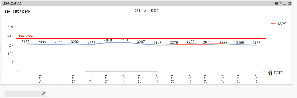
- Mark as New
- Bookmark
- Subscribe
- Mute
- Subscribe to RSS Feed
- Permalink
- Report Inappropriate Content
I can't see the Dual function in the script? Am I missing something?