Unlock a world of possibilities! Login now and discover the exclusive benefits awaiting you.
- Qlik Community
- :
- All Forums
- :
- QlikView App Dev
- :
- Charts
Options
- Subscribe to RSS Feed
- Mark Topic as New
- Mark Topic as Read
- Float this Topic for Current User
- Bookmark
- Subscribe
- Mute
- Printer Friendly Page
Turn on suggestions
Auto-suggest helps you quickly narrow down your search results by suggesting possible matches as you type.
Showing results for
Not applicable
2015-09-04
07:53 AM
- Mark as New
- Bookmark
- Subscribe
- Mute
- Subscribe to RSS Feed
- Permalink
- Report Inappropriate Content
Charts
I've been asked to replicate a report similar to the following in QlikView for our Call Centre...
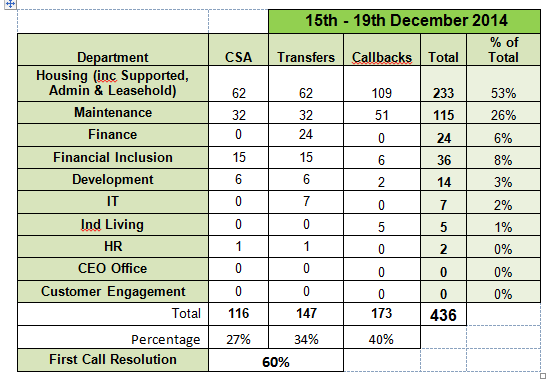
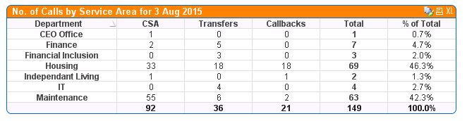
I've used a Straight Table chart to generate the majority of this (screenshot below) but am not sure how I can include the last three lines, i.e. Total, Percentage, First Call Resolution, or if there is another way of presenting this data but still give them what they need.
Many thanks in advance peeps 
- Tags:
- new_to_qlikview
145 Views
1 Reply
Not applicable
2015-09-04
10:15 AM
Author
- Mark as New
- Bookmark
- Subscribe
- Mute
- Subscribe to RSS Feed
- Permalink
- Report Inappropriate Content
Any advice peeps?
111 Views