Unlock a world of possibilities! Login now and discover the exclusive benefits awaiting you.
- Qlik Community
- :
- All Forums
- :
- QlikView App Dev
- :
- Re: Colour scatter points relative to reference li...
- Subscribe to RSS Feed
- Mark Topic as New
- Mark Topic as Read
- Float this Topic for Current User
- Bookmark
- Subscribe
- Mute
- Printer Friendly Page
- Mark as New
- Bookmark
- Subscribe
- Mute
- Subscribe to RSS Feed
- Permalink
- Report Inappropriate Content
Colour scatter points relative to reference lines
Can any one show me how to colour the scatter points on this chart based on the following rules
1. If points are in top right quadrant then colour Green
2. If points are in bottom right then colour Red
3. If points are in bottom left then colour Orange
4. If points are in top left then colour blue
Bare in mind the reference points are set relative to the percentile so will move as and when new data is added.
- « Previous Replies
-
- 1
- 2
- Next Replies »
- Mark as New
- Bookmark
- Subscribe
- Mute
- Subscribe to RSS Feed
- Permalink
- Report Inappropriate Content
Why a new post?
What's the difference with https://community.qlik.com/thread/301500 ?
- Mark as New
- Bookmark
- Subscribe
- Mute
- Subscribe to RSS Feed
- Permalink
- Report Inappropriate Content
If you look the source data is formatted differently meaning my expressions are different. I'm not sure how to rearrange the colour definition
- Mark as New
- Bookmark
- Subscribe
- Mute
- Subscribe to RSS Feed
- Permalink
- Report Inappropriate Content
ok
- Mark as New
- Bookmark
- Subscribe
- Mute
- Subscribe to RSS Feed
- Permalink
- Report Inappropriate Content
Thanks for the help. Now my chart looks like this?
- Mark as New
- Bookmark
- Subscribe
- Mute
- Subscribe to RSS Feed
- Permalink
- Report Inappropriate Content
- Mark as New
- Bookmark
- Subscribe
- Mute
- Subscribe to RSS Feed
- Permalink
- Report Inappropriate Content
Good,
You can now apply formulas similar to the one we saw before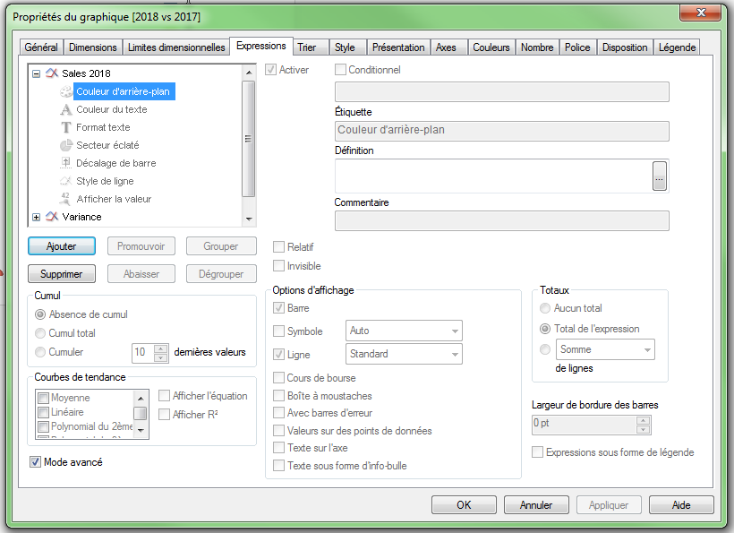
- Mark as New
- Bookmark
- Subscribe
- Mute
- Subscribe to RSS Feed
- Permalink
- Report Inappropriate Content
Sorry I'm confused the points on the chart are not displayed as they were before.
For instance there are no negative variances
- Mark as New
- Bookmark
- Subscribe
- Mute
- Subscribe to RSS Feed
- Permalink
- Report Inappropriate Content
When I opened the original app, there were no data
- Mark as New
- Bookmark
- Subscribe
- Mute
- Subscribe to RSS Feed
- Permalink
- Report Inappropriate Content
Sorry this has become too complicated for my skill level. I wanted a solution similar to the first post without having to use set analysis.
Don't worry, thanks for your help though
- « Previous Replies
-
- 1
- 2
- Next Replies »