Unlock a world of possibilities! Login now and discover the exclusive benefits awaiting you.
- Qlik Community
- :
- All Forums
- :
- QlikView App Dev
- :
- Re: Community Detection
- Subscribe to RSS Feed
- Mark Topic as New
- Mark Topic as Read
- Float this Topic for Current User
- Bookmark
- Subscribe
- Mute
- Printer Friendly Page
- Mark as New
- Bookmark
- Subscribe
- Mute
- Subscribe to RSS Feed
- Permalink
- Report Inappropriate Content
Community Detection
Hey everybody,
Is there a Qlik way how to detect groups within a set of data? Let's say you have 100 people working on different projects. How can I visualize who works together on which task?
Thanks a lot!
- « Previous Replies
-
- 1
- 2
- Next Replies »
Accepted Solutions
- Mark as New
- Bookmark
- Subscribe
- Mute
- Subscribe to RSS Feed
- Permalink
- Report Inappropriate Content
Hi,
you could present the relation between projects and project members as a pivot table:
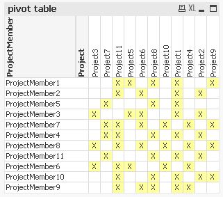
In order to accentuate groups of people working in similar projects as well as projects sharing the same members you could sort the project and project member dimensions accordingly:
Please find attached a (rather inefficient 😉 example application.
I tried to create a score that accumulates the differences between neighbouring rows and columns to find a sequence with minimal changes thus creating groups in the chart.
Maybe someone can come up with an optimization algorithm that performs better than the included brute force attempt to create the order sequence ...
hope this helps
regards
Marco
- Mark as New
- Bookmark
- Subscribe
- Mute
- Subscribe to RSS Feed
- Permalink
- Report Inappropriate Content
Not really sure what you are asking for.
In general, the relations should be visible just using Qlik's associative DB in, i.e. if you select a task, you will see all related e.g. people and non-related people will be removed / greyed out.
If you are asking for a special kind of visualization, maybe like this?
Informative, Curvy & Never Before Seen (by me at least) – The Associated Curve Chart | QVDesign
or this
Brilliant Qlikview Parallel Co-Ordinates Chart | QVDesign
(but both are rather complex charts to create)
- Mark as New
- Bookmark
- Subscribe
- Mute
- Subscribe to RSS Feed
- Permalink
- Report Inappropriate Content
If you are looking for special visualization, here are some more examples using extensions
But again, all these and the development aspects behind are not really chart objects for starters.
- Mark as New
- Bookmark
- Subscribe
- Mute
- Subscribe to RSS Feed
- Permalink
- Report Inappropriate Content
Thank you!
- Mark as New
- Bookmark
- Subscribe
- Mute
- Subscribe to RSS Feed
- Permalink
- Report Inappropriate Content
- Mark as New
- Bookmark
- Subscribe
- Mute
- Subscribe to RSS Feed
- Permalink
- Report Inappropriate Content
You are welcome (though still not sure which part of my answer was valuable to you).
If your question is answered, please consider closing this thread by marking helpful or correct answers.
- Mark as New
- Bookmark
- Subscribe
- Mute
- Subscribe to RSS Feed
- Permalink
- Report Inappropriate Content
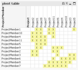
Hi,
you could present the relation between projects and project members as a pivot table:
In order to accentuate groups of people working in similar projects as well as projects sharing the same members you could sort the project and project member dimensions accordingly:
Please find attached a (rather inefficient 😉 example application.
I tried to create a score that accumulates the differences between neighbouring rows and columns to find a sequence with minimal changes thus creating groups in the chart.
Maybe someone can come up with an optimization algorithm that performs better than the included brute force attempt to create the order sequence ...
hope this helps
regards
Marco
- Mark as New
- Bookmark
- Subscribe
- Mute
- Subscribe to RSS Feed
- Permalink
- Report Inappropriate Content
Thank you very much!!
- Mark as New
- Bookmark
- Subscribe
- Mute
- Subscribe to RSS Feed
- Permalink
- Report Inappropriate Content
You're welcome.
Please close your thread if your question is answered or explain if the proposed solutions do not solve your problem.
Thanks
Regards
Marco
- Mark as New
- Bookmark
- Subscribe
- Mute
- Subscribe to RSS Feed
- Permalink
- Report Inappropriate Content
Since I am using Qlik Sense Desktop now, I am unable to open your qvw.
How can I make an "x" in the pivot table?
- « Previous Replies
-
- 1
- 2
- Next Replies »