Unlock a world of possibilities! Login now and discover the exclusive benefits awaiting you.
- Qlik Community
- :
- All Forums
- :
- QlikView App Dev
- :
- Re: Compare YoY Sales in the same line graph
- Subscribe to RSS Feed
- Mark Topic as New
- Mark Topic as Read
- Float this Topic for Current User
- Bookmark
- Subscribe
- Mute
- Printer Friendly Page
- Mark as New
- Bookmark
- Subscribe
- Mute
- Subscribe to RSS Feed
- Permalink
- Report Inappropriate Content
Compare YoY Sales in the same line graph
Hi everyone,
I want to see a simple line graph that shows a line for FY14 sales and a separate line for FY15 sales on the same line graph. Data is ordered sequentially and example graph below. I've read a few forums with very complicated suggestions for complicated datasets, but mine is simple - 2 cuts of the same dataset. I assume I create an Expression with a formula (e.g. Sales where Year = 2014) and another Expression ( Sales where Year = 2015), so what's the syntax to show only a limited selection of the same data ?
| Year | Month | Sales |
| 2014 | January | 65% |
| 2014 | February | 72% |
| 2014 | March | 66% |
| 2014 | April | 50% |
| 2014 | May | 60% |
| 2015 | January | 70% |
| 2015 | February | 73% |
| 2015 | March | 80% |
| 2015 | April | 70% |
| 2015 | May | 65% |
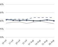
And second question is - how do I then add a singular line that represents the target ? So if Target is 80% across the year, can I do this another way that doesn't involve adding it line by line in to the source data ?
Thanks,
Dave
Accepted Solutions
- Mark as New
- Bookmark
- Subscribe
- Mute
- Subscribe to RSS Feed
- Permalink
- Report Inappropriate Content
Hi,
In the expression use this formula
=sum({<Year={'2014'}>}Sales) for the YOY for 2014
=sum({<Year={'2015'}>}Sales) for YOY for 2015
- Mark as New
- Bookmark
- Subscribe
- Mute
- Subscribe to RSS Feed
- Permalink
- Report Inappropriate Content
Hi,
In the expression use this formula
=sum({<Year={'2014'}>}Sales) for the YOY for 2014
=sum({<Year={'2015'}>}Sales) for YOY for 2015
- Mark as New
- Bookmark
- Subscribe
- Mute
- Subscribe to RSS Feed
- Permalink
- Report Inappropriate Content
try
sum({<Year={2015}>} Sales)
sum({<Year={2014}>} Sales)
- Mark as New
- Bookmark
- Subscribe
- Mute
- Subscribe to RSS Feed
- Permalink
- Report Inappropriate Content
create a variable lik
vYear= max(Year)-1
then create a input box with variable vYear
create chart with expressions
sum({$<Year={$(=Max(Year))}>} Sales)
sum({$<Year={$(=Max(Year)-vYear)}>} Sales)
you can compare 2015 with 2014 and also with more previous years by changing values in input box
- Mark as New
- Bookmark
- Subscribe
- Mute
- Subscribe to RSS Feed
- Permalink
- Report Inappropriate Content
Thanks everyone - I especially like the input box variable idea.
I've also just worked out how simple my second question is to answer 🙂
A third Expression with =80%
- Mark as New
- Bookmark
- Subscribe
- Mute
- Subscribe to RSS Feed
- Permalink
- Report Inappropriate Content
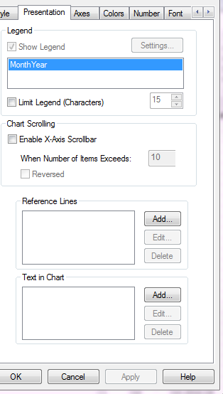
For your second question, you could also just add a Reference Line on the bottom right of the Presentation tab.