Unlock a world of possibilities! Login now and discover the exclusive benefits awaiting you.
- Qlik Community
- :
- All Forums
- :
- QlikView App Dev
- :
- Compare block charts
- Subscribe to RSS Feed
- Mark Topic as New
- Mark Topic as Read
- Float this Topic for Current User
- Bookmark
- Subscribe
- Mute
- Printer Friendly Page
- Mark as New
- Bookmark
- Subscribe
- Mute
- Subscribe to RSS Feed
- Permalink
- Report Inappropriate Content
Compare block charts
Hi,
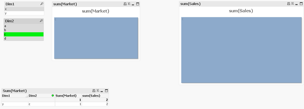
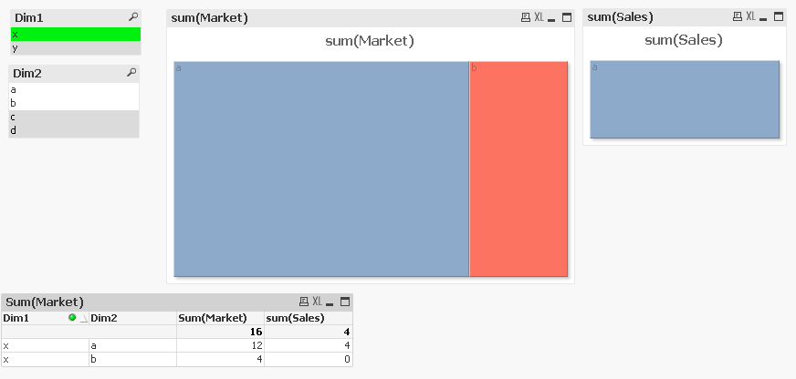
I am using two Block Charts for a side by side comparison of market versus sales - how can I align the axis of each chart so that the block sizes are comparable?
Regards
Marty.
- Mark as New
- Bookmark
- Subscribe
- Mute
- Subscribe to RSS Feed
- Permalink
- Report Inappropriate Content
Perhaps a bar chart will work better. Or perhaps you can use the Trellis option on the Dimensions tab.
talk is cheap, supply exceeds demand
- Mark as New
- Bookmark
- Subscribe
- Mute
- Subscribe to RSS Feed
- Permalink
- Report Inappropriate Content
Hi,
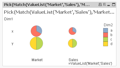
Or maybe a grid chart (3 dimensions here, the minimum - 1 synthetic assuming your market & sales are in different fields);

Otherwise I think you are looking at macros to manipulate the size of the object.
Cheers,
Chris.
- Mark as New
- Bookmark
- Subscribe
- Mute
- Subscribe to RSS Feed
- Permalink
- Report Inappropriate Content
Hi,
While putting off doing something I really ought to I took a look at the macro … so the attached manipulates the sizes of the objects. It does not take into account the white space, so you get a slightly distorted sizes, that could probably be fixed by tweaking the formulae, but the effect is Ok;

Chris.
- Mark as New
- Bookmark
- Subscribe
- Mute
- Subscribe to RSS Feed
- Permalink
- Report Inappropriate Content
Perhaps use Market/Sales as the first dimension. That would render two blocks in the same chart with the same scale.
-Rob
