Unlock a world of possibilities! Login now and discover the exclusive benefits awaiting you.
- Qlik Community
- :
- All Forums
- :
- QlikView App Dev
- :
- Re: Create schedule view chart with set number of ...
- Subscribe to RSS Feed
- Mark Topic as New
- Mark Topic as Read
- Float this Topic for Current User
- Bookmark
- Subscribe
- Mute
- Printer Friendly Page
- Mark as New
- Bookmark
- Subscribe
- Mute
- Subscribe to RSS Feed
- Permalink
- Report Inappropriate Content
Create schedule view chart with set number of rows per date
We have a need to create a schedule chart of events at each of four venues. Each venue can have up to four events on each day.
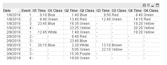
The finished chart should have four rows for every date and start time and class for each of the venues in separate columns.
Please see the attached spreadsheet - two tabs, first is sample input data and the second is the desired output.
Any points would be much appreciated.
Thank you
- Subscribe by Topic:
-
Missing Data
-
Pivot chart
-
QlikView
-
schedule view
-
straight chart
- « Previous Replies
-
- 1
- 2
- Next Replies »
Accepted Solutions
- Mark as New
- Bookmark
- Subscribe
- Mute
- Subscribe to RSS Feed
- Permalink
- Report Inappropriate Content
There you go:
My way of doing this is:
- Sort the raw table by timestamp and date to determine which event comes first.
- Then, split the raw table into 4 different Venue Tables(G1,G2,G3, and G4) by using loop.
- Rename [Time and Class] into 2 new columns (eg: [G1 Time] and [G1 Class]) during the loop.
- Join back all table back into the first table.
Refer qvw attached for reference.
Thanks and regards,
Arthur Fong
- Mark as New
- Bookmark
- Subscribe
- Mute
- Subscribe to RSS Feed
- Permalink
- Report Inappropriate Content
Christine, did Arthur's sample app give you what you needed? If so, please be sure to circle back and use the Accept as Solution button on his post to give him credit. If that does not work for some reason, you can leave a post letting us know too, and I can circle back and mark things. If you did something different, consider posting that and then mark it as the solution so others will know, and if you still need help, give us an update of where things stand.
Regards,
Brett
I now work a compressed schedule, Tuesday, Wednesday and Thursday, so those will be the days I will reply to any follow-up posts.
- Mark as New
- Bookmark
- Subscribe
- Mute
- Subscribe to RSS Feed
- Permalink
- Report Inappropriate Content
Thank you Arthur. Only now got around to finishing implementing your solution but I got it to work.
Now, if only I could get QlikView to let me make a bolder horizontal line under each change in date...?
- Mark as New
- Bookmark
- Subscribe
- Mute
- Subscribe to RSS Feed
- Permalink
- Report Inappropriate Content
There you go:
Instead of using table box, change it to straight table in chart object.
Next, insert Date and Event as Dimension, the rest as Measurements.
Under Date Dimension, expand it then select Text Format and apply logic to underline the date.
Refer qvw attached as reference.
Thanks and regards,
Arthur Fong
- Mark as New
- Bookmark
- Subscribe
- Mute
- Subscribe to RSS Feed
- Permalink
- Report Inappropriate Content
Actually, it's the cell border I want to be a different colour...all the way across.
- Mark as New
- Bookmark
- Subscribe
- Mute
- Subscribe to RSS Feed
- Permalink
- Report Inappropriate Content
Use the same concept to color the background:
Refer qvw attached as reference.
Thanks and regards,
Arthur Fong
- Mark as New
- Bookmark
- Subscribe
- Mute
- Subscribe to RSS Feed
- Permalink
- Report Inappropriate Content
Actually, it's the CELL BORDER I want to change...not the background colour. I have other requirements for the background colour.
- Mark as New
- Bookmark
- Subscribe
- Mute
- Subscribe to RSS Feed
- Permalink
- Report Inappropriate Content
This is the best i can get:
1. Add Total at dimension limit tab.
2. Use Custom Format cell to format the Total borders.
Refer qvw attached as reference.
Thanks and regards,
Arthur Fong
- Mark as New
- Bookmark
- Subscribe
- Mute
- Subscribe to RSS Feed
- Permalink
- Report Inappropriate Content
Thanks for your help. This is now working as I had hoped on my desktop. Unfortunately when I port it to QMC the order that it creates the event tables is different so I have to manually change the first table name in the script and then back again after it's loaded in QMC.
Where can I force the name of the table so that it will be the same every time? Perhaps something like 'Venues' instead of G1?
- « Previous Replies
-
- 1
- 2
- Next Replies »


