Unlock a world of possibilities! Login now and discover the exclusive benefits awaiting you.
- Qlik Community
- :
- All Forums
- :
- QlikView App Dev
- :
- Re: Creating Panel Charts / Enhancing Bar Charts t...
- Subscribe to RSS Feed
- Mark Topic as New
- Mark Topic as Read
- Float this Topic for Current User
- Bookmark
- Subscribe
- Mute
- Printer Friendly Page
- Mark as New
- Bookmark
- Subscribe
- Mute
- Subscribe to RSS Feed
- Permalink
- Report Inappropriate Content
Creating Panel Charts / Enhancing Bar Charts to resemble Panel
I would like to create sort of a 'panel' chart with my data for the end user to view.
Currently, My data looks like this:
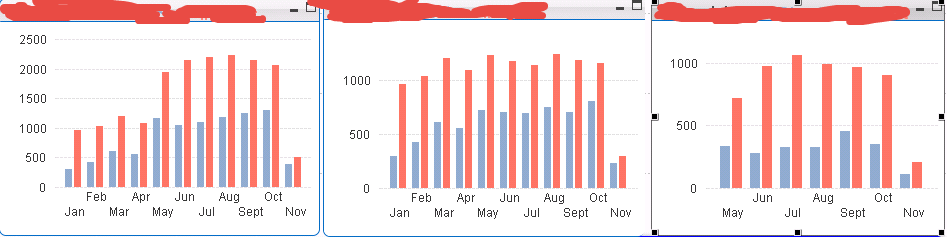
The chart on the left is the "TOTAL" view, and the middle, right charts are "BREAKDOWNS" by different PRODUCT TYPE
I want to scale these to the TOTAL chart, which I did with a static step/min/max, which eventually I will probably create a formula for in order to keep the scale the same as the left (haven't thought of how to do that yet)
but I also want the AXIS of the middle/right chart to go away, because the user can see from the left what the values are, HOWEVER, when removing the axis, the GRIDLINES are removed, so it becomes difficult to tell what the trend is, etc.
Has anyone else done something similar to this, so that these charts aren't as hard to read.
Looking for suggestions.
- « Previous Replies
- Next Replies »
Accepted Solutions
- Mark as New
- Bookmark
- Subscribe
- Mute
- Subscribe to RSS Feed
- Permalink
- Report Inappropriate Content
OK, so is it always just those specific two products? That's where the inline load comes in.
[Product Groups]:
LOAD * INLINE [
Product Group,Product
Total,Financial Card
Total,Vehicle/Home EQ
Financial Card,Financial Card
Vehicle/Home EQ,Vehicle/Home EQ
];
- Mark as New
- Bookmark
- Subscribe
- Mute
- Subscribe to RSS Feed
- Permalink
- Report Inappropriate Content
I want to say "trellis chart in combination with a new dimension that includes the total", but it'd show the numbers in all sub charts or no sub charts, so doesn't solve your problem.
As a brute force solution, get rid of borders, and just hide the two charts under each other so that the numbers don't show.
As far as the formula, let's say you're doing a sum(Sales) and sum(Proceeds) by Month for your two bars. Your static max for all charts could be max(aggr(rangemax(sum(Sales),sum(Proceeds)),Month)). I'd put it in a variable in case you need to play with it. Then you only need to play with it in one spot.
I still want to say trellis chart, though. Use a new dimension:
[Product Groups]:
LOAD *
,[Product Type] as [Product Group]
;
LOAD text(fieldvalue('Product Type',recno())) as [Product Type]
AUTOGENERATE fieldvaluecount('Product Type')
;
CONCATENATE ([Product Groups])
LOAD
'Total' as [Product Group]
,[Product Type]
RESIDENT [Product Groups]
;
Though if you only have a couple products, and inline table would be easier than the script above.
Bar chart, Dimension 1 = Product Group, Dimension 2 = Month, click on the Trellis button on the Dimensions tab, enable, you might want a fixed layout, fiddle around with it. It won't do what you're asking visually, not exactly. But what it will do is dramatically simplify the creation of a bar chart for each product plus one for the total. Just using product group as a dimension will do that. It will automatically synchronize the Y axis of each sub chart. Pretty much everything you want except for hiding the numbers in most charts since they're all the same.
Edit: If you trellis, you might need to fiddle around with the creation of the product groups table to get things in the order you want them. Like do the total first, then concatenate the individual products, and show in load order. Again, much easier if you only have a couple products and can just do an inline load. Like the below to show Total, then A, then B.
[Product Groups]:
LOAD * INLINE [
Product Group, Product Type
Total, A
Total, B
A, A
B, B
];
- Mark as New
- Bookmark
- Subscribe
- Mute
- Subscribe to RSS Feed
- Permalink
- Report Inappropriate Content
Thanks John, this is good information. I'll test this out when I get a chance. I like to load a few questions on here and get some answers that I can review later. I'll post results 
- Mark as New
- Bookmark
- Subscribe
- Mute
- Subscribe to RSS Feed
- Permalink
- Report Inappropriate Content
Would doing an inline load require me to manually update these aggregates? I'm confused as to how that would simplify anything...
- Mark as New
- Bookmark
- Subscribe
- Mute
- Subscribe to RSS Feed
- Permalink
- Report Inappropriate Content
You'd only want to do it as an inline load if you had a short, fixed product list that never changes. If the list changes over time, or isn't short, you'd want to use the more complicated script for the Product Groups table. It will work no matter how many products or how often they change.
- Mark as New
- Bookmark
- Subscribe
- Mute
- Subscribe to RSS Feed
- Permalink
- Report Inappropriate Content
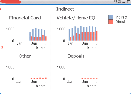
This is what my trellis chart looks like with Dim 1 = ProductGroup, Dim2 = Month
Expression 1 and 2 from my charts above added into this, but there isn't a group for TOTAL:
- Mark as New
- Bookmark
- Subscribe
- Mute
- Subscribe to RSS Feed
- Permalink
- Report Inappropriate Content
Also, I'm really only interested in the top two charts, with a TOTAL of the two as well.... the bottom two aren't necessary, but I don't want to remove them from my Product field
- Mark as New
- Bookmark
- Subscribe
- Mute
- Subscribe to RSS Feed
- Permalink
- Report Inappropriate Content
I think you can create a synthetic dimension using Pick & Match and then define your expression for Total separately again using pick & match.
can your provide some sample data to play with.
- Mark as New
- Bookmark
- Subscribe
- Mute
- Subscribe to RSS Feed
- Permalink
- Report Inappropriate Content
OK, so is it always just those specific two products? That's where the inline load comes in.
[Product Groups]:
LOAD * INLINE [
Product Group,Product
Total,Financial Card
Total,Vehicle/Home EQ
Financial Card,Financial Card
Vehicle/Home EQ,Vehicle/Home EQ
];
- Mark as New
- Bookmark
- Subscribe
- Mute
- Subscribe to RSS Feed
- Permalink
- Report Inappropriate Content
Hey John, I'm revisiting this option, but I'm still confused as to how you suggest loading this
[Product Groups]:
LOAD * INLINE [
Product Group,Product
Total,Financial Card
Total,Vehicle/Home EQ
Financial Card,Financial Card
Vehicle/Home EQ,Vehicle/Home EQ
];
are you suggesting I enter the formulas to calculate these expressions in the inline load?
- « Previous Replies
- Next Replies »