Unlock a world of possibilities! Login now and discover the exclusive benefits awaiting you.
- Qlik Community
- :
- All Forums
- :
- QlikView App Dev
- :
- Creating Panel Charts / Enhancing Bar Charts to re...
- Subscribe to RSS Feed
- Mark Topic as New
- Mark Topic as Read
- Float this Topic for Current User
- Bookmark
- Subscribe
- Mute
- Printer Friendly Page
- Mark as New
- Bookmark
- Subscribe
- Mute
- Subscribe to RSS Feed
- Permalink
- Report Inappropriate Content
Creating Panel Charts / Enhancing Bar Charts to resemble Panel
I would like to create sort of a 'panel' chart with my data for the end user to view.
Currently, My data looks like this:
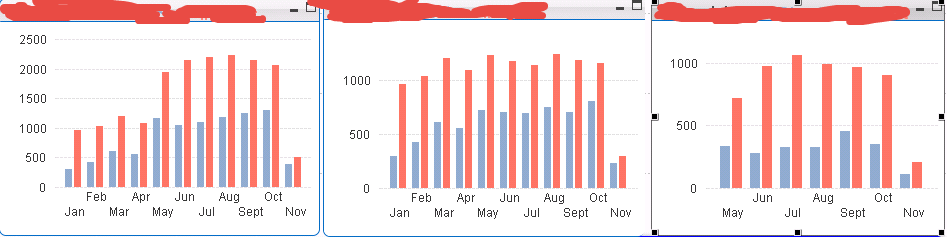
The chart on the left is the "TOTAL" view, and the middle, right charts are "BREAKDOWNS" by different PRODUCT TYPE
I want to scale these to the TOTAL chart, which I did with a static step/min/max, which eventually I will probably create a formula for in order to keep the scale the same as the left (haven't thought of how to do that yet)
but I also want the AXIS of the middle/right chart to go away, because the user can see from the left what the values are, HOWEVER, when removing the axis, the GRIDLINES are removed, so it becomes difficult to tell what the trend is, etc.
Has anyone else done something similar to this, so that these charts aren't as hard to read.
Looking for suggestions.
- « Previous Replies
- Next Replies »
- Mark as New
- Bookmark
- Subscribe
- Mute
- Subscribe to RSS Feed
- Permalink
- Report Inappropriate Content
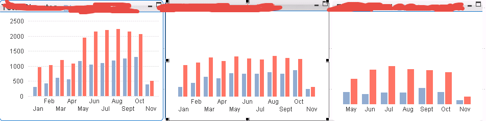
Wow, I didn't realize you could angle your Dimension labels. This looks much more clean. Thanks for the tip!!!
- « Previous Replies
- Next Replies »