Unlock a world of possibilities! Login now and discover the exclusive benefits awaiting you.
- Qlik Community
- :
- All Forums
- :
- QlikView App Dev
- :
- Customise the legend titles in a bar chart
- Subscribe to RSS Feed
- Mark Topic as New
- Mark Topic as Read
- Float this Topic for Current User
- Bookmark
- Subscribe
- Mute
- Printer Friendly Page
- Mark as New
- Bookmark
- Subscribe
- Mute
- Subscribe to RSS Feed
- Permalink
- Report Inappropriate Content
Customise the legend titles in a bar chart
Hi Guys,
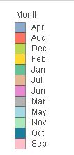
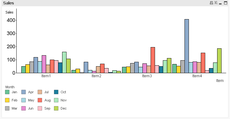
How to customise the legend titles in a bar chart?
Current one:
Required one:
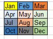
Thanks in advance.
Accepted Solutions
- Mark as New
- Bookmark
- Subscribe
- Mute
- Subscribe to RSS Feed
- Permalink
- Report Inappropriate Content
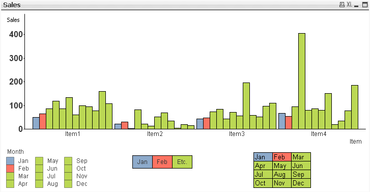
If you truly need it to look EXACTLY as shown, you could do it with 12 text boxes with the appropriate background color. Then to make absolutely certain your text box colors don't get out of sync with your chart colors, you could define the colors for each month in script, then use set analysis to assign the right color in the text boxes, and a background color for the expression to assign the color in your charts.
You could also use a pivot table with background colors and dimensions quarter and month in quarter.
I'd avoid either approach at almost all costs, but I have had users that insist that something must look EXACTLY like they want, even if what I've given them is completely functionally equivalent.
See attached example. I only set colors for the first three months, and didn't complete the job for the text boxes, but it should be enough to get the idea.
- Mark as New
- Bookmark
- Subscribe
- Mute
- Subscribe to RSS Feed
- Permalink
- Report Inappropriate Content
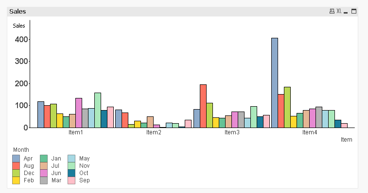
I don't think this is possible with inbuilt functionality of QlikView. the closest you can get is this
- Mark as New
- Bookmark
- Subscribe
- Mute
- Subscribe to RSS Feed
- Permalink
- Report Inappropriate Content
Hi,
Try this..
MonthNo:
Load * inline [
Month, MonthNo
Jan, 1
Feb, 2
Mar, 3
Apr, 4
May, 5
Jun, 6
Jul, 7
Aug, 8
Sep, 9
Oct, 10
Nov, 11
Dec, 12
];
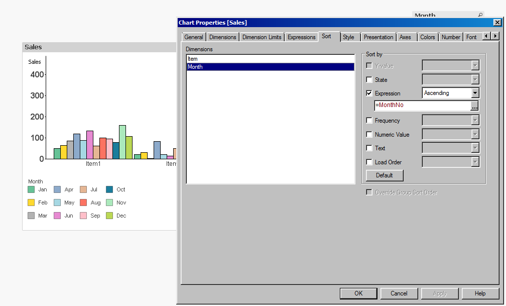
-Sathish
- Mark as New
- Bookmark
- Subscribe
- Mute
- Subscribe to RSS Feed
- Permalink
- Report Inappropriate Content
- Mark as New
- Bookmark
- Subscribe
- Mute
- Subscribe to RSS Feed
- Permalink
- Report Inappropriate Content
I just moved the legend to the bottom of the chart. You can move it by pressing Shift + Ctrl + S and when you see red lines appearing, drag the legend box all the way to the bottom.
- Mark as New
- Bookmark
- Subscribe
- Mute
- Subscribe to RSS Feed
- Permalink
- Report Inappropriate Content
Yes.. I have done the same what sunny has mentioned above.
-Sathish
- Mark as New
- Bookmark
- Subscribe
- Mute
- Subscribe to RSS Feed
- Permalink
- Report Inappropriate Content
Hi
By using Ctrl+Shift we can drag the legends from up to bottom.
go to the presentation tab and we can change the font and format of legends by using legend setting.
- Mark as New
- Bookmark
- Subscribe
- Mute
- Subscribe to RSS Feed
- Permalink
- Report Inappropriate Content
If you truly need it to look EXACTLY as shown, you could do it with 12 text boxes with the appropriate background color. Then to make absolutely certain your text box colors don't get out of sync with your chart colors, you could define the colors for each month in script, then use set analysis to assign the right color in the text boxes, and a background color for the expression to assign the color in your charts.
You could also use a pivot table with background colors and dimensions quarter and month in quarter.
I'd avoid either approach at almost all costs, but I have had users that insist that something must look EXACTLY like they want, even if what I've given them is completely functionally equivalent.
See attached example. I only set colors for the first three months, and didn't complete the job for the text boxes, but it should be enough to get the idea.
- Mark as New
- Bookmark
- Subscribe
- Mute
- Subscribe to RSS Feed
- Permalink
- Report Inappropriate Content
I wish there was a way to group things together in QlikView so those 12 text boxes could have been grouped together into one object.