Unlock a world of possibilities! Login now and discover the exclusive benefits awaiting you.
- Qlik Community
- :
- All Forums
- :
- QlikView App Dev
- :
- Dashboard Help
- Subscribe to RSS Feed
- Mark Topic as New
- Mark Topic as Read
- Float this Topic for Current User
- Bookmark
- Subscribe
- Mute
- Printer Friendly Page
- Mark as New
- Bookmark
- Subscribe
- Mute
- Subscribe to RSS Feed
- Permalink
- Report Inappropriate Content
Dashboard Help
Hi there,
I have a few questions for the new dashboard i am building.
1) Is there a way to create min and max value input box? For example, user wants to set limits and be able to change those. As I researched here, the only answer was to insert input boxes, which I did. But graphs do not change accordingly when i set the limits.
(Slider with values is not an option)
2) List boxes with year and period.
When I choose specific period the check box lights, however, when i do not specifically click on the list box and click somewhere on the graph, not active periods grey out. I there a way to make it, so if I click on any other data the periods in which it happened will also light.
3) How I can create concatenated field for period and year, so it will show for example 11/2014, and not two separate rows as below. But also, this data will be updated year, to year, so there will be 11/2015 and so on. Will it be too complicated to show? Should I just stick with the list box as above, and choose to show periods only below?

Thank you-
- « Previous Replies
-
- 1
- 2
- Next Replies »
- Mark as New
- Bookmark
- Subscribe
- Mute
- Subscribe to RSS Feed
- Permalink
- Report Inappropriate Content
Hi Nina,
this will help for your question 1.
In you graph, select the Dimension Limit tab and in Limits section tick "Restrict which values are displayed using the first expression and show only radio button. Then select largest or smallest. In value box select your variable vLargest or vSmallest. Graph will change according to the users input.
Hope this will help you.
- Mark as New
- Bookmark
- Subscribe
- Mute
- Subscribe to RSS Feed
- Permalink
- Report Inappropriate Content
to 2): there might be a workaround in using a straight table and colour the background/using a 'check' symbol with only() function.
In does not work in a listbox as it would be give a wrong information: green stands for 'actively' selected - so the user can trust (no matter about data/datamodel in the background) that this particular value in this particular field is selected. If you select something else that is (maybe just by coincidence) linked to this field it should be indicated as 'available data' but it could also cover other values as well. I would not recommend to confuse the users in applying an artificial green pseudo-selection colour code
- Mark as New
- Bookmark
- Subscribe
- Mute
- Subscribe to RSS Feed
- Permalink
- Report Inappropriate Content
to 3) instead of the two dimensions try to have one calculated dimension like
=MyMonthField &'/'& MyYearField
- Mark as New
- Bookmark
- Subscribe
- Mute
- Subscribe to RSS Feed
- Permalink
- Report Inappropriate Content
Hi,
Use Slider.
- Mark as New
- Bookmark
- Subscribe
- Mute
- Subscribe to RSS Feed
- Permalink
- Report Inappropriate Content
To 3).
Do you want to create new dimension concatenating Period and year field or new expression to show in the graph?
- Mark as New
- Bookmark
- Subscribe
- Mute
- Subscribe to RSS Feed
- Permalink
- Report Inappropriate Content
Hi,
For 1:
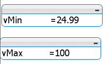
You have use those variables in the set analysis then only the data get filtered in the charts.
Ex: Sum({<Value={'>=$(=vMin)<=$(=vMax)'}>} Sales)
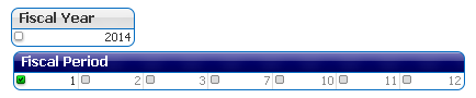
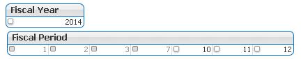
For 2: The greyed out values are not related to the current selections, and white color values are related to your current selections, when you select explicitly then only you will get the colors in Green color
Color Codes
White - Possible values
Grey - Non related values
Green - Selected Values
For 3:
In script concatenate or date format both the values and create a separate field, this is best practice
LOAD
*,
Date(MonthStart(DateFieldName), 'MM/YYYY') AS MonthYear
FROM DataSource;
Now use MonthYear as dimension in your chart.
or simply you can use calculated dimension like below, but there will be some sorting issues.
=Month & '/'& Year
Hope this helps you.
Regards,
Jagan.
- Mark as New
- Bookmark
- Subscribe
- Mute
- Subscribe to RSS Feed
- Permalink
- Report Inappropriate Content
Hi Daniel,
Thank you for your response. I followed your instructions, but now have aother issue.
Periods are not sorted properly. So I Inserted expression beloiw and still out of luck
([MyMonthField,Index('janfebmaraprmayjunjulaugsepoctnovdec',lower(MyMonthField)))

Any ideas?
- Mark as New
- Bookmark
- Subscribe
- Mute
- Subscribe to RSS Feed
- Permalink
- Report Inappropriate Content
Hi Prasad,
Could you please expand on this? I actually need to be able to set the range and all graphs need to reflect it, when selected only. The user need to be able to control it, whenever they want to input another amount to min or max.
I am starting to think it is not possible in Qlik?
Thank you-
- Mark as New
- Bookmark
- Subscribe
- Mute
- Subscribe to RSS Feed
- Permalink
- Report Inappropriate Content
Hi Jagan,
Could you please expand on #1? I actually need to be able to set the range and all graphs need to reflect it, when selected only. The user need to be able to control it, whenever they want to input another amount to min or max.
I am starting to think it is not possible in Qlik?
Thank you-
- « Previous Replies
-
- 1
- 2
- Next Replies »