Unlock a world of possibilities! Login now and discover the exclusive benefits awaiting you.
- Qlik Community
- :
- All Forums
- :
- QlikView App Dev
- :
- Re: Diagram changes from points to a line if there...
- Subscribe to RSS Feed
- Mark Topic as New
- Mark Topic as Read
- Float this Topic for Current User
- Bookmark
- Subscribe
- Mute
- Printer Friendly Page
- Mark as New
- Bookmark
- Subscribe
- Mute
- Subscribe to RSS Feed
- Permalink
- Report Inappropriate Content
Diagram changes from points to a line if there are more than 100 values.
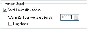
I would like all the points without a scroll bar in a diagram, is that possible?
If the number exceeds 100 makes Qlikview Qlikview draws a line. - « Previous Replies
-
- 1
- 2
- Next Replies »
Accepted Solutions
- Mark as New
- Bookmark
- Subscribe
- Mute
- Subscribe to RSS Feed
- Permalink
- Report Inappropriate Content
Just circling back to note the issue has been fixed by R&D and will be included in an upcoming release. There are no patch releases as yet, but if you need one, please submit a support case and reference defect QV-18849 and a patch request for the track you are on. Please note, you will likely need to update to the most current SR in the track you are running, and currently the only tracks we would be able to request the patch upon would be 12.20 and later given support for 12.10 ended November 2019. I believe the fix should be included in the upcoming April 2020 release.
Just a quick update for anyone that runs across this, the fix is planned to be implemented in the 12.40 SR4 release, but that is subject to change, best info I have at the moment.
Regards,
Brett
I now work a compressed schedule, Tuesday, Wednesday and Thursday, so those will be the days I will reply to any follow-up posts.
- Mark as New
- Bookmark
- Subscribe
- Mute
- Subscribe to RSS Feed
- Permalink
- Report Inappropriate Content
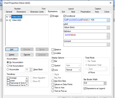
What if you create two identical measures in a combo chart one styled with dots one with line. Then use conditional show to decide which one to display. See attached qvw
Qlik Community MVP
- Mark as New
- Bookmark
- Subscribe
- Mute
- Subscribe to RSS Feed
- Permalink
- Report Inappropriate Content
My problem is that qlik independently decides that if there are more than 100 records, draw a line instead of displaying all the points.
I want to see all the dots without having to use a scrollbar.
- Mark as New
- Bookmark
- Subscribe
- Mute
- Subscribe to RSS Feed
- Permalink
- Report Inappropriate Content
Markus, I believe I found the setting for the dots to line:
MaxLineSymbols
The default value is in fact 100, so I think if you increase that it should get that part of things as you want them. The interesting thing is the setting in the chart properties does not seem to write to that setting, not sure if that is because it is a different setting or if there may be a bug, so we will have to try to change things in the Settings.ini file instead.
Your Desktop Settings.ini is located in C:\Users\UserProfileName\AppData\Roaming\QlikTech\QlikView
Add MaxLineSymbols=Your desired number within the [Settings 7] tag area and restart the client and test to see if the dots now stay to the number you wish... Shout back once you can do things and let us know if that gets you that far. I am not sure if there are any potential gotchas with changing this or not, I suspect the default value is to try to be sure the dots are always visible etc. Hopefully this gets us part of the way there.
Regards,
Brett
I now work a compressed schedule, Tuesday, Wednesday and Thursday, so those will be the days I will reply to any follow-up posts.
- Mark as New
- Bookmark
- Subscribe
- Mute
- Subscribe to RSS Feed
- Permalink
- Report Inappropriate Content
Hi Brett,
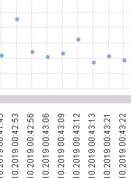
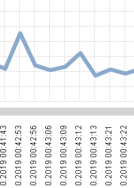
this is a nice solution, but leads me to an othe question. The right side of the diagram has narrower distances than the left part. See screenshots.
Regards,
Markus
- Mark as New
- Bookmark
- Subscribe
- Mute
- Subscribe to RSS Feed
- Permalink
- Report Inappropriate Content
Hey Markus, very interesting, and off top of my head, I have no idea what is going on there, any chance you have a sample app you can attach, so I can have a direct look at things on my side? If need be, you could private message me on this one with the app too if you want, and I can have a look and see if I can figure something out.
Regards,
Brett
I now work a compressed schedule, Tuesday, Wednesday and Thursday, so those will be the days I will reply to any follow-up posts.
- Mark as New
- Bookmark
- Subscribe
- Mute
- Subscribe to RSS Feed
- Permalink
- Report Inappropriate Content
Hi Brett,
I have reduced and changed the data of the app, but you can see what happens. I have Set the MaxLineSymbols=5000. I need all these data points also in the temporal course - also I must be able to recognize which one is first and wich one second.
Thank you.
Markus
- Mark as New
- Bookmark
- Subscribe
- Mute
- Subscribe to RSS Feed
- Permalink
- Report Inappropriate Content
Hey Markus, oddly enough, it does that with the conversion to line as well, as I forgot I needed to make the change you did to the Settings.ini, but I noticed while I was looking at things that the dates got closer together the farther to the right I scrolled, so that seems to be some other setting I will have to try to track down.
So, you also still want to get rid of the horizontal scrolling as well? That is going to be a lot of data points crammed into the view, not sure that is going to work without imposing a limit on the number to display. Let me see what I can find in the meantime here and change my other setting to match yours.
Regards,
Brett
I now work a compressed schedule, Tuesday, Wednesday and Thursday, so those will be the days I will reply to any follow-up posts.
- Mark as New
- Bookmark
- Subscribe
- Mute
- Subscribe to RSS Feed
- Permalink
- Report Inappropriate Content
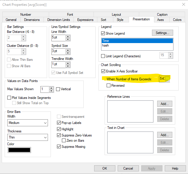
Markus, ok, I think I found the issue with the spacing, it is in the setting of the Number of Items:
What we figured out is if you lower that number, that will 'fix' the spacing, so this seems to be a potential defect you have found, but I checked an old case of yours, it showed you were still on 11.20 track, is that still the case? I was able to replicate in 12.40 SR1, but I wanted to see if you could possibly go ahead and submit a support case on this one? If you can send me the case number after you get it created, I can be sure to go add my comments to things and explain what I did etc. to be sure we are not asking you to reinvent the wheel again as we say! 🙂 The problem is, I am not sure what the engineers are going to say about us increasing the other setting, that may be a problem too! 🙂 Shout back when you can.
Regards,
Brett
I now work a compressed schedule, Tuesday, Wednesday and Thursday, so those will be the days I will reply to any follow-up posts.
- Mark as New
- Bookmark
- Subscribe
- Mute
- Subscribe to RSS Feed
- Permalink
- Report Inappropriate Content
In fact, if possible I would like to avoid horizontal scrolling, if necessary I would only display about 1000 data points.
- « Previous Replies
-
- 1
- 2
- Next Replies »
