Unlock a world of possibilities! Login now and discover the exclusive benefits awaiting you.
- Qlik Community
- :
- All Forums
- :
- QlikView App Dev
- :
- Different Graph for Different Selections in One Sh...
- Subscribe to RSS Feed
- Mark Topic as New
- Mark Topic as Read
- Float this Topic for Current User
- Bookmark
- Subscribe
- Mute
- Printer Friendly Page
- Mark as New
- Bookmark
- Subscribe
- Mute
- Subscribe to RSS Feed
- Permalink
- Report Inappropriate Content
Different Graph for Different Selections in One Sheet?
Hello Everyone,
I am trying to figure out a solution , where I can have different graphs for different selections (from same column field) and yes in the same sheet. Example: I have an excel sheet with employee data on it. I have a column "department" where there are like 12 different departments. Now I have to draw a comparison chart showing diversity in each department based on gender, race and age. so I have created 3 graphs that can show me different analysis based on age , gender and race.
I have used my dimesion as Year in all the 3 graphs, so as to compare everything year over year,i.e, showing trends. Now , I have done all this, but I want something where I could just select 3 different departments(may be from a list box) or anything and I want to give user maximum 3 options where he can compare data for 3 differnt departments.
So he can see 9 graphs on screen , where 3 graphs:
1) Year and age
2) year and gender
3) year and race
So all these above type will show diversity based on our 3 different selections, like Dept. 1 has its seperate chart for age, gender and race. likewise dept2 and Dept. 3. should have but on the same screen.
I know its kinda complicated. But is it possible to do this? I hope I am clear enough in my question.
Thank You.
Best,
Yaman
- Tags:
- new_to_qlikview
Accepted Solutions
- Mark as New
- Bookmark
- Subscribe
- Mute
- Subscribe to RSS Feed
- Permalink
- Report Inappropriate Content
In the chart properties on the Dimensions tab, there's a Trellis button. That will let you create one chart for each value of whatever field you choose. So you could do a Trellis based on department for each of your three graphs, and if three departments are selected, you'll see three copies of each graph, one for each department. The main problem is getting that much data to display and make sense on a single screen.
- Mark as New
- Bookmark
- Subscribe
- Mute
- Subscribe to RSS Feed
- Permalink
- Report Inappropriate Content
Hey John,
Yes it doesnt make any sense, to display trellis on this. I don't know what is the optimized way to do this? I am designing a dashboard where they want to display comprasion chart for different years and using differnt input values. so , it would be great if you can suggest something.
Also , after using trellis function, I am getting graphs but visually very small. Is there a way to increase the size or anything?
Thank you
Yaman
- Mark as New
- Bookmark
- Subscribe
- Mute
- Subscribe to RSS Feed
- Permalink
- Report Inappropriate Content
yaman1510 wrote:
Also , after using trellis function, I am getting graphs but visually very small. Is there a way to increase the size or anything?
I assume you mean how the charts can leave a whole lot of blank space no matter how much you drag the border out to make more space? I think the way around that is to use a fixed number of columns and rows instead of letting QlikView decide automatically for you (it chooses badly, at least in V9). Then to make more room for the relevant data, consider using smaller font sizes than usual for your dimensions and shrinking the big title over each sub-chart.
The title font is in what might be a bit of a non-intuitive place. It's under Title Settings on the General tab, which might seem obvious enough until you notice that the button is grayed out. You need to checkmark "show title in chart", then use the button and change the font, then uncheckmark it again. Well, in V9 anyway. Maybe that's fixed in V10.
- Mark as New
- Bookmark
- Subscribe
- Mute
- Subscribe to RSS Feed
- Permalink
- Report Inappropriate Content
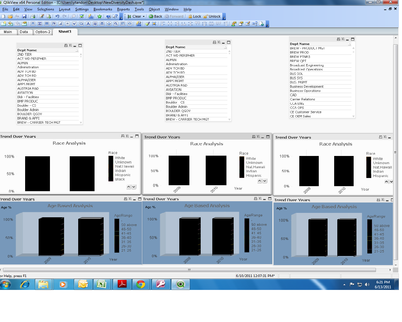
Hi John,
Thank you for your replies. You can see the above picture...this is something what I am looking forward to create.
3 different list box containing department name. Now what I want is :
1) when you select different department name...from different list box, ( I dont know if that s possible or not) then the following race and age graph should display value corresponds to the selections.
This way you can compare 3 different departments easliy based on age and race based analysis ( I want to give user max of 3 selections).
2)The charts are identical , i mean those are just 2 copies of age and race based chart. Is there a way to selct 3 different departments from 3 diff list boxs on a same sheet??
Well , the trellis function is not something I want.
Any alternative soluntion would be appreciated.
Thank you so much
Yaman
- Mark as New
- Bookmark
- Subscribe
- Mute
- Subscribe to RSS Feed
- Permalink
- Report Inappropriate Content
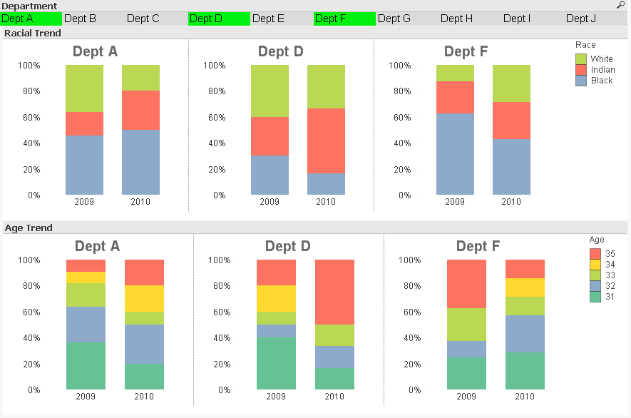
Why do you need three different list boxes? If you want them to select three departments to compare, just have them select three compartments to compare. There's no need for separate list boxes, which just complicates things.
And why do you say "the trellis function is not something I want"? Looking at the picture you posted, the trellis function is EXACTLY what you want.
See attached and below.
- Mark as New
- Bookmark
- Subscribe
- Mute
- Subscribe to RSS Feed
- Permalink
- Report Inappropriate Content
Hello John,
Thank you for the example,you are right. The reason why I said that I don't require Trellis is because I wasn't using it properly...I didnt add the dimension Department and so got confused on how it's gonna relate my charts to the departments. Also, the auto option made some visually not good graphs.
Thank you again.
Yaman