Unlock a world of possibilities! Login now and discover the exclusive benefits awaiting you.
- Qlik Community
- :
- All Forums
- :
- QlikView App Dev
- :
- Dynamic Y axis with smaller scale
- Subscribe to RSS Feed
- Mark Topic as New
- Mark Topic as Read
- Float this Topic for Current User
- Bookmark
- Subscribe
- Mute
- Printer Friendly Page
- Mark as New
- Bookmark
- Subscribe
- Mute
- Subscribe to RSS Feed
- Permalink
- Report Inappropriate Content
Dynamic Y axis with smaller scale
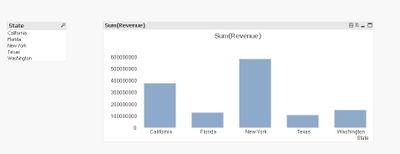
i want to display small numbers on Y axis by keeping number change dynamically if I select values in listbox
I have large numbers on Y axis , attached is the sample data
Accepted Solutions
- Mark as New
- Bookmark
- Subscribe
- Mute
- Subscribe to RSS Feed
- Permalink
- Report Inappropriate Content
Hello!
You can split axes on half to half and uncheck "Forced 0" to make your data more various.
I also hid axes because values are shown on the data points.
- Mark as New
- Bookmark
- Subscribe
- Mute
- Subscribe to RSS Feed
- Permalink
- Report Inappropriate Content
Hello!
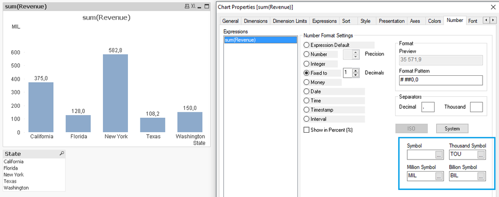
You can scale values with QV tooltips:
If I missed a point - please give me a feedback with more details of the issue.
- Mark as New
- Bookmark
- Subscribe
- Mute
- Subscribe to RSS Feed
- Permalink
- Report Inappropriate Content
Sorry I could not provide more details in my previous post . Please find attached sample data
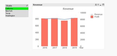
I have prepared Combo chart using sample data and Listbox of State . If I click on any State value in List Box then Line in Combo chart should show Ups and Downs (variation). This is not happening if I click on California , Texas and Washington
below is the screenshot of state 'California' .
- Mark as New
- Bookmark
- Subscribe
- Mute
- Subscribe to RSS Feed
- Permalink
- Report Inappropriate Content
Line appeared to be almost straight line , I want to show variations
- Mark as New
- Bookmark
- Subscribe
- Mute
- Subscribe to RSS Feed
- Permalink
- Report Inappropriate Content
Hello!
You can split axes on half to half and uncheck "Forced 0" to make your data more various.
I also hid axes because values are shown on the data points.
- Mark as New
- Bookmark
- Subscribe
- Mute
- Subscribe to RSS Feed
- Permalink
- Report Inappropriate Content
Thank you
Its working when I unchecked option 'Forced 0' ,
why I need to do split axis also?
- Mark as New
- Bookmark
- Subscribe
- Mute
- Subscribe to RSS Feed
- Permalink
- Report Inappropriate Content
Actually you don't have to. It's only helps to read a line more clear (without bars crossing).
- Mark as New
- Bookmark
- Subscribe
- Mute
- Subscribe to RSS Feed
- Permalink
- Report Inappropriate Content
Thanks for your contribution sergei very helpfull.
Quick question I see in you qvw that the labels are located one on the side of the other one , how did you do that? I cannot do this
- Mark as New
- Bookmark
- Subscribe
- Mute
- Subscribe to RSS Feed
- Permalink
- Report Inappropriate Content
Hello, Hector!
You meant labels on data points - how they on the one line for the curve points and bars?
If so, that's because they have the same dimension - Year. If no - please, provide more information about your case.
Or this is a question about legend labels?


