Unlock a world of possibilities! Login now and discover the exclusive benefits awaiting you.
- Qlik Community
- :
- All Forums
- :
- QlikView App Dev
- :
- Easy KPI object in QlikView using a straight-table
- Subscribe to RSS Feed
- Mark Topic as New
- Mark Topic as Read
- Float this Topic for Current User
- Bookmark
- Subscribe
- Mute
- Printer Friendly Page
- Mark as New
- Bookmark
- Subscribe
- Mute
- Subscribe to RSS Feed
- Permalink
- Report Inappropriate Content
Easy KPI object in QlikView using a straight-table
Easy (but reasonably capable) KPI box in QlikView using (simply) a straight-table
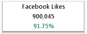
A basic example of a KPI box using a straight table is shown here. (Example is for illustration purpose showing This Year's KPI and percent change from previous year. It can be further enhanced or changed as required). The purpose of this blog is to show how something like this can be easily and quickly configured using out-of-the box properties of a straight table.
Benefits:
Simple to configure; quick to replicate--just copy and paste and change expressions; and easy to customize the presentation. Only one object per KPI box (i.e. 1 straight table)--so very manageable. Example shown here is quite basic...to further customize, such as adding images (such as up or down arrows)-- compute within expression and represent as image.
How to:
Here there are 4 simple expressions:

- Facebook Likes is just text ‘Facebook Likes’ in the definition with nothing in the label
- TY is this year’s calculation of the desired metric (this can be any expression you need calculated for the measure).
- Change is a calculation as (TY-PY)/PY formatted as percent using number properties in the chart. Conditional formatting is applied via Visual Cues properties in the chart to show color of the metric.
- PY is previous year’s calculation of the desired metric (this can be any expression you need calculated for the measure). This expression is set to Hidden using the properties in the Presentation section of the chart properties. Here we were required to show only This Year and the Change--so we hid Previous Year. But having it computed made easier to configure the Change expression and for carrying out validations. Makes a modular approach to calculate TY and PY separately and take advantage of how the difference can be computed by referencing other expressions in a straight table.
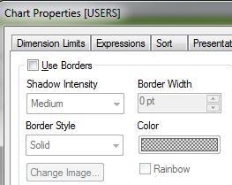
The raised appearance is obtained by border settings of the chart in Layout as shown below:
To change gridline properties use Style:
