Unlock a world of possibilities! Login now and discover the exclusive benefits awaiting you.
- Qlik Community
- :
- All Forums
- :
- QlikView App Dev
- :
- Help needed with Bar Chart Percentages and pointer...
- Subscribe to RSS Feed
- Mark Topic as New
- Mark Topic as Read
- Float this Topic for Current User
- Bookmark
- Subscribe
- Mute
- Printer Friendly Page
- Mark as New
- Bookmark
- Subscribe
- Mute
- Subscribe to RSS Feed
- Permalink
- Report Inappropriate Content
Help needed with Bar Chart Percentages and pointer on bars
Dear Qlik Stars,
Here is a screenshot of the problem with the bar chart where I needed your help:
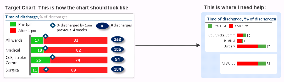
In the above chart the Red and Green bar data goes to show last one week in percentages.
My Questions:
1. The Red and Green bars in the chart on the right side should be as percentages with values inside segments like the one shown in the Target chart on the left?
2. Is it possible to add "All Wards" in the same chart instead of creating a second one?
3. How to get "% discharged by 1 pm previous 4 weeks" pointer on the bars as shown in the Target chart?
Please find the attached application with the data and chart. Please could someone help with solving these problems?
Regards,
RK
Accepted Solutions
- Mark as New
- Bookmark
- Subscribe
- Mute
- Subscribe to RSS Feed
- Permalink
- Report Inappropriate Content
1. Yes, enable the Plot Values Inside Segments option on the Presentation tab.
2. Yes, create an extra table in the script:
ReportDim:
LOAD distinct WardSpeciality, WardSpeciality as ReportDim
Resident IP;
Concatenate(ReportDim)
LOAD distinct WardSpeciality, 'All Wards' as ReportDim
Resident IP;
The use the field ReportDim as dimension instead of WardSpeciality
3. Yes,
Remove the Time_Bucket dimension from the chart.
Change the chart type to Combi chart. Change the expression to
=Count({<Time_Bucket={'Pre-1PM '}, DischargeDateTime={">=$(=weekstart(max(Date_Field),-1)) <=$(=weekend(max(Date_Field),-1)+1)"}, WardSpecialty={*}-{'None'}>}LocalPatientIdentifier)
Copy that expression and change {'Pre-1PM '} to {'After 1PM'}.
Set the Display option of both these expressions to Bar
Add another expression that calculates the values for the diamond markers and set its Display option to Symbol.
See attached example. (I've simply used 8 as expression, replace that with your expression for the discharges).
talk is cheap, supply exceeds demand
- Mark as New
- Bookmark
- Subscribe
- Mute
- Subscribe to RSS Feed
- Permalink
- Report Inappropriate Content
Hi Gysbert,
Thanks a lot for the Quick reply giving solutions to the problems. Your solutions solved the 2nd and 3rd questions perfectly. Here are 3 further issues:
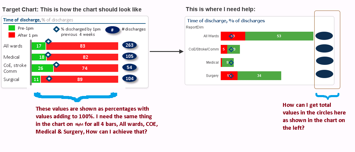
1. I am sorry for not being more clear on the first question. As shown below in the Target chart the bar values will sum upto 100 %, I want the same on the chart on the Right with the values in the segments to be percentage values rather than actual values.
2. How can I get total values in the Oval circles in the chart on the right?
3. Is it possible to move the Diamond markers slightly up as in the chart on the left so that these markers wont block the visibility of the plot values in the segments?
Also please find the attached application with the updated data model and charts?
Many Thanks,
RK
- Mark as New
- Bookmark
- Subscribe
- Mute
- Subscribe to RSS Feed
- Permalink
- Report Inappropriate Content
Hi Gysbert,
I figured out the answer for the 2nd question above. This expression does what I needed:
Count({<DischargeDateTime={">=$(=weekstart(max(Date_Field),-1)) <=$(=weekend(max(Date_Field),-1)+1)"}, WardSpecialty={*}-{'None'}>}LocalPatientIdentifier)
I just need your help with the 1st Question, please could you let me know your solution for this question so I can mark this Thread as answered?
Thanks,
RK
- Mark as New
- Bookmark
- Subscribe
- Mute
- Subscribe to RSS Feed
- Permalink
- Report Inappropriate Content
I managed to do it myself as in the attachment. I still didn't figured out whether its possible to move the diamond symbols a bit above on the bars so as not to obstruct the bar values inside the segments as the system I am working is QlikView v10 and with this version whether there is any such option available. Anyways I will mark this thread as answered.
- Mark as New
- Bookmark
- Subscribe
- Mute
- Subscribe to RSS Feed
- Permalink
- Report Inappropriate Content
No, there's no option to offset the symbols.
talk is cheap, supply exceeds demand
- Mark as New
- Bookmark
- Subscribe
- Mute
- Subscribe to RSS Feed
- Permalink
- Report Inappropriate Content
Thanks Gysbert for your help.
Regards,
RK