Unlock a world of possibilities! Login now and discover the exclusive benefits awaiting you.
- Qlik Community
- :
- All Forums
- :
- QlikView App Dev
- :
- Horizontal values on data points + Combo chart
- Subscribe to RSS Feed
- Mark Topic as New
- Mark Topic as Read
- Float this Topic for Current User
- Bookmark
- Subscribe
- Mute
- Printer Friendly Page
- Mark as New
- Bookmark
- Subscribe
- Mute
- Subscribe to RSS Feed
- Permalink
- Report Inappropriate Content
Horizontal values on data points + Combo chart
Hi,
I need to get horizontal values on data points.Please find the below image and for reference find the attached .qvw
Thanks..
- « Previous Replies
-
- 1
- 2
- Next Replies »
Accepted Solutions
- Mark as New
- Bookmark
- Subscribe
- Mute
- Subscribe to RSS Feed
- Permalink
- Report Inappropriate Content
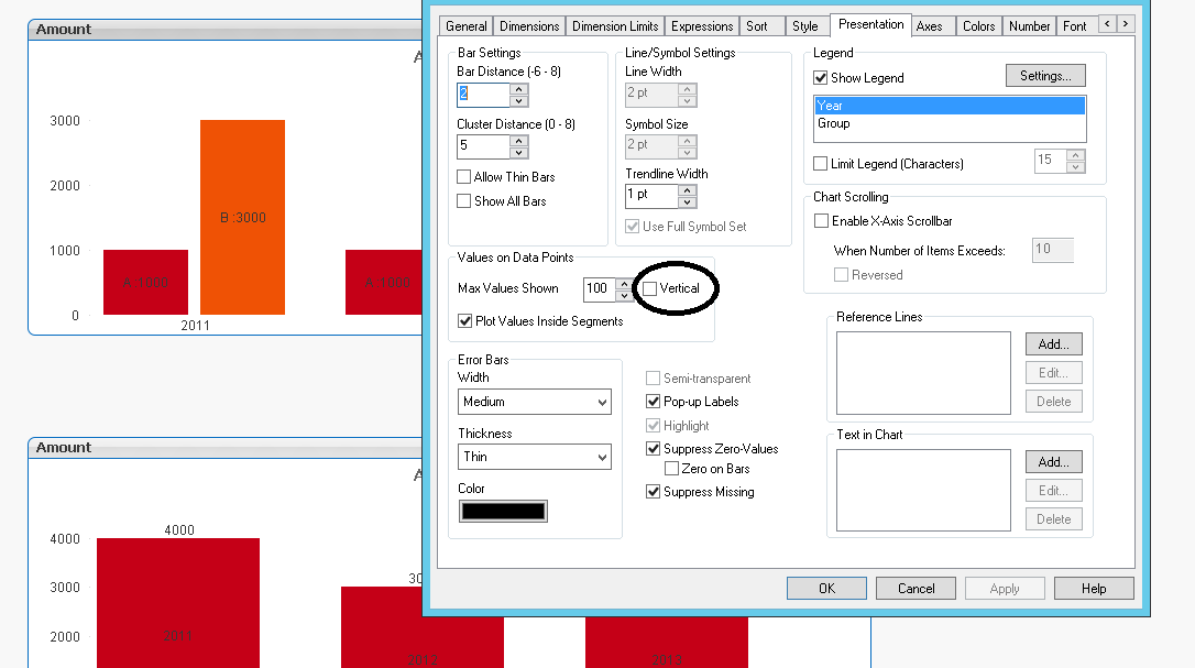
If you open the qvw I attached you can check the two charts on the right to see what the settings are. When you position those two charts on the right at exactly at the same position you will get the same as you see on the left.
Basically you copy paste the chart and apply the following settings
- The chart on top has a custom layer, value 4 and the bottom chart value 3 (layout tab\layer properties)
- The chart on top has a transparent background, colors tab transparency set to 100
- The chart on top uses the vertical label, line expression for the labels on top disabled
- The bottom chart has the bar expression with the vertical labels set to invisible
- The bottom chart has the vertical option in the presentations tab unchecked
- Mark as New
- Bookmark
- Subscribe
- Mute
- Subscribe to RSS Feed
- Permalink
- Report Inappropriate Content
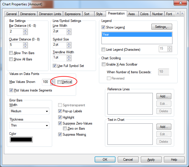
In the presentation tab un tick the vertical check box
- Mark as New
- Bookmark
- Subscribe
- Mute
- Subscribe to RSS Feed
- Permalink
- Report Inappropriate Content
check this
disable vertical
- Mark as New
- Bookmark
- Subscribe
- Mute
- Subscribe to RSS Feed
- Permalink
- Report Inappropriate Content
Hi ,
I need Value inside bar as vertical and top of the bar as horizontal.
Thanks..
- Mark as New
- Bookmark
- Subscribe
- Mute
- Subscribe to RSS Feed
- Permalink
- Report Inappropriate Content
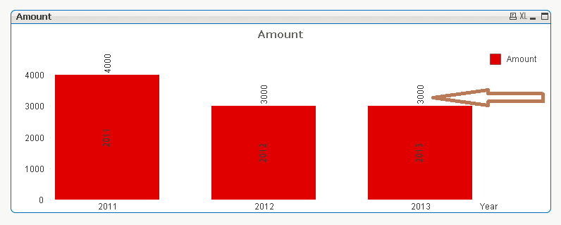
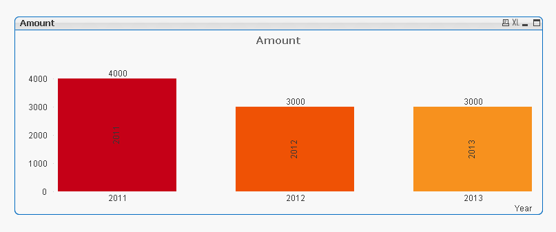
Hi,
I need the values on top of the bar as horizontal..please find below..
Thanks..!
- Mark as New
- Bookmark
- Subscribe
- Mute
- Subscribe to RSS Feed
- Permalink
- Report Inappropriate Content
As stated in the previous post about this, you can either have both vertical or both horizontal.
A workaround would be to overlay two charts, one with the values on top of the bar horizontal in the background and the one with the vertical labels on top. The on top chart should have a transparent background
- Mark as New
- Bookmark
- Subscribe
- Mute
- Subscribe to RSS Feed
- Permalink
- Report Inappropriate Content
Example attached, the charts on the right are a copy to show you which chart is showing what.
- Mark as New
- Bookmark
- Subscribe
- Mute
- Subscribe to RSS Feed
- Permalink
- Report Inappropriate Content
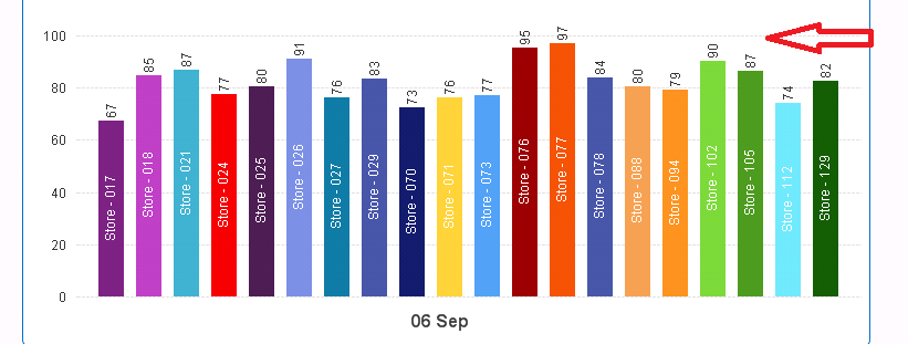
Vertical Values (I don't think so is that is possible in qlikview?) Because there has only one option values on data points. But, for expression i didn't see vertical values.
Might be someone help you, if that is possible.
- Mark as New
- Bookmark
- Subscribe
- Mute
- Subscribe to RSS Feed
- Permalink
- Report Inappropriate Content
Hi,
Can you please explain in detail.
Is it's possible, as i saw your image attached is the exact output we required.
Thanks..
- Mark as New
- Bookmark
- Subscribe
- Mute
- Subscribe to RSS Feed
- Permalink
- Report Inappropriate Content
If you open the qvw I attached you can check the two charts on the right to see what the settings are. When you position those two charts on the right at exactly at the same position you will get the same as you see on the left.
Basically you copy paste the chart and apply the following settings
- The chart on top has a custom layer, value 4 and the bottom chart value 3 (layout tab\layer properties)
- The chart on top has a transparent background, colors tab transparency set to 100
- The chart on top uses the vertical label, line expression for the labels on top disabled
- The bottom chart has the bar expression with the vertical labels set to invisible
- The bottom chart has the vertical option in the presentations tab unchecked
- « Previous Replies
-
- 1
- 2
- Next Replies »