Unlock a world of possibilities! Login now and discover the exclusive benefits awaiting you.
- Qlik Community
- :
- All Forums
- :
- QlikView App Dev
- :
- Re: How do I group values in a bar chart ?
- Subscribe to RSS Feed
- Mark Topic as New
- Mark Topic as Read
- Float this Topic for Current User
- Bookmark
- Subscribe
- Mute
- Printer Friendly Page
- Mark as New
- Bookmark
- Subscribe
- Mute
- Subscribe to RSS Feed
- Permalink
- Report Inappropriate Content
How do I group values in a bar chart ?
Hi,
What is the best method for summing data records into bands ? In the script ? Or in set analysis ?
I have thousands of transactions of sales data made up of the following fields....
Sale ID
Date of Sale
Sale Amount (in £)
Salesperson
I want to create a simple bar chart showing the number of salespersons ('Y' axis) who have a total sales figure between £0 and £100,000; between £100,001 and £200,000; between £200,001 and £300,000....and so on, in groups or bands of £100,000. The bands will appear on the 'X' axis.
So, for example, Salesman A who has sales of £650,000 will count as 1 salesperson in the £600,001 - £700,000 column band of the chart.
How should I approach this?
Your advice is much appreciated
MV
- « Previous Replies
-
- 1
- 2
- Next Replies »
Accepted Solutions
- Mark as New
- Bookmark
- Subscribe
- Mute
- Subscribe to RSS Feed
- Permalink
- Report Inappropriate Content
Hi,
maybe like this:
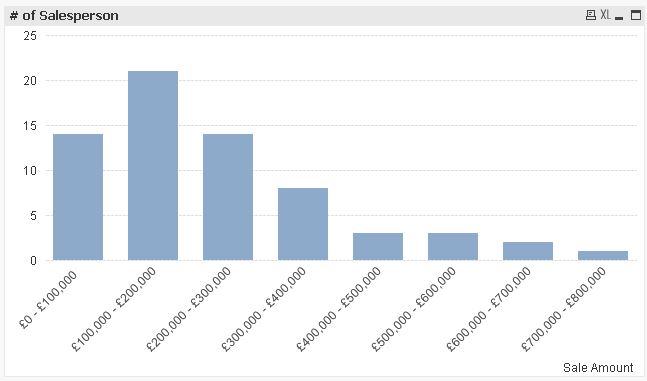
=Aggr(Dual(Money(SubField(Class(Sum([Sale Amount]),100000),' <= x < ',1),'£#,##0')&' - '&Money(SubField(Class(Sum([Sale Amount]),100000),' <= x < ',2),'£#,##0'),Class(Sum([Sale Amount]),100000)),Salesperson)
or this:
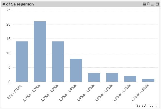
=Aggr(Dual(Money(SubField(Class(Sum([Sale Amount]),100000),' <= x < ',1)/1000,'£#,##0k')&' - '&Money(SubField(Class(Sum([Sale Amount]),100000),' <= x < ',2)/1000,'£#,##0k'),Class(Sum([Sale Amount]),100000)),Salesperson)
hope this helps
regards
Marco
- Mark as New
- Bookmark
- Subscribe
- Mute
- Subscribe to RSS Feed
- Permalink
- Report Inappropriate Content
look at class function
from Qlik help
class(expression, interval [ , label [ , offset ]])
Creates a classification of expressions. The bin width is determined by the number set as interval. The result is shown as a<=x<b, where a and b are the upper and lower limits of the bin. The x can be replaced by an arbitrary string stated in label. 0 is normally the default starting point of the classification. This can be changed by adding an offset.
Examples:
class( var,10 ) with var = 23 returns '20<=x<30'
class( var,5,'value' ) with var = 23 returns '20<= value <25'
class( var,10,'x',5 ) with var = 23 returns '15<=x<25'
in bar chart you can use this as calculated dimension
class([Sale Amount], 100000)
and this as expression
count(Salesperson)
- Mark as New
- Bookmark
- Subscribe
- Mute
- Subscribe to RSS Feed
- Permalink
- Report Inappropriate Content
hi
you do it like this
in the dimension you use calculate dimension
with this expression :
class(aggr(sum([Sale Amount (in £)]),Salesperson),'X',100000)
and to count the sales persons use this expression
count(distinct Salesperson)
- Mark as New
- Bookmark
- Subscribe
- Mute
- Subscribe to RSS Feed
- Permalink
- Report Inappropriate Content
Thanks Massimo,
Is there any way to display the x-axis labels differently. The first label on my chart is being displayed like this:
1 <=x<100001
Can I edit it like this....
1 - 100k
or this....
£1 - £100k
- Mark as New
- Bookmark
- Subscribe
- Mute
- Subscribe to RSS Feed
- Permalink
- Report Inappropriate Content
You might have to play around with it a little, try something like this as your calculated dimension:
=SubField(Class(), '<', 1) & '-' & Floor(SubField(Class(), '<', 3)/1000) & 'k' // Use the class function you have right now within the SubField function
For example, this in a text box
=SubField('1 <=x<100001', '<', 1) & '-' & Floor(SubField('1 <=x<100001', '<', 3)/1000) & 'k'
gives this:
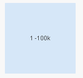
HTH
Best,
Sunny
- Mark as New
- Bookmark
- Subscribe
- Mute
- Subscribe to RSS Feed
- Permalink
- Report Inappropriate Content
Or
Aggr(Class(Sum(...
Regards
Marco
- Mark as New
- Bookmark
- Subscribe
- Mute
- Subscribe to RSS Feed
- Permalink
- Report Inappropriate Content
Dear Maureen,
Use replace() function for replacing '<= x <' with '-'.
=Replace(Class([Sale Amount], 100000),'<= x <', '-')
Regards,
Neetha
- Mark as New
- Bookmark
- Subscribe
- Mute
- Subscribe to RSS Feed
- Permalink
- Report Inappropriate Content
Hi,
maybe like this:
=Aggr(Dual(Money(SubField(Class(Sum([Sale Amount]),100000),' <= x < ',1),'£#,##0')&' - '&Money(SubField(Class(Sum([Sale Amount]),100000),' <= x < ',2),'£#,##0'),Class(Sum([Sale Amount]),100000)),Salesperson)
or this:
=Aggr(Dual(Money(SubField(Class(Sum([Sale Amount]),100000),' <= x < ',1)/1000,'£#,##0k')&' - '&Money(SubField(Class(Sum([Sale Amount]),100000),' <= x < ',2)/1000,'£#,##0k'),Class(Sum([Sale Amount]),100000)),Salesperson)
hope this helps
regards
Marco
- Mark as New
- Bookmark
- Subscribe
- Mute
- Subscribe to RSS Feed
- Permalink
- Report Inappropriate Content
Thanks to everyone who helped. I tried out each of your solutions on my application.
I do like Marco's though ! Very well explained with an example application and additional screenshots.
That's a great help Marco
MV
- Mark as New
- Bookmark
- Subscribe
- Mute
- Subscribe to RSS Feed
- Permalink
- Report Inappropriate Content
One more thing Marco. How do I show those groups/bands on the x axis which have a value of 0 ?
- « Previous Replies
-
- 1
- 2
- Next Replies »