Unlock a world of possibilities! Login now and discover the exclusive benefits awaiting you.
- Qlik Community
- :
- All Forums
- :
- QlikView App Dev
- :
- How do I show only a few values in a line graph?
- Subscribe to RSS Feed
- Mark Topic as New
- Mark Topic as Read
- Float this Topic for Current User
- Bookmark
- Subscribe
- Mute
- Printer Friendly Page
- Mark as New
- Bookmark
- Subscribe
- Mute
- Subscribe to RSS Feed
- Permalink
- Report Inappropriate Content
How do I show only a few values in a line graph?
Hi all!
I have the next graph:

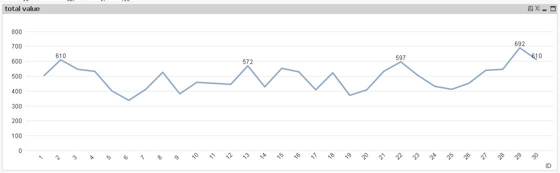
I would like to show the labels but the graph would be this:

I would like to show only the most representative values... Is there solution for this?... Could someone to help me?...
Thanks in advance....
- Tags:
- new_to_qlikview
- « Previous Replies
-
- 1
- 2
- Next Replies »
Accepted Solutions
- Mark as New
- Bookmark
- Subscribe
- Mute
- Subscribe to RSS Feed
- Permalink
- Report Inappropriate Content
Perhaps you can use the Show Value option and use the Rank function to show the Top X values:
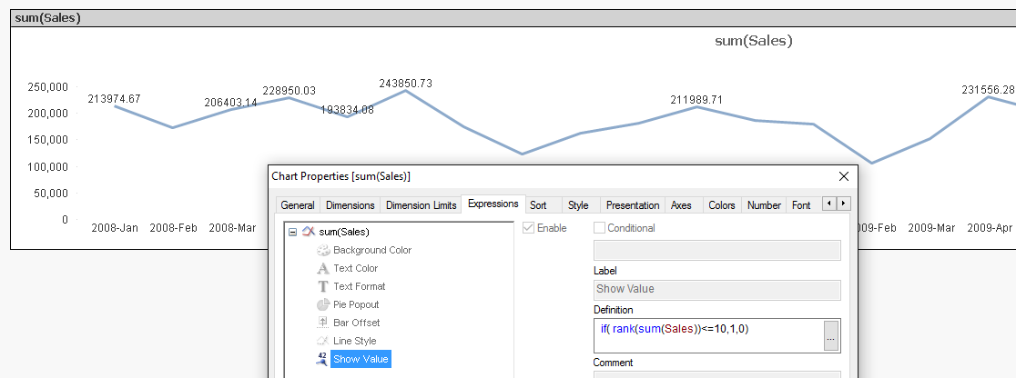
talk is cheap, supply exceeds demand
- Mark as New
- Bookmark
- Subscribe
- Mute
- Subscribe to RSS Feed
- Permalink
- Report Inappropriate Content
To improve the spacing between data points, enable an X-axis scroll bar.
What are the most representative values? If you mean the highest values, have a look at Dimension Limits where you can easily restrict the values shown to for instance the top 10.
Peter
- Mark as New
- Bookmark
- Subscribe
- Mute
- Subscribe to RSS Feed
- Permalink
- Report Inappropriate Content
Maybe use a horizontal bar chart, then you'll be able to show all values and they won't overlap each other.
- Mark as New
- Bookmark
- Subscribe
- Mute
- Subscribe to RSS Feed
- Permalink
- Report Inappropriate Content
I don't know how to add a scroll bar...
I tried to take Dimension Limits but in this case I working with an Expression not with Dimension...
- Mark as New
- Bookmark
- Subscribe
- Mute
- Subscribe to RSS Feed
- Permalink
- Report Inappropriate Content
Bill I think is a good idea to use a horizontal bar, but we could have 53 weeks and in this case would be impractical to use a horizontal bar...
- Mark as New
- Bookmark
- Subscribe
- Mute
- Subscribe to RSS Feed
- Permalink
- Report Inappropriate Content
In your line chart, goto Properties->Presentation and in the Chart Scrolling-group (right side in the middle), check Enable X-Axis Scrollbar. Select a number of Dimension values above which the scroll bar should be displayed.
Peter
- Mark as New
- Bookmark
- Subscribe
- Mute
- Subscribe to RSS Feed
- Permalink
- Report Inappropriate Content
Perhaps you can use the Show Value option and use the Rank function to show the Top X values:
talk is cheap, supply exceeds demand
- Mark as New
- Bookmark
- Subscribe
- Mute
- Subscribe to RSS Feed
- Permalink
- Report Inappropriate Content
Hi,
another solution could be:
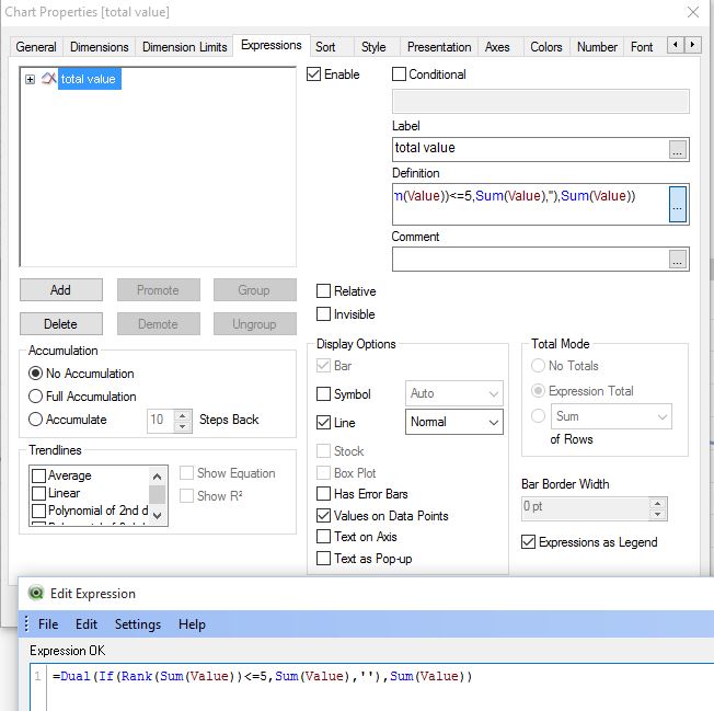
hope this helps
regards
Marco
- Mark as New
- Bookmark
- Subscribe
- Mute
- Subscribe to RSS Feed
- Permalink
- Report Inappropriate Content
Thank you very much Gysbert.
So is it possible to show for example the 10 highest values and the 10 lowest values?
- Mark as New
- Bookmark
- Subscribe
- Mute
- Subscribe to RSS Feed
- Permalink
- Report Inappropriate Content
It is possible to display the values every 3 month?... This would be better because if you have 2 high values next to each other then also not be displayed correctly..
- « Previous Replies
-
- 1
- 2
- Next Replies »