Unlock a world of possibilities! Login now and discover the exclusive benefits awaiting you.
- Qlik Community
- :
- All Forums
- :
- QlikView App Dev
- :
- Re: How to do Sum of the values per project?
- Subscribe to RSS Feed
- Mark Topic as New
- Mark Topic as Read
- Float this Topic for Current User
- Bookmark
- Subscribe
- Mute
- Printer Friendly Page
- Mark as New
- Bookmark
- Subscribe
- Mute
- Subscribe to RSS Feed
- Permalink
- Report Inappropriate Content
How to do Sum of the values per project?
Hello,
I have Project_number, Report Parameter and Value columns in my table. For every project, there are multiple Report Parameters like Sales, GM_Per, Risk and the values associated with them. Something as shown in below picture;
| Project_No | Report_Param | Value |
| 113913 | Sales | 14.907 |
| 113913 | GM_Per | 24.80% |
| 113913 | Risk | 21.25 |
| 123456 | Sales | 31.5 |
| 123456 | GM_Per | 11.20% |
| 123456 | Risk | 9.87 |
Here is the table chart I am getting for project no.113913 as shown below
I am trying to get a visual like as shown below, Please help me to modify the script to get sum all the values and build a table like this.
So that I can compare the Sales vs Gross_Profit _Percentages.
| Project_no | Sum(Sales) | Sum(GM_Per) |
|---|---|---|
| 133913 | 14.907 | 24.8 |
Any help is greatly appreciated
thanks
Bhavesh
- « Previous Replies
-
- 1
- 2
- Next Replies »
- Mark as New
- Bookmark
- Subscribe
- Mute
- Subscribe to RSS Feed
- Permalink
- Report Inappropriate Content
May be try this?
Dim: Project_no
Expr1: Sum(TOTAL <Project_no> Sales)
Expr2: Sum(TOTAL <Project_no> GM_Per)
OR
= Sum(Aggr(Sum(Sales), Project_no))
= Sum(Aggr(Sum(Gm_Per), Project_no))
Oops did not realize you have field values for Sales and GM_Per. Try like below
Param:
GEneric Load
* INLINE [
Project_No, Report_Param, Value
113913, Sales, 14.907
113913, GM_Per, 24.80%
113913, Risk, 21.25
123456, Sales, 31.5
123456, GM_Per, 11.20%
123456, Risk, 9.87
];
Then using Straight table add Project_No and expr as
Sum(Sales)
Sum(Gm_Per) * 100
- Mark as New
- Bookmark
- Subscribe
- Mute
- Subscribe to RSS Feed
- Permalink
- Report Inappropriate Content
Use Project_No as dimension and as expressions
=Sum({<Report_Param = {'Sales'}>} Value)
=Sum({<Report_Param = {'GM_Per'}>} Value)
- Mark as New
- Bookmark
- Subscribe
- Mute
- Subscribe to RSS Feed
- Permalink
- Report Inappropriate Content
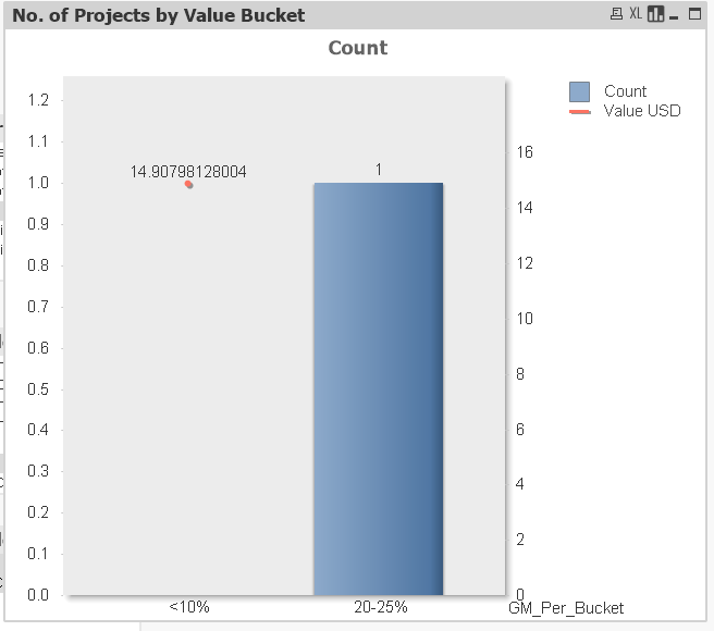
Hi, I am trying to build a Bar chart with Line Axis Comparing the GM_Per range vs Sales amount. as shown below
Please tell me how to resolve this?
- Mark as New
- Bookmark
- Subscribe
- Mute
- Subscribe to RSS Feed
- Permalink
- Report Inappropriate Content
You can also use the Generic load as
tab1:
Generic
LOAD * INLINE [
Project_No Report_Param Value
113913 Sales 14.907
113913 GM_Per 24.80%
113913 Risk 21.25
123456 Sales 31.5
123456 GM_Per 11.20%
123456 Risk 9.87
] (delimiter is '\t');
- Mark as New
- Bookmark
- Subscribe
- Mute
- Subscribe to RSS Feed
- Permalink
- Report Inappropriate Content
Hi, please look at my reply above I am trying to achieve Bar chart with Line axis.
- Mark as New
- Bookmark
- Subscribe
- Mute
- Subscribe to RSS Feed
- Permalink
- Report Inappropriate Content
is this a different question? You asked to see the output in a table? Am i missing something here? And where is this Bucket coming from in your sample posted intially?
- Mark as New
- Bookmark
- Subscribe
- Mute
- Subscribe to RSS Feed
- Permalink
- Report Inappropriate Content
- Mark as New
- Bookmark
- Subscribe
- Mute
- Subscribe to RSS Feed
- Permalink
- Report Inappropriate Content
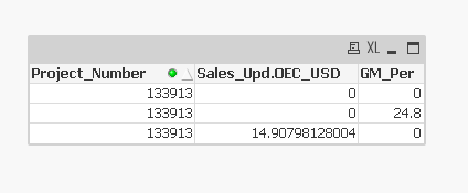
I have GM_Buckets in my script;
if(GM_Per >= 0.1 and GM_Per <= 10, '<10%',
if(GM_Per > 10 and GM_Per <= 14 ,'10-14%',
if(GM_Per > 14 and GM_Per <= 20, '14-20%',
if(GM_Per > 20 and GM_Per <= 25, '20-25%',
if(GM_Per > 25 and GM_Per <= 30, '25-30%',
if(GM_Per > 30 and GM_Per <= 35, '30-35%',
if(GM_Per > 35 and GM_Per <= 40, '35-40%',
if(GM_Per > 40, '>40%')))))))) as GM_Per_Bucket
I am using GM_Bucket as dimension and created the expression as sum({<Report_Param ={'Sales'}>}Value).
But When I try to create the Chart, this is what I am getting it

- Mark as New
- Bookmark
- Subscribe
- Mute
- Subscribe to RSS Feed
- Permalink
- Report Inappropriate Content
I have GM_Buckets in my script;
if(GM_Per >= 0.1 and GM_Per <= 10, '<10%',
if(GM_Per > 10 and GM_Per <= 14 ,'10-14%',
if(GM_Per > 14 and GM_Per <= 20, '14-20%',
if(GM_Per > 20 and GM_Per <= 25, '20-25%',
if(GM_Per > 25 and GM_Per <= 30, '25-30%',
if(GM_Per > 30 and GM_Per <= 35, '30-35%',
if(GM_Per > 35 and GM_Per <= 40, '35-40%',
if(GM_Per > 40, '>40%')))))))) as GM_Per_Bucket
I am using GM_Bucket as dimension and created the expression as sum({<Report_Param ={'Sales'}>}Value).
But When I try to create the Chart, this is what I am getting it

- « Previous Replies
-
- 1
- 2
- Next Replies »