Unlock a world of possibilities! Login now and discover the exclusive benefits awaiting you.
- Qlik Community
- :
- All Forums
- :
- QlikView App Dev
- :
- How to plot graphs from multiple CSV files
- Subscribe to RSS Feed
- Mark Topic as New
- Mark Topic as Read
- Float this Topic for Current User
- Bookmark
- Subscribe
- Mute
- Printer Friendly Page
- Mark as New
- Bookmark
- Subscribe
- Mute
- Subscribe to RSS Feed
- Permalink
- Report Inappropriate Content
How to plot graphs from multiple CSV files
Hey everyone,
I'm currently facing an issue with regard to plotting graph values after importing multiple CSV files and require your help to resolve it:
Objective: Import data from 20/30 CSV files and plot the data from each file on a common graph between certain axis values [Say between X and Y1].
Problem: After importing the CSV files, I only can see the plot data as one single graph which is the cumulative data from the complete imported files (Eg: Averaged data)
Expected: (For representation to show plot of axis values from multiple files )

Actual:

Any suggestions with regard to how I can obtain and plot the axis values from each file on a single graph?
Thanks a lot!!
Code: Currently, I'm only using a loop to load all the files from the Folder

- « Previous Replies
-
- 1
- 2
- Next Replies »
Accepted Solutions
- Mark as New
- Bookmark
- Subscribe
- Mute
- Subscribe to RSS Feed
- Permalink
- Report Inappropriate Content
Hi,
one example using your sample data:
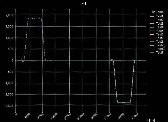
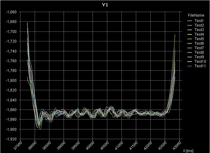
table1:
LOAD "X [ms]",
    Y1,
    FileBaseName() as FileName
FROM  (txt, codepage is 1252, embedded labels, delimiter is ',', msq, header is 17 lines);
hope this helps
regards
Marco
- Mark as New
- Bookmark
- Subscribe
- Mute
- Subscribe to RSS Feed
- Permalink
- Report Inappropriate Content
Use FileName as second dimension in your chart.
Can you post some sample data to test with?
hope this helps
regards
Marco
- Mark as New
- Bookmark
- Subscribe
- Mute
- Subscribe to RSS Feed
- Permalink
- Report Inappropriate Content
Hi Marco,
Thanks for your reply and suggestion. I have now attached a set of CSV files that you can use as sample data for your testing.
Will also try checking the plot with FileName as the second dimension in the chart.
Regards,
Suraj
- Mark as New
- Bookmark
- Subscribe
- Mute
- Subscribe to RSS Feed
- Permalink
- Report Inappropriate Content
Hi,
one example using your sample data:
table1:
LOAD "X [ms]",
    Y1,
    FileBaseName() as FileName
FROM  (txt, codepage is 1252, embedded labels, delimiter is ',', msq, header is 17 lines);
hope this helps
regards
Marco
- Mark as New
- Bookmark
- Subscribe
- Mute
- Subscribe to RSS Feed
- Permalink
- Report Inappropriate Content
Hello Marco,
Yes, that's exactly what I needed.
So, the FileBaseName() function returns the loaded file names. The graph is then plotted considering X [ms] as the first dimension and FileName as the second dimension. I assume here that the expression in Y1 only contains the direct value of Y1. Is my overall understanding right?
Also, on a curious note, how did you get the various file names as a legend on the right hand side of the graph?
Please excuse me if my questions seem silly. But, I'm extremely new to this topic and want to see the degree to which this tool can help me with reading and displaying the information in the data files.
Thanks a lot for your support.
Best regards,
Suraj
- Mark as New
- Bookmark
- Subscribe
- Mute
- Subscribe to RSS Feed
- Permalink
- Report Inappropriate Content
Hi,
you're right about the FileBaseName() - script function loading the filename.
I used this function in my wildcard load as an alternative to your loading the files in a loop having a file name variable.
The second (FileName) dimension can be shown as a legend (To be (de)activated in Line Chart / Presentation Tab / Show Legend)
I used the Avg() aggregation in this case which might not be necessary when having only one Y1 value per millisecond (So the implicit only() function is used instead).
hope this helps
regards
Marco
- Mark as New
- Bookmark
- Subscribe
- Mute
- Subscribe to RSS Feed
- Permalink
- Report Inappropriate Content
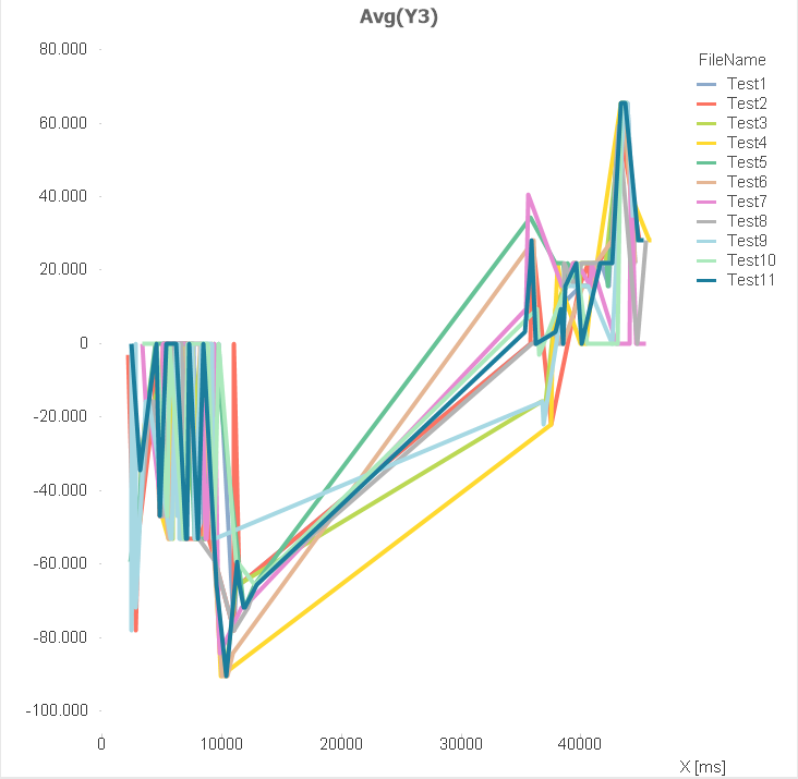
Hi Marco,
I tried to duplicate your results using the same test data, but I've found certain differences in the display.
Overall display:
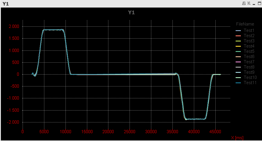
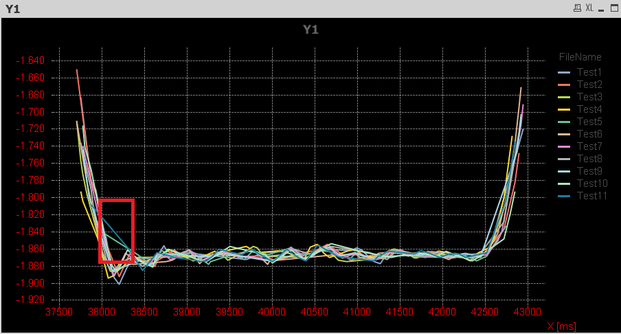
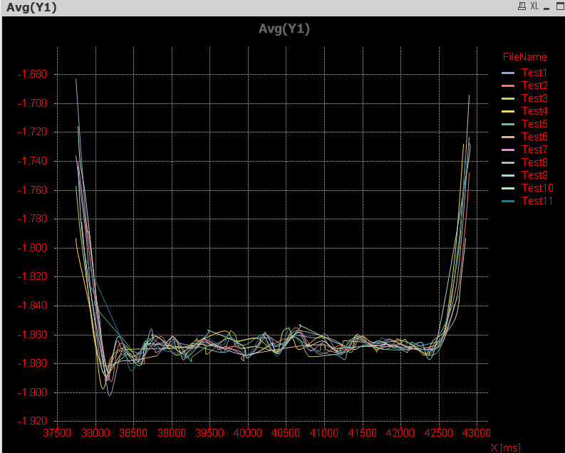
Zoomed scope view:
What are the settings that must be done to reduce the size of the lines in the graph similar to yours?
[By default, the line size is really thick and I managed to reduce it to this current state by setting the line style definition in Y1 as '<W0.5>'. However, I find that your graph was much more clearer and better representative display and I just couldn't thin it down further]
An observation, there is a deviation in the plot data for the portion highlighted in red in the zoomed scope with respect to your display and I'm not sure about this reason. Just in case, have attached my qvw file.
If I directly create a graph, I obtain a result as below. Is it possible to set the defaults in the chart display formatting for all graphs [Eg: Line size, Graph background color, grid lines] or must we configure them every time and for each graph?
Also, I tried loading your attached qvw file, but sadly Qlikview showed it's not able to read the file. Could you please load it again?
Thanks for your support and time.
Regards,
Suraj
- Mark as New
- Bookmark
- Subscribe
- Mute
- Subscribe to RSS Feed
- Permalink
- Report Inappropriate Content
Hi,
the line width can be reduced using this setting:
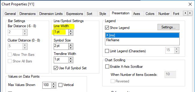
To keep previously set chart properties you might derive new charts from a copy of your customized chart.
What is the exact error message you get when trying to open my qvw?
It worked for me, so maybe you're trying to open with a personal edition?
Please close your thread if your initial question is answered:
Qlik Community Tip: Marking Replies as Correct or Helpful
thanks
regards
Marco
- Mark as New
- Bookmark
- Subscribe
- Mute
- Subscribe to RSS Feed
- Permalink
- Report Inappropriate Content
Hi Marco,
Thanks a lot for your inputs and I would still be going around in circles if it wasn't for your help.
Yes, I'm using the Personal edition version and that's why I wasn't able to load your file.
I changed the line width and it's now much better in terms of visualizing the graph, but it's still not as clear or smooth as your graph plot[The waveform can be easily distinguished in yours, however it's much harder to see in my plot as below (Lot of stray data points)]. Any suggestions what I could do to improve it? I only used Avg(Y1) as my expression. Do I need to change anything with that regard?
Best regards,
Suraj
- Mark as New
- Bookmark
- Subscribe
- Mute
- Subscribe to RSS Feed
- Permalink
- Report Inappropriate Content
can you post your result to look into?
- « Previous Replies
-
- 1
- 2
- Next Replies »