Unlock a world of possibilities! Login now and discover the exclusive benefits awaiting you.
- Qlik Community
- :
- All Forums
- :
- QlikView App Dev
- :
- How we can create chart with the following require...
- Subscribe to RSS Feed
- Mark Topic as New
- Mark Topic as Read
- Float this Topic for Current User
- Bookmark
- Subscribe
- Mute
- Printer Friendly Page
- Mark as New
- Bookmark
- Subscribe
- Mute
- Subscribe to RSS Feed
- Permalink
- Report Inappropriate Content
How we can create chart with the following requirement ?
Hi All,
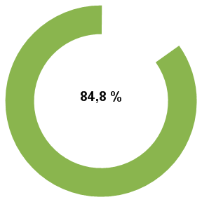
Here i am having the following scenario, The overall percentage of a school is 84.8%
Example: 1
| Student Name | Marks | Total Marks |
| a | 552 | 600 |
| b | 504 | 600 |
| c | 471 | 600 |
Note : Here we need to show 84.8% of chart , the rest of 15.2% chart should hide.
Example :2
| Student Name | Marks | Total Marks |
| a | 582 | 600 |
| b | 590 | 600 |
| c | 550 | 600 |
Note : in this scenario 95.7% chart should show, the rest of 4.3% chart should hide.
here i am attaching the files, please find attached files
Note : And also we need to remove the boarders of the charts.
Thanks
Madhu
- Mark as New
- Bookmark
- Subscribe
- Mute
- Subscribe to RSS Feed
- Permalink
- Report Inappropriate Content
i didn't get you exactly but you asking in a chart you want to show those who secured highest marks above 84.8% is to show in chart rest to be hidden for that take student name as dimension and sum(marks) is measures, then go to properties- dimension limits -select limits select highest 2 values, then go to caption select active and inactive background as transparent
- Mark as New
- Bookmark
- Subscribe
- Mute
- Subscribe to RSS Feed
- Permalink
- Report Inappropriate Content
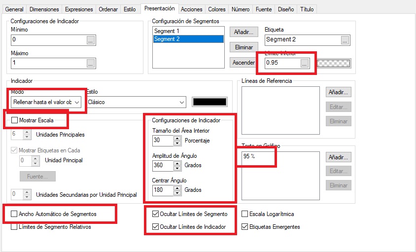
Hi madhu, using a gauge chart you can create similar visualizations, mainly using the properties in presentation tab, PFA.
You can open two Qlikview to check the differences between the sample and the standard options, as a guide:
- Mark as New
- Bookmark
- Subscribe
- Mute
- Subscribe to RSS Feed
- Permalink
- Report Inappropriate Content
Hi,
see Attachment.
Regards,
Antonio.
- Mark as New
- Bookmark
- Subscribe
- Mute
- Subscribe to RSS Feed
- Permalink
- Report Inappropriate Content
Hi,
PFA Solution.
Regards,
Pankaj