Unlock a world of possibilities! Login now and discover the exclusive benefits awaiting you.
- Qlik Community
- :
- All Forums
- :
- QlikView App Dev
- :
- I do not know how to ask this question so let me t...
- Subscribe to RSS Feed
- Mark Topic as New
- Mark Topic as Read
- Float this Topic for Current User
- Bookmark
- Subscribe
- Mute
- Printer Friendly Page
- Mark as New
- Bookmark
- Subscribe
- Mute
- Subscribe to RSS Feed
- Permalink
- Report Inappropriate Content
I do not know how to ask this question so let me try to demonstrate it.
I do not know how to phrase this question so let me see if I can demonstrate it. I am trying to format a graph and I want to keep the legend but get rid of the duplicate verbiage in the lower right hand portion of the graph.
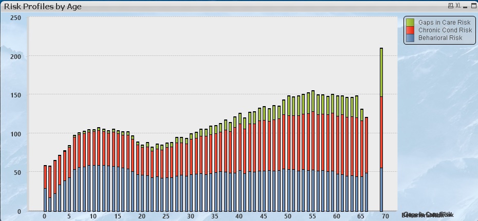
as you can see this is an aggregate of 3 risk scores and it is layering the names of those scores on top of one another.
I do not see anywhere to override this default.
Thanks for any help.
Steve
- Tags:
- new_to_qlikview
- Mark as New
- Bookmark
- Subscribe
- Mute
- Subscribe to RSS Feed
- Permalink
- Report Inappropriate Content
How many dimensions did you define for this graph? Does this text mess disappear if you disable all dimension labels?
Peter
- Mark as New
- Bookmark
- Subscribe
- Mute
- Subscribe to RSS Feed
- Permalink
- Report Inappropriate Content
Hi Peter,
Thanks for reaching out. Cannot reply online so replying via email.
There is only 1 dimension which is Age. There are 3 Expressions which represent the relative risk score for the three risk models (all based on regression algorithms).
I have tried turning off whatever I could find that said label or legend but all I have accomplished was getting rid of the legend, which I need to have. I have looked and tried both in web view and without web view.
Steve
- Mark as New
- Bookmark
- Subscribe
- Mute
- Subscribe to RSS Feed
- Permalink
- Report Inappropriate Content
Check Chart Properties->Presentation->Text in Chart. Is the Edit... button grayed our or is it active? Do you see any text in the frame next to it?
Other check to figure out where it's coming from: activate the chart and press Ctrl+Shift. Is the overlapping text surrounded by a red frame?
If not, do you use a background image (see Chart Propeties->Colors->Frame Background)? If so, does the text disappear when you disable the background image?
Peter