Unlock a world of possibilities! Login now and discover the exclusive benefits awaiting you.
- Qlik Community
- :
- All Forums
- :
- QlikView App Dev
- :
- In Scatter Chart, is there a way to display bubble...
- Subscribe to RSS Feed
- Mark Topic as New
- Mark Topic as Read
- Float this Topic for Current User
- Bookmark
- Subscribe
- Mute
- Printer Friendly Page
- Mark as New
- Bookmark
- Subscribe
- Mute
- Subscribe to RSS Feed
- Permalink
- Report Inappropriate Content
In Scatter Chart, is there a way to display bubbles randomly?
Please see the attached pic. I have unit on X-axis with numerous related values to be projected on Y-axis. When I create a scatter chart all bubbles are comming in single line. But I want them to scatter on the entire chart. How can i do that?
- « Previous Replies
-
- 1
- 2
- Next Replies »
- Mark as New
- Bookmark
- Subscribe
- Mute
- Subscribe to RSS Feed
- Permalink
- Report Inappropriate Content
Assign a number to each unit, and then randomly move away from that number within a narrow band using the rand() function. In one of my charts, for instance, I'm using "Current Event" where you have the units. I believe it's defined with a dual() function so that it has a numeric value. Then I do this as the dimension in the chart:
dual("Current Event",35-(min("Event #")-.6*rand()-.15))
In a different application, it looks like I decided to randomize in the script, probably for better performance on a large data set, and perhaps to keep data points from moving around randomly every time the chart redraws itself. Here's what looks like the relevant portion of the script. I have various types of equipment, and I want to plot data points for this equipment in bands rather than in a line.
[Equipment Type]:
MAPPING LOAD *
INLINE [
Equipment Type,Equipment Type Sequence
Tractor,1
Scooter,2
Crane,3
Forklift,4
Automobile,5
Manlift,6
Locomotive,7
Boom Lift,8
];
[Inspection]:
LOAD *
...
,dual([Equipment Type] & ' ' & [Inspection Item]
,8-(applymap('Equipment Type',[Equipment Type])-.8*rand()-.12)) as [Plot Item]
FROM Inspection.qvd (QVD)
;
So now in this case, I use the [Plot Item] field instead of the [Equipment Type] field. If you have a lot of data points, I also recommend using the argb() function for transparent colors.
The other problem is that QlikView will want to plot your data points as numbers. To get around this, I've actually created a text object with the legends that I want and put it on top of the numbers, and made certain that the axis was fixed so that it always matched my text.
- Mark as New
- Bookmark
- Subscribe
- Mute
- Subscribe to RSS Feed
- Permalink
- Report Inappropriate Content
But I have like 250 items to be displayed. Number may increase in future. I cannot write In-Line for everything rite!?
is there any alternative to do that?
- Mark as New
- Bookmark
- Subscribe
- Mute
- Subscribe to RSS Feed
- Permalink
- Report Inappropriate Content
It's trivial in QlikView to assign a number to each value without using an inline load (recno() for distinct values for instance), so you could randomize the bubble display for 250+ items fairly easily. The problem is that QlikView will display the number instead of the item. My text object solution to that problem isn't going to help for 250+ items. There may be a workaround, but I don't know of one.
- Mark as New
- Bookmark
- Subscribe
- Mute
- Subscribe to RSS Feed
- Permalink
- Report Inappropriate Content
Ideally such information is best displayed in a bar chart. A scatter diagram is 3-dimensional and requires two dimensions for an item. For example the items (Tractor & Scooter etc) need more than the one dimension of quantity - it may be color or type or whatever. Otherwise what JW has suggested can be done. If you do not want to load inline you may add another field of 'Item Nos' which automaically gets the next number when an item is added. This is easy to do in the excel spreadsheet. However the x axis in the chart will still show the serial numbers.
- Mark as New
- Bookmark
- Subscribe
- Mute
- Subscribe to RSS Feed
- Permalink
- Report Inappropriate Content
See the attached. I'm showing inventory age by location. Every plot point is an item in a location. Each location has its own "swim lane" for the inventory data to appear in. Scatter charts like this make it easy to see patterns in the data. You can mouse over any particular point to see its details, or click to select it. Say you see a group of aged inventory and want to understand what it is and why it's so old. Drag a box around the group and go look at the details for the items in that group.
The other way I can see displaying this is also on the tab, which is sparklines for the number of items by inventory age range. But I think the patterns are less apparent that way, and that it is harder to then explore any patterns that you DO see.
How would you even display this data with a bar chart? Well, I mean other than using a bar chart in place of each sparkline. That's certainly doable, but I don't think is any better than the sparklines.
We may have just interpreted the question differently. The attached was my interpretation. What's yours?
- Mark as New
- Bookmark
- Subscribe
- Mute
- Subscribe to RSS Feed
- Permalink
- Report Inappropriate Content
Unfortunately I can't open your attachment due to 'personal edition' limitation. But I do get your point. I also think we have interpreted the Q differently. How I saw it was that there were only two dimensions to the data given - items and numbers. For that situation the Bars give you the adequate visuals. In your example, if you had only the age of inventory items to show, a bar chart will do the job and a scatter will not add anything. Having another characteristic of the items (location) gives the option (definitely better one) of using the scatter diagram. If there was one more characteristic , say floor figure, I presume a bubble diagram would suit better -I have not tried it though. I think it is important to know what kind of data we have and which chart will suit it best. Hope this clarifies mycomment earlier. Darshan
- Mark as New
- Bookmark
- Subscribe
- Mute
- Subscribe to RSS Feed
- Permalink
- Report Inappropriate Content
I suspect you're visualizing what I did correctly. But just for clarity, here's what I was building:
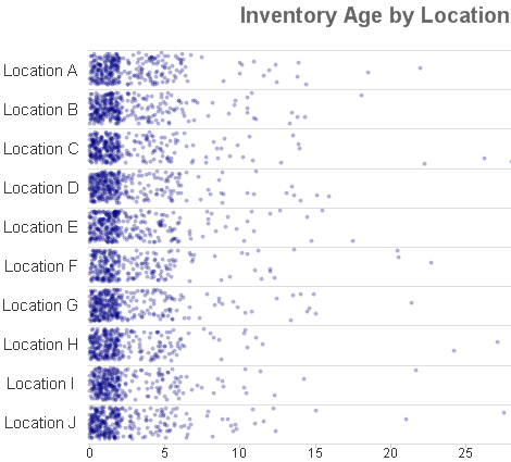
And here's the script:
[Locations]:
MAPPING LOAD
'Location ' & chr(ord('A')+recno()-1) as Location
,recno() as Sequence
AUTOGENERATE 10
;
[Inventory]:
LOAD *
,dual('Item ' & ID & ' in ' & Location
,10-(applymap('Locations',Location)-.8*rand()-.12)) as "Plot ID"
,class(Age,1) as "Age Class"
;
LOAD
recno() as ID
,'Location ' & chr(ord('A')+floor(rand()*10)) as Location
,rand()*2+if(rand()>.4,0,rand()*5+if(rand()>.2,0,rand()*10+if(rand()>.1,0,rand()*20))) as Age
AUTOGENERATE 3000
;
- Mark as New
- Bookmark
- Subscribe
- Mute
- Subscribe to RSS Feed
- Permalink
- Report Inappropriate Content
Thanks for the details. I ran the script and could replicate your chart as below. However for some reason I do not get the Locations A, B etc. along Y axis – wonder what simple step I am missing out.
Darshan Bhatt, MD, M.Phil.
Consultant: Patient Safety & Pharmacovigilance
- Mark as New
- Bookmark
- Subscribe
- Mute
- Subscribe to RSS Feed
- Permalink
- Report Inappropriate Content
You're not missing a simple step, and that's a weakness of the approach. As I said earlier:
"The... problem is that QlikView will want to plot your data points as numbers. To get around this, I've actually created a text object with the legends that I want and put it on top of the numbers, and made certain that the axis was fixed so that it always matched my text."
And with large numbers of values, I recommend using argb() in the background color expression for the first expression so that single points are very light, but multiple points in the same area build up a more solid color. In one chart, I even let the user select the transparency value to better match the number of points currently being displayed. In that chart, I noticed that different patterns were visible at different transparency values.
- « Previous Replies
-
- 1
- 2
- Next Replies »