Unlock a world of possibilities! Login now and discover the exclusive benefits awaiting you.
- Qlik Community
- :
- All Forums
- :
- QlikView App Dev
- :
- Line Chart example
- Subscribe to RSS Feed
- Mark Topic as New
- Mark Topic as Read
- Float this Topic for Current User
- Bookmark
- Subscribe
- Mute
- Printer Friendly Page
- Mark as New
- Bookmark
- Subscribe
- Mute
- Subscribe to RSS Feed
- Permalink
- Report Inappropriate Content
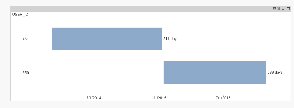
Line Chart example
Hello,
I am trying to plot the information below on a line chart (I have attached the sample data as well).
Basically I would like to show on a line chart:
- Min and Max Leave start and end date
- Then I would like to plot the Hospital attendance on the chart to show the attendance frequency.
The expected result is that I will see when the user became less frequent at the hospital and also where the user decides to go during the weekends instead of Weekdays.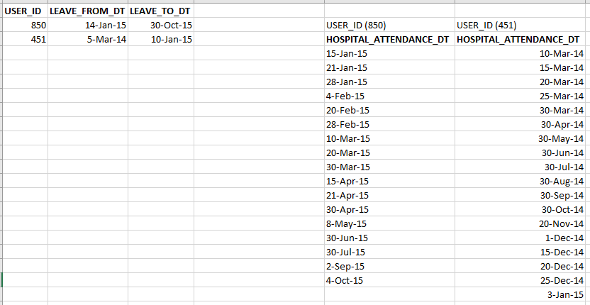
Any help or suggestion is appreciated.
Regards
Accepted Solutions
- Mark as New
- Bookmark
- Subscribe
- Mute
- Subscribe to RSS Feed
- Permalink
- Report Inappropriate Content
Hi,
one solution might be:
tabTemp:
CrossTable (UserTemp,AttendanceTemp)
LOAD 1,*
FROM [https://community.qlik.com/servlet/JiveServlet/download/1078912-235152/attendance.xlsx] (ooxml, embedded labels, header is 1 lines, table is Sheet1, filters(Remove(Col, Pos(Top, 4)),Remove(Col, Pos(Top, 3)),Remove(Col, Pos(Top, 2)),Remove(Col, Pos(Top, 1)),Remove(Row, Pos(Top, 2))));

tabAttendance:
LOAD TextBetween(UserTemp,'(',')') as USER_ID,
     Date(AttendanceTemp) as HOSPITAL_ATTENDANCE_DT
Resident tabTemp;

DROP Table tabTemp;

tabLeave:
LOAD USER_ID,
     LEAVE_FROM_DT,
     LEAVE_TO_DT
FROM [https://community.qlik.com/servlet/JiveServlet/download/1078912-235152/attendance.xlsx] (ooxml, embedded labels, table is Sheet1);
hope this helps
regards
Marco
- Mark as New
- Bookmark
- Subscribe
- Mute
- Subscribe to RSS Feed
- Permalink
- Report Inappropriate Content
- Mark as New
- Bookmark
- Subscribe
- Mute
- Subscribe to RSS Feed
- Permalink
- Report Inappropriate Content
Hi Sunny,
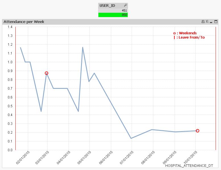
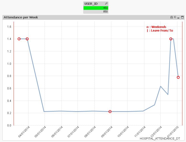
My requirement is actually to achieve this on a line chart. My manager would like to see the line drop for the user in the days/weeks he is not attending the hospital.
You will notice from the dates in the beginning the users are very frequent but then it slows and the gap between visits is widened.
What do you suggest?
Thanks a lot.
- Mark as New
- Bookmark
- Subscribe
- Mute
- Subscribe to RSS Feed
- Permalink
- Report Inappropriate Content
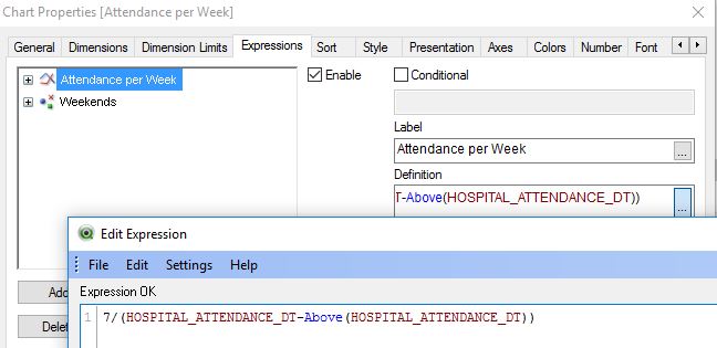
What is the input here for the application?
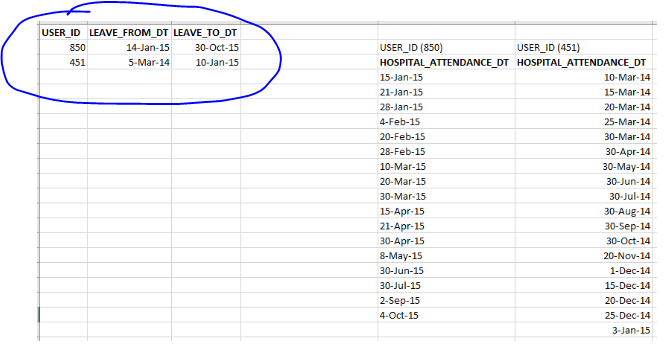
I assumed that just the circled part is the input and the portion on the right is some kind of output?
- Mark as New
- Bookmark
- Subscribe
- Mute
- Subscribe to RSS Feed
- Permalink
- Report Inappropriate Content
Hi Sunny, sorry for the late reply. timezone.
The information in the excel attachment comes from 2 tables 1is the LEAVE table which holds the leave from and to dates for every user.
The 2nd is the attendance table which holds information about every attendance date for users on leave.so what you circled is the information from table one.
Thanks
- Mark as New
- Bookmark
- Subscribe
- Mute
- Subscribe to RSS Feed
- Permalink
- Report Inappropriate Content
Hi,
one solution might be:
tabTemp:
CrossTable (UserTemp,AttendanceTemp)
LOAD 1,*
FROM [https://community.qlik.com/servlet/JiveServlet/download/1078912-235152/attendance.xlsx] (ooxml, embedded labels, header is 1 lines, table is Sheet1, filters(Remove(Col, Pos(Top, 4)),Remove(Col, Pos(Top, 3)),Remove(Col, Pos(Top, 2)),Remove(Col, Pos(Top, 1)),Remove(Row, Pos(Top, 2))));

tabAttendance:
LOAD TextBetween(UserTemp,'(',')') as USER_ID,
     Date(AttendanceTemp) as HOSPITAL_ATTENDANCE_DT
Resident tabTemp;

DROP Table tabTemp;

tabLeave:
LOAD USER_ID,
     LEAVE_FROM_DT,
     LEAVE_TO_DT
FROM [https://community.qlik.com/servlet/JiveServlet/download/1078912-235152/attendance.xlsx] (ooxml, embedded labels, table is Sheet1);
hope this helps
regards
Marco
- Mark as New
- Bookmark
- Subscribe
- Mute
- Subscribe to RSS Feed
- Permalink
- Report Inappropriate Content
Hi Marco,
That is the sort of thing am after. I will apply it to my data and confirm the result.
Thanks again