Unlock a world of possibilities! Login now and discover the exclusive benefits awaiting you.
- Qlik Community
- :
- All Forums
- :
- QlikView App Dev
- :
- Lines are used instead of symbols in chart
- Subscribe to RSS Feed
- Mark Topic as New
- Mark Topic as Read
- Float this Topic for Current User
- Bookmark
- Subscribe
- Mute
- Printer Friendly Page
- Mark as New
- Bookmark
- Subscribe
- Mute
- Subscribe to RSS Feed
- Permalink
- Report Inappropriate Content
Lines are used instead of symbols in chart
Here is a simple problem. I am plotting data in a line chart, but in Properties | Expressions | Display Options I check 'Symbol' and uncheck 'Line'. Then my graph should have symbols, not lines? However my graph shows lines. It's only when I zoom it to a quite detailed level that the lines disappear and the symbols appear.
How to get rid of this annoying behaviour and get only symbols when I want only symbols?
Thanks, D.
See attached files for example and screen shots.
- Mark as New
- Bookmark
- Subscribe
- Mute
- Subscribe to RSS Feed
- Permalink
- Report Inappropriate Content
Weird. Have you contacted QlikTech support about this? May be a bug?
- Mark as New
- Bookmark
- Subscribe
- Mute
- Subscribe to RSS Feed
- Permalink
- Report Inappropriate Content
Hi, we have the same problem. It changes from symbol to lines if you have more than 100 values on your x-axis...
No idea how you can change that...
- Mark as New
- Bookmark
- Subscribe
- Mute
- Subscribe to RSS Feed
- Permalink
- Report Inappropriate Content
I have contacted tech support and I am waiting for their answer. I'll let you know what they find.
- Mark as New
- Bookmark
- Subscribe
- Mute
- Subscribe to RSS Feed
- Permalink
- Report Inappropriate Content
Have you tried changing this section? 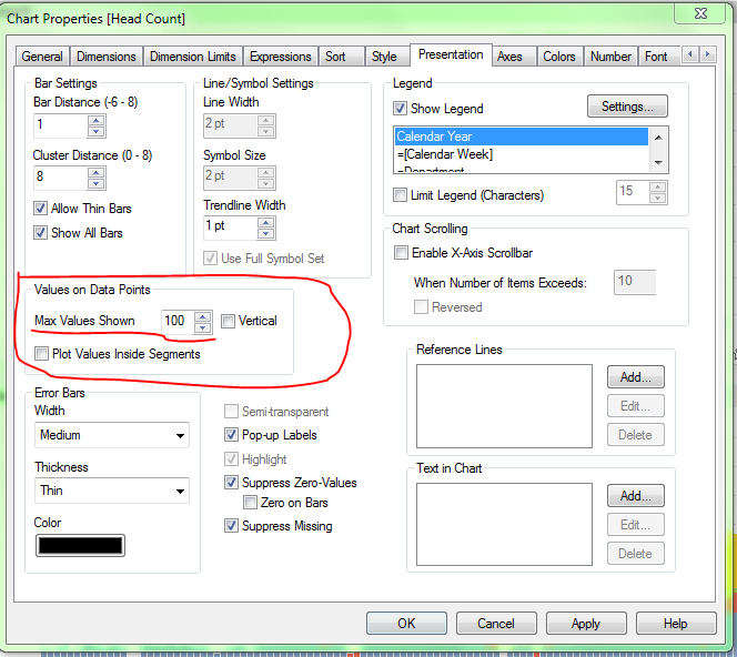
- Mark as New
- Bookmark
- Subscribe
- Mute
- Subscribe to RSS Feed
- Permalink
- Report Inappropriate Content
Yes I tried, but it doesn't seem to solve the problem.
- Mark as New
- Bookmark
- Subscribe
- Mute
- Subscribe to RSS Feed
- Permalink
- Report Inappropriate Content
I don't think it's a generic solution but you could go to:
Settings >> User Preferences >> select the tab "Objects" and put in a higher number at "Max Symbols in Chart"
So atleast for you as a user it should be fixed, but I think if someone else opens it he has to do this aswell.
Hope this helps.
- Mark as New
- Bookmark
- Subscribe
- Mute
- Subscribe to RSS Feed
- Permalink
- Report Inappropriate Content
Thank you. That is just the solution I was looking for. Perfect. Would never have found on my own. Thanks again.
- Mark as New
- Bookmark
- Subscribe
- Mute
- Subscribe to RSS Feed
- Permalink
- Report Inappropriate Content
Hi..
The symbol is not visible in the local system, but once deployed on the server and when I am accessing it using full browser version of access point, the User Preferences settings is again changed to the old one, i.e. 100 symbols.
What changes can be done, so that it will be reflected in the access point also.
Thanks,
- Mark as New
- Bookmark
- Subscribe
- Mute
- Subscribe to RSS Feed
- Permalink
- Report Inappropriate Content
Thanks a lot,
I also has issue with symbols changing to lines and this fixed it.