Unlock a world of possibilities! Login now and discover the exclusive benefits awaiting you.
- Qlik Community
- :
- All Forums
- :
- QlikView App Dev
- :
- Make Scatterplot show selection and grey other val...
- Subscribe to RSS Feed
- Mark Topic as New
- Mark Topic as Read
- Float this Topic for Current User
- Bookmark
- Subscribe
- Mute
- Printer Friendly Page
- Mark as New
- Bookmark
- Subscribe
- Mute
- Subscribe to RSS Feed
- Permalink
- Report Inappropriate Content
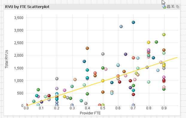
Make Scatterplot show selection and grey other values
I'm trying to do the following, but not with a line chart.
https://community.qlikview.com/blogs/qlikviewdesignblog/2014/02/07/line-chart-tricks-part-two#
Ishiness (or Keeping an Overall Sense of Where You Are in the Data Space)
I want all of the other values except what I'm selecting to be greyed out, and to highlight what I selected. When I click on a Clinician's name, all of the other values disappear.
Dimension: Clinician Name
Expression 1: Provider FTE = [YTD Avg]
Expression 2: Total RVUs = Sum({1} [RVU WORK])
- « Previous Replies
-
- 1
- 2
- Next Replies »
Accepted Solutions
- Mark as New
- Bookmark
- Subscribe
- Mute
- Subscribe to RSS Feed
- Permalink
- Report Inappropriate Content
you put the [Clinician Name] field in the color expression? like in my exemple:
if(isnull(only([Store Name])) ,ARGB(20,200,200,200),ARGB(190,43, 123, 70))
you put [Clinician Name] instead of [Store Name].
- Mark as New
- Bookmark
- Subscribe
- Mute
- Subscribe to RSS Feed
- Permalink
- Report Inappropriate Content
Hello,
put the color expression from the article which is:
if(isnull(only([Store Name])) ,ARGB(20,200,200,200),ARGB(190,43, 123, 70))
into background color for the first expression
Hope it helps,
Andrei
- Mark as New
- Bookmark
- Subscribe
- Mute
- Subscribe to RSS Feed
- Permalink
- Report Inappropriate Content
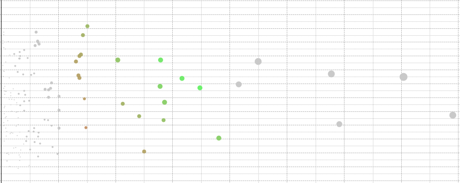
This is how it looks at me
- Mark as New
- Bookmark
- Subscribe
- Mute
- Subscribe to RSS Feed
- Permalink
- Report Inappropriate Content
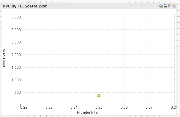
Ok, that made the colors uniform, however all other values disappear when I make a selection to look at a single employee's data compared to everyone else's.
- Mark as New
- Bookmark
- Subscribe
- Mute
- Subscribe to RSS Feed
- Permalink
- Report Inappropriate Content
you have to put the set analysis in your expressions as well
for example: sum( {<UsedDimension=>} Qty) . you have to put the set analysis in every expression for the visual to work.
"UsedDimension=" in set analysis means it ignores the selections made on the UsedDimension and that's how the values are remaining on the scatterplot
- Mark as New
- Bookmark
- Subscribe
- Mute
- Subscribe to RSS Feed
- Permalink
- Report Inappropriate Content
I'm still missing something, which may be very obvious.
Expression1: sum( {1<[Clinician Name]=>} [YTD Avg]) (tried with and without the 1)
Expression2: Sum({1<[Clinician Name]=>}[RVU WORK])
Making a selection still makes all of the values except what I selected disappear.
- Mark as New
- Bookmark
- Subscribe
- Mute
- Subscribe to RSS Feed
- Permalink
- Report Inappropriate Content
you put the [Clinician Name] field in the color expression? like in my exemple:
if(isnull(only([Store Name])) ,ARGB(20,200,200,200),ARGB(190,43, 123, 70))
you put [Clinician Name] instead of [Store Name].
- Mark as New
- Bookmark
- Subscribe
- Mute
- Subscribe to RSS Feed
- Permalink
- Report Inappropriate Content
Yup.
if(isnull(only([Clinician Name])) ,ARGB(20,200,200,200),ARGB(190,43, 123, 70))
- Mark as New
- Bookmark
- Subscribe
- Mute
- Subscribe to RSS Feed
- Permalink
- Report Inappropriate Content
can you share the qvw?
- Mark as New
- Bookmark
- Subscribe
- Mute
- Subscribe to RSS Feed
- Permalink
- Report Inappropriate Content
I found it, the colors of the dots was very light and could not see on my screen. Thanks for your help!
- « Previous Replies
-
- 1
- 2
- Next Replies »