Unlock a world of possibilities! Login now and discover the exclusive benefits awaiting you.
- Qlik Community
- :
- All Forums
- :
- QlikView App Dev
- :
- Monthly Bar graph
Options
- Subscribe to RSS Feed
- Mark Topic as New
- Mark Topic as Read
- Float this Topic for Current User
- Bookmark
- Subscribe
- Mute
- Printer Friendly Page
Turn on suggestions
Auto-suggest helps you quickly narrow down your search results by suggesting possible matches as you type.
Showing results for
Anonymous
Not applicable
2018-04-16
04:51 PM
- Mark as New
- Bookmark
- Subscribe
- Mute
- Subscribe to RSS Feed
- Permalink
- Report Inappropriate Content
Monthly Bar graph
Hi community,
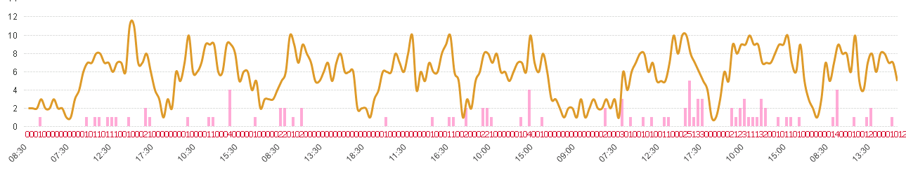
I have a bar chart with time interval in 30 min(6AM, 6.30AM, 7AM, 7.30AM, 8AM, 8.30AM, 9AM, till 7PM )as dimension and sum(Sales) as expression.
When I select month I want to see which interval has more sales, so that I can allocate more sales persons. but my graph is looking like this.
please help.
Regards,
SR.
216 Views
1 Reply
Master
2018-04-17
02:12 AM
- Mark as New
- Bookmark
- Subscribe
- Mute
- Subscribe to RSS Feed
- Permalink
- Report Inappropriate Content
What is your expected output? How is month related to your model? can you share app
167 Views