Unlock a world of possibilities! Login now and discover the exclusive benefits awaiting you.
- Qlik Community
- :
- All Forums
- :
- QlikView App Dev
- :
- Re: MultiLine Chart
- Subscribe to RSS Feed
- Mark Topic as New
- Mark Topic as Read
- Float this Topic for Current User
- Bookmark
- Subscribe
- Mute
- Printer Friendly Page
- Mark as New
- Bookmark
- Subscribe
- Mute
- Subscribe to RSS Feed
- Permalink
- Report Inappropriate Content
MultiLine Chart
Hi friends,
I am trying to create the multi-line chart as three line.In this two lines will tell comparison of two lines as continuous and third line should show the difference between two data points as discrete.Here I am able to create the two lines in the chart but not able to create the third line.
For your reference, I have given sample chart created in paint.
Need to make this in QlikView.I was structured in creating the third line. Can one helo me.
Any ideas to make this chart.
Thanks in Advance
Kumar KVP
Accepted Solutions
- Mark as New
- Bookmark
- Subscribe
- Mute
- Subscribe to RSS Feed
- Permalink
- Report Inappropriate Content
Sorry, Kumar,
seems I was kind of blocked in my head. But now I understand what you want.
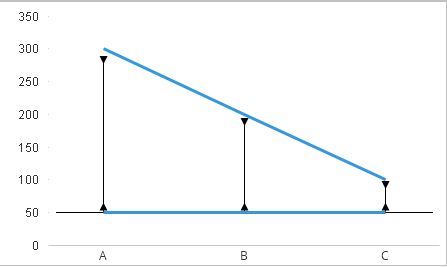
See the picture above. This was generated by using a kind of a degenerated box plot in order to create the vertical lines in your chart.
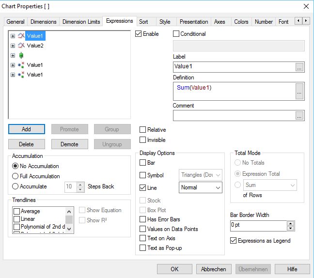
If this is what you want, go to the expression tab add an empty expression as box plot. Enter as expression for bottom, top and middle: Column(2) as expression do this also for lower whisker. For upper whisker enter : Sum(Value1) - Sum(Value1)*0.05 as expression. Also add a new expression Sum(Value1) - Sum(Value1)*0.05 which you declare as Symbol, Triangles (down), Another expression: Column(2) as Symbol, Triangles (up).
That's all.
See the below picture for details:
Hope this helps
Burkhard
- Mark as New
- Bookmark
- Subscribe
- Mute
- Subscribe to RSS Feed
- Permalink
- Report Inappropriate Content
Hi Kumar,
add a third expression like this: Column(1) - Column(2).
This will give you the difference line.
Hope this helps
Burkhard
- Mark as New
- Bookmark
- Subscribe
- Mute
- Subscribe to RSS Feed
- Permalink
- Report Inappropriate Content
Column(1)-Column(2) will do
- Mark as New
- Bookmark
- Subscribe
- Mute
- Subscribe to RSS Feed
- Permalink
- Report Inappropriate Content
Hi Burkhard,
Thanks for your reply,
By using this expression I will get the difference but I need to represent the line as a vertical line.
How can I build the vertical line as arrow I shown in image?
Any ideas to build the line.
Thanks
Kumar KVP
- Mark as New
- Bookmark
- Subscribe
- Mute
- Subscribe to RSS Feed
- Permalink
- Report Inappropriate Content
Hi Gowtham,
Thanks for your reply ,
By using this we can get the difference value but how we will represent the value in a vertical line. Any idea.
Thanks
Kumar KVP
- Mark as New
- Bookmark
- Subscribe
- Mute
- Subscribe to RSS Feed
- Permalink
- Report Inappropriate Content
Hi Kumar,
if you want a vertical line, go to the general tab, switch from line chart to combo chart. Then go to the expression tab and mark the Bar check box with your third expression. With this the difference values are represented as vertical bars.
Frankly speaking I do not understand your issue with the arrow. In your picture it is placed horizontally, but your question is for a vertical arrow!?!
Could you please explain this issue again?
Burkhard
- Mark as New
- Bookmark
- Subscribe
- Mute
- Subscribe to RSS Feed
- Permalink
- Report Inappropriate Content
Like this
Exp1-above(exp1)
Or else required Application
- Anil Chowdary
- Mark as New
- Bookmark
- Subscribe
- Mute
- Subscribe to RSS Feed
- Permalink
- Report Inappropriate Content
Hi Burkhand,
My issue is i need to represent the third as vertical line in below attachement.
I will explain you,
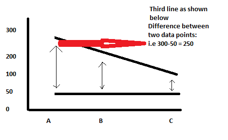
Introduction:
In the line chart, I shown in the image contains three line right with x-axis as names(A,B,C) and Y-axis as values(0 to 300) ,in that two lines are horizontal lines and one is a vertical line as arrow style.
Creating lines by default :
Two horizontal lines are coming by using expression as sum(sales) as sales and sum(Qty) as Quantity
Another line as the difference between two lines i.e Quantity-sales as Diff.
To represent these line in the line chart sales and Quantity as horizontal lines as coming default line chart with two expressions and when I add the third expression it is also taking a horizontal line .
Requirement:
So now I need to represent the third as vertical line style as arrow style like in the image .
Thanks in advance,
Kumar KVP
- Mark as New
- Bookmark
- Subscribe
- Mute
- Subscribe to RSS Feed
- Permalink
- Report Inappropriate Content
Sorry, Kumar,
seems I was kind of blocked in my head. But now I understand what you want.
See the picture above. This was generated by using a kind of a degenerated box plot in order to create the vertical lines in your chart.
If this is what you want, go to the expression tab add an empty expression as box plot. Enter as expression for bottom, top and middle: Column(2) as expression do this also for lower whisker. For upper whisker enter : Sum(Value1) - Sum(Value1)*0.05 as expression. Also add a new expression Sum(Value1) - Sum(Value1)*0.05 which you declare as Symbol, Triangles (down), Another expression: Column(2) as Symbol, Triangles (up).
That's all.
See the below picture for details:
Hope this helps
Burkhard
- Mark as New
- Bookmark
- Subscribe
- Mute
- Subscribe to RSS Feed
- Permalink
- Report Inappropriate Content
Hi Burkhard ,
Thank you so much for the valuable information on my chart and description.
Now I can able to show the line as I expected.
Thanks
Kumar KVP