Unlock a world of possibilities! Login now and discover the exclusive benefits awaiting you.
- Qlik Community
- :
- All Forums
- :
- QlikView App Dev
- :
- Multiple fields on Y-axis
- Subscribe to RSS Feed
- Mark Topic as New
- Mark Topic as Read
- Float this Topic for Current User
- Bookmark
- Subscribe
- Mute
- Printer Friendly Page
- Mark as New
- Bookmark
- Subscribe
- Mute
- Subscribe to RSS Feed
- Permalink
- Report Inappropriate Content
Multiple fields on Y-axis
I have following representation.
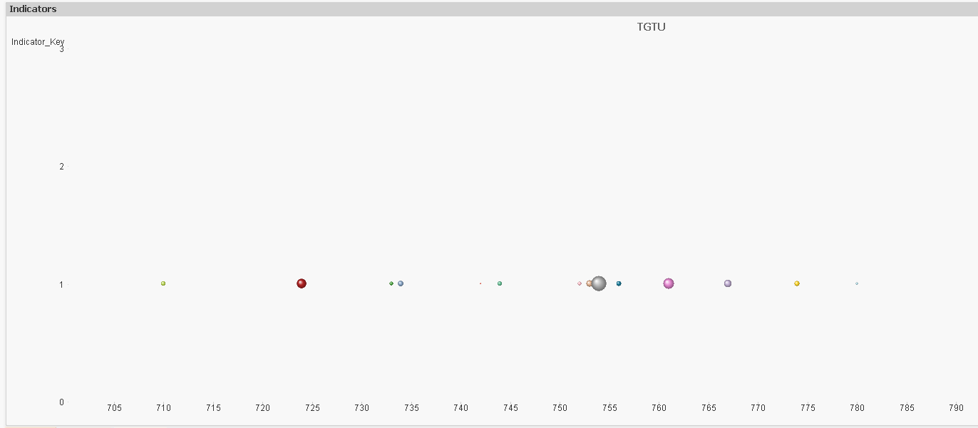
I'm displaying values of a field (say population) at Y=1. Now I would like to add another field (say age) at Y=2. How can I define Y axis and corresponding field values on Z_axis in a bubble chart?
- Tags:
- new_to_qlikview
- Mark as New
- Bookmark
- Subscribe
- Mute
- Subscribe to RSS Feed
- Permalink
- Report Inappropriate Content
Hi Nishant,
Do you use the scatter Chart ?
If yes, you can use the X,Y and Z axis.
Can you post an app and the expected result ?
François
- Mark as New
- Bookmark
- Subscribe
- Mute
- Subscribe to RSS Feed
- Permalink
- Report Inappropriate Content
Hi
Yes, I'm using scatter chart. It's not really possible to post that app here. I just want some of my fields to be represented simultaneously on Y-axis. In the above example I have a field represented at Y=1. So all the values of that field appear in the front of Y=1. Similarly for any other field, it should appear at say Y=2. Please let me know if you are still not clear with the use case.
- Mark as New
- Bookmark
- Subscribe
- Mute
- Subscribe to RSS Feed
- Permalink
- Report Inappropriate Content
Here I've attached a sample which looks similar to my data model. I have represented 'LifeExpectancy' on Y=1. Dimension used is 'Year'. X Axis represents average 'Population'. I would like to have bubbles for 'NumberOfParks' and 'NumberOfSchools' represented on Y=2 and Y=3 respectively.