Unlock a world of possibilities! Login now and discover the exclusive benefits awaiting you.
- Qlik Community
- :
- All Forums
- :
- QlikView App Dev
- :
- Pivot question: Alert when does the stock runout (...
- Subscribe to RSS Feed
- Mark Topic as New
- Mark Topic as Read
- Float this Topic for Current User
- Bookmark
- Subscribe
- Mute
- Printer Friendly Page
- Mark as New
- Bookmark
- Subscribe
- Mute
- Subscribe to RSS Feed
- Permalink
- Report Inappropriate Content
Pivot question: Alert when does the stock runout (AGGR?)
Dear specialist,
I got a pivot table with 3 dimensions:
Product
Stock
Weeknumber (Year and Week)
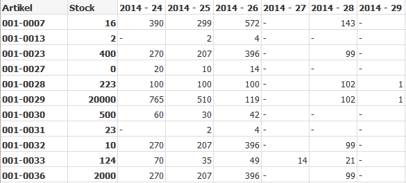
For every Product I got an expression which calculates te stock need for every week, which results in this pivot:
What I would like is a Pivot which shows me when my stocks runs out like this:
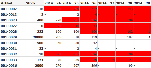
For example product 001-0028 the current stock is 223, I got enough for 2014-24 and 2014-15, but not enough for the next week so from there it needs to become red.
What Expression should I use for the background colour to get this?
Thanks,
Dennis.
Accepted Solutions
- Mark as New
- Bookmark
- Subscribe
- Mute
- Subscribe to RSS Feed
- Permalink
- Report Inappropriate Content
Try this one:
if(rangesum(before(total sum(Needed)*sum(Totaal),0,ColumnNo(total)))>CurrentStock,rgb(250,125,125))
talk is cheap, supply exceeds demand
- Mark as New
- Bookmark
- Subscribe
- Mute
- Subscribe to RSS Feed
- Permalink
- Report Inappropriate Content
Maybe something like =if(rangesum(before(total sum(WeekAmount),0,rowno(total)) > Stock, red())
talk is cheap, supply exceeds demand
- Mark as New
- Bookmark
- Subscribe
- Mute
- Subscribe to RSS Feed
- Permalink
- Report Inappropriate Content
Thanks Gysbert, but I dont get it to work with that, the expression you suggested returns 0
What I am trying now, I add a field Year_week_number, which I want to use in a set analyses in combination with AGGR.
What I got now is :
AGGR(SUM({$<YEAR_WEEK_NUMBER={' < $(YEAR_WEEK_NUMBER)'}>}AMOUNTNEEDED), PRODUCT)
This way I am trying to get a sum of all the AMMOUNTNEEDED, of the product of the weeks with a lower number then week in the pivot. From their I will try further.
Any suggustions?
- Mark as New
- Bookmark
- Subscribe
- Mute
- Subscribe to RSS Feed
- Permalink
- Report Inappropriate Content
I don't think set analysis will work. The set is calculated at the chart level so you won't get a set per dimension value of YEAR_WEEK_NUMBER. Perhaps you can post a small example document with some data.
talk is cheap, supply exceeds demand
- Mark as New
- Bookmark
- Subscribe
- Mute
- Subscribe to RSS Feed
- Permalink
- Report Inappropriate Content
Thank for explaining.
Here is an example document of how my charts looks like.
Thanks.
- Mark as New
- Bookmark
- Subscribe
- Mute
- Subscribe to RSS Feed
- Permalink
- Report Inappropriate Content
Try this one:
if(rangesum(before(total sum(Needed)*sum(Totaal),0,ColumnNo(total)))>CurrentStock,rgb(250,125,125))
talk is cheap, supply exceeds demand
- Mark as New
- Bookmark
- Subscribe
- Mute
- Subscribe to RSS Feed
- Permalink
- Report Inappropriate Content
Perfect! Thanks again Gysbert!