Unlock a world of possibilities! Login now and discover the exclusive benefits awaiting you.
- Qlik Community
- :
- All Forums
- :
- QlikView App Dev
- :
- Problem with combo chart
- Subscribe to RSS Feed
- Mark Topic as New
- Mark Topic as Read
- Float this Topic for Current User
- Bookmark
- Subscribe
- Mute
- Printer Friendly Page
- Mark as New
- Bookmark
- Subscribe
- Mute
- Subscribe to RSS Feed
- Permalink
- Report Inappropriate Content
Problem with combo chart
Hi Qlik Community,
I was recently introduced to QlikView and I could really use some help. I have a chart that is displaying the lines in a weird way and I can't figure out why.
I really hope you can help me.
I did search for an answer in the community, however I could not find anything...
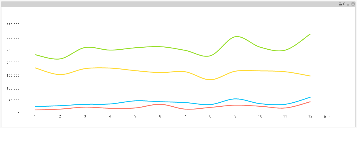
I created a line chart with two dimensions (Year and Month) and four expressions (representing different regions).
However I can only display one dimension with this line chart. Like this:
I tried changing it to a combo chart and it worked. It was now displaying both dimensions, like I needed. However, the lines are displayed like this:
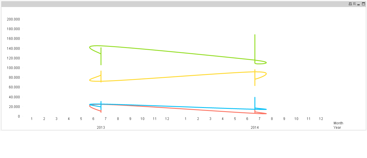
Why is this? I want to have them displayed as the first chart, but with the two dimensions visible.
Is there any quick solution?
Thanks in advance.
Mariana
- « Previous Replies
-
- 1
- 2
- Next Replies »
Accepted Solutions
- Mark as New
- Bookmark
- Subscribe
- Mute
- Subscribe to RSS Feed
- Permalink
- Report Inappropriate Content
Hi, check this sample file.
- Mark as New
- Bookmark
- Subscribe
- Mute
- Subscribe to RSS Feed
- Permalink
- Report Inappropriate Content
Can you please attach your qvw file. Want to see the expression you have written
- Mark as New
- Bookmark
- Subscribe
- Mute
- Subscribe to RSS Feed
- Permalink
- Report Inappropriate Content
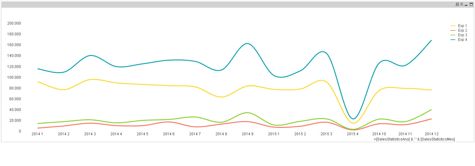
if you mean that the lines should return one value for each Year/Month, then you need to create another dimension (you can add it in the load script) or a calculated dimension which is the combination of year and month (= [Year] & ' ' & [Month]) and use this as a dimension.
- Mark as New
- Bookmark
- Subscribe
- Mute
- Subscribe to RSS Feed
- Permalink
- Report Inappropriate Content
Hi Malek,
I tried this, but I couldn't get it to work. I will give it another try and get back to you.
Thanks for your reply.
- Mark as New
- Bookmark
- Subscribe
- Mute
- Subscribe to RSS Feed
- Permalink
- Report Inappropriate Content
Hi Ankita,
Thanks for your reply.
I would need to resize my sample since I am working with a huge file with company data.
What I wrote is very simple, a sum of sales, with set analysis for different markets.
Sum({<MarketCd{'10','11','12','13','14','15','17','22','23','24','25','28','93','93A','94'}>} SalesStatisticsSalesTons)
- Mark as New
- Bookmark
- Subscribe
- Mute
- Subscribe to RSS Feed
- Permalink
- Report Inappropriate Content
How exactly you want it to look?
Maybe try to use Region as the 3rd dimension, and only one expression.
- Mark as New
- Bookmark
- Subscribe
- Mute
- Subscribe to RSS Feed
- Permalink
- Report Inappropriate Content
Hi, check this sample file.
- Mark as New
- Bookmark
- Subscribe
- Mute
- Subscribe to RSS Feed
- Permalink
- Report Inappropriate Content
Hi Michael,
Thanks for your reply.
I could do that, but I really need to display four regions/markets and this involves different fields in my data model.
I can't achieve this via simply adding region, and I reckon I can't do it via calculated dimensions.
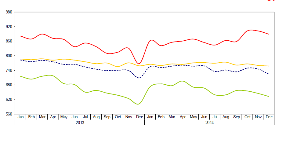
This is what I had in mind.
This is reported originally in excel.
- Mark as New
- Bookmark
- Subscribe
- Mute
- Subscribe to RSS Feed
- Permalink
- Report Inappropriate Content
Hi Malek,
Thank you very much.
I did get the same result as you. I would prefer that month and year would be displayed individually, but this will do just fine.
However my dates are all mixed, could you help me? I need to sort 2014, 10, 11 and 12 accordingly. I couldn't get wildmatch to work.
This is a really stupid question but I only started working on QlikView the last 2 weeks. 
- Mark as New
- Bookmark
- Subscribe
- Mute
- Subscribe to RSS Feed
- Permalink
- Report Inappropriate Content
Hi Mariana,
As per my knowledge Line chart can work only on one dimension. If you want two dimensions to work you can concatenate them as shown below:
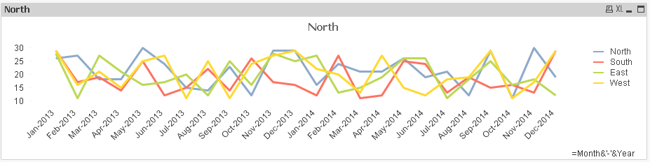
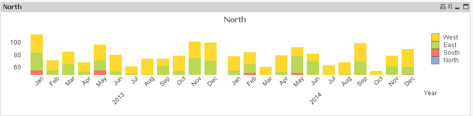
You can use a bar chart if you want to show both the dimensions separately as shown below:
Thanks and Regards,
Ankita
- « Previous Replies
-
- 1
- 2
- Next Replies »