Unlock a world of possibilities! Login now and discover the exclusive benefits awaiting you.
- Qlik Community
- :
- All Forums
- :
- QlikView App Dev
- :
- Question on bar chart: expression formula
- Subscribe to RSS Feed
- Mark Topic as New
- Mark Topic as Read
- Float this Topic for Current User
- Bookmark
- Subscribe
- Mute
- Printer Friendly Page
- Mark as New
- Bookmark
- Subscribe
- Mute
- Subscribe to RSS Feed
- Permalink
- Report Inappropriate Content
Question on bar chart: expression formula
Hello,
I have an excel file with one column showing the average revenue per month as follows:
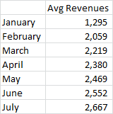
That means that in January the revenue was 1295.
In February the 2059 is the average revenue generated in January+February
In March the 2219 is the average revenue generated in January+February+March
In April the 2380 is the average revenue generated in January+February+March+April
.....
I want to create a bar chart showing the revenue per each month, not the average revenue accumulated. That would mean the following:
January = 1295
February = 2059 * 2 (months) - sum (revenue from January)
March = 2219 * 3 (months) - sum (revenue from January+February)
April = 2380 * 4 (months) - sum (revenue from January+February+March)
...
Following these formulas the revenue per month would be as follows, and this is the data I want to show in a bar graph: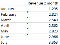
And here the question: do you know what I should write in the expression formula to get these figures ?
Attached the xls file
Thanks,
dani
- Tags:
- new_to_qlikview
Accepted Solutions
- Mark as New
- Bookmark
- Subscribe
- Mute
- Subscribe to RSS Feed
- Permalink
- Report Inappropriate Content
Check attached qvw.
- Mark as New
- Bookmark
- Subscribe
- Mute
- Subscribe to RSS Feed
- Permalink
- Report Inappropriate Content
Check attached qvw.
- Mark as New
- Bookmark
- Subscribe
- Mute
- Subscribe to RSS Feed
- Permalink
- Report Inappropriate Content
Great Tresesco. This is just what I was looking for !!!