Unlock a world of possibilities! Login now and discover the exclusive benefits awaiting you.
- Qlik Community
- :
- All Forums
- :
- QlikView App Dev
- :
- Radar Chart Help
- Subscribe to RSS Feed
- Mark Topic as New
- Mark Topic as Read
- Float this Topic for Current User
- Bookmark
- Subscribe
- Mute
- Printer Friendly Page
- Mark as New
- Bookmark
- Subscribe
- Mute
- Subscribe to RSS Feed
- Permalink
- Report Inappropriate Content
Radar Chart Help
I created a radar chart. In this chart I only want the grid to only have one grid ring. Currently it displayed all the minor grid rings and I only need one of those rings displayed. How do I change that? Furthermore, I only want one point value for the radar chart to display. That point value should correlate with the grid ring as I stated before. Is there a way I can fix this?
Thank you for your help
Accepted Solutions
- Mark as New
- Bookmark
- Subscribe
- Mute
- Subscribe to RSS Feed
- Permalink
- Report Inappropriate Content
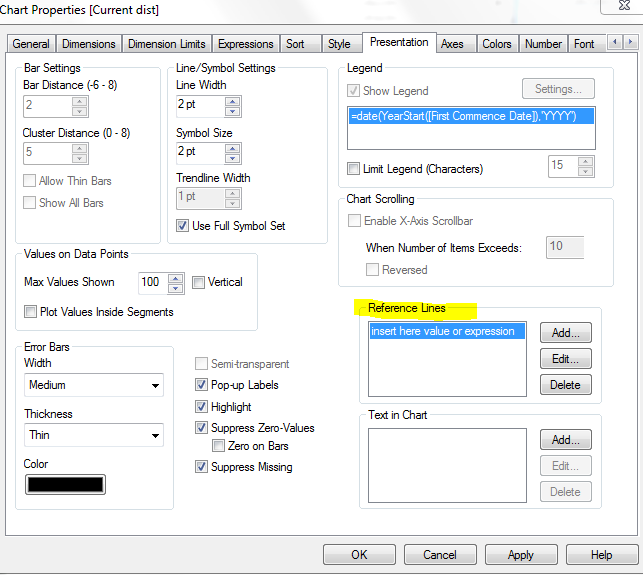
Maybe you can use a reference line instead of the grid - as you can control the reference line with a constant value / variable or expression. And you can also layout e.g. the color
- Mark as New
- Bookmark
- Subscribe
- Mute
- Subscribe to RSS Feed
- Permalink
- Report Inappropriate Content
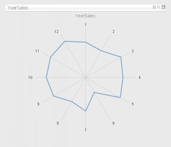
This gets rid of all the 'rings' . Is it closer to what you want ? I selected 'hide axis' on the presentation tab of the chart properties.
- Mark as New
- Bookmark
- Subscribe
- Mute
- Subscribe to RSS Feed
- Permalink
- Report Inappropriate Content
Maybe you can use a reference line instead of the grid - as you can control the reference line with a constant value / variable or expression. And you can also layout e.g. the color
- Mark as New
- Bookmark
- Subscribe
- Mute
- Subscribe to RSS Feed
- Permalink
- Report Inappropriate Content
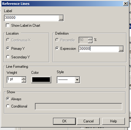
Thank you both for your help. So I hide the axis as you suggested and that worked better. When I entered in my value for the reference line it would not post for some reason. Currently what I have is attached. What I would like to do is: put an axis around the middle of that radar chart. I only want one axis to display at the middle value which is 200,000. How should I do this?
- Mark as New
- Bookmark
- Subscribe
- Mute
- Subscribe to RSS Feed
- Permalink
- Report Inappropriate Content
Hi james - i tested daniels reply too ( and 'liked it' as well:) ) ... make sure you add the number as the expression AND label
also make sure the color is not transparent and its has a weight > 0pt.
Finally ... try re-enabling the axis to just ensure 200,000 is actually in the range.
Lastly, the chart is dynamic and will not 'stretch out' to show the reference line if the values are smaller. You may need to add a 'max value' on the axis tab to something greater than 200,000 to ensure its always viewable.
- Mark as New
- Bookmark
- Subscribe
- Mute
- Subscribe to RSS Feed
- Permalink
- Report Inappropriate Content
Thank you for the help. I forget to add the value in the expression section. It works great now.