Unlock a world of possibilities! Login now and discover the exclusive benefits awaiting you.
- Qlik Community
- :
- All Forums
- :
- QlikView App Dev
- :
- Removing Outliers before using Fractile
- Subscribe to RSS Feed
- Mark Topic as New
- Mark Topic as Read
- Float this Topic for Current User
- Bookmark
- Subscribe
- Mute
- Printer Friendly Page
- Mark as New
- Bookmark
- Subscribe
- Mute
- Subscribe to RSS Feed
- Permalink
- Report Inappropriate Content
Removing Outliers before using Fractile
I have data set which contains Columns - Vertical,Product,Metric Name and Metric Value.
The association is as such,
Vertical
|
Product
|
Metric Name and Value
Means - a vertical can have many products and a product can have many Metrics and Values.
Now, I'm using a bar chart with Vertical as Dimension. In expression, I used Fractile(MetricValue,0.25) to get the 25th percentile. Therefore, if the user clicks the Metrics Name(which I will give as a List box to choose from) then 25th percentile of Metric Values for that particular metric will be calculated across all Verticals.
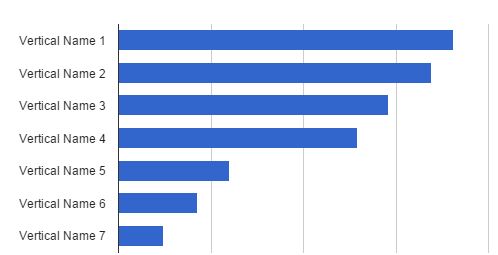
If User Clicks a Metric Name, my chart should be like
This is where the problem lies. There are some outliers in Metric values. Because of outliers, some of the verticals were missing if I calculate Fractile().
How to use the outlier removed values in bar chart?
- Mark as New
- Bookmark
- Subscribe
- Mute
- Subscribe to RSS Feed
- Permalink
- Report Inappropriate Content
Maybe something like Fractile({<MetricValue={">=10<=200"}>}MetricValue,0.25). Change 10 and 200 to get the range of values that you want to accept for calculating the fractiles.
If you need more help please post a small qlikview document with example data that illustrates the problem.
talk is cheap, supply exceeds demand