Unlock a world of possibilities! Login now and discover the exclusive benefits awaiting you.
- Qlik Community
- :
- All Forums
- :
- QlikView App Dev
- :
- Representing a % of the whole in a chart
- Subscribe to RSS Feed
- Mark Topic as New
- Mark Topic as Read
- Float this Topic for Current User
- Bookmark
- Subscribe
- Mute
- Printer Friendly Page
- Mark as New
- Bookmark
- Subscribe
- Mute
- Subscribe to RSS Feed
- Permalink
- Report Inappropriate Content
Representing a % of the whole in a chart
Greetings fellow Qlikviewers!
I've researched, searched and scoured but haven't yet discovered an answer to this problem. I have data from 2 different sources, each source returns:
[Analyst] (String value, the name of the employee in question)
Total Tickets ( Integer, the sum of all tickets worked by the Analyst)
[Assigned To] (String, the name of the analyst the Breached SLA ticket was assigned to)
[Analyst] [Total Tickets] [Assigned To]
Bob 500 Bob
Frank 600 Frank
Mary 300 Mary
I would like to represent the percentage of Breached SLA tickets as a percentage of all tickets in a Pie or Block Chart when an individual Analyst is selected.
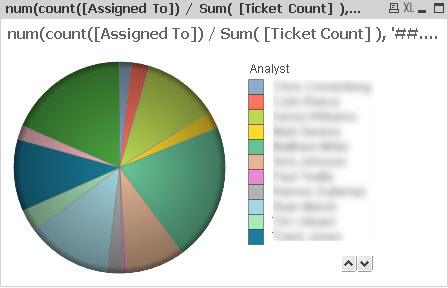
I can create a chart, select Analyst as the dimension and use:
num(count([Assigned To]) / Sum( [Ticket Count] ), '##.# %')
The return value, for each Analyst would be a percentage value, like "Mary: 1.3 %" and will produce a nice pie chart like this:
Now when I select a particular Analyst, of course I get this:
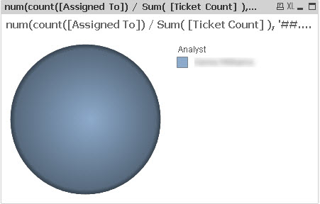
I've used functions like If(GetSelectedValue(Analyst),Do.This, Do.That) or If( len( Trim( GetCurrentSelections()))=0, Use.This.Formula, Use.That.Formula ) but for the life of me I can't figure out a way to select a single value and return a Pie Chart that reveals the result of the formula (or any variation thereof) as a fraction of 100% when a single Analyst is selected.
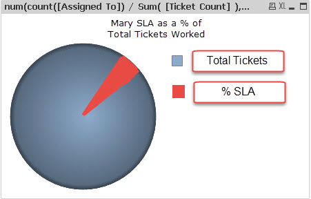
something like this:
Do any of you wise QlikView Dev's have a suggestion on how to create this functionality?
Much gratitude for your consideration!
mfc
- Mark as New
- Bookmark
- Subscribe
- Mute
- Subscribe to RSS Feed
- Permalink
- Report Inappropriate Content
re-reading my ask.... it occurred to me that my question can be boiled down to:
If a calculation returns a percentage value, say 4.5%, when a single Analyst is selected, how can I visualize that value as slice of a pie? or restated:
If the calculation returns a value, in this case 0.45142300312305..... how do I convince the chart to visualize that value as a slice of 1?
Please, this issue keeps me up at night! I suspect the answer is right in front of me but I just can't see it.
- Mark as New
- Bookmark
- Subscribe
- Mute
- Subscribe to RSS Feed
- Permalink
- Report Inappropriate Content
Hi,
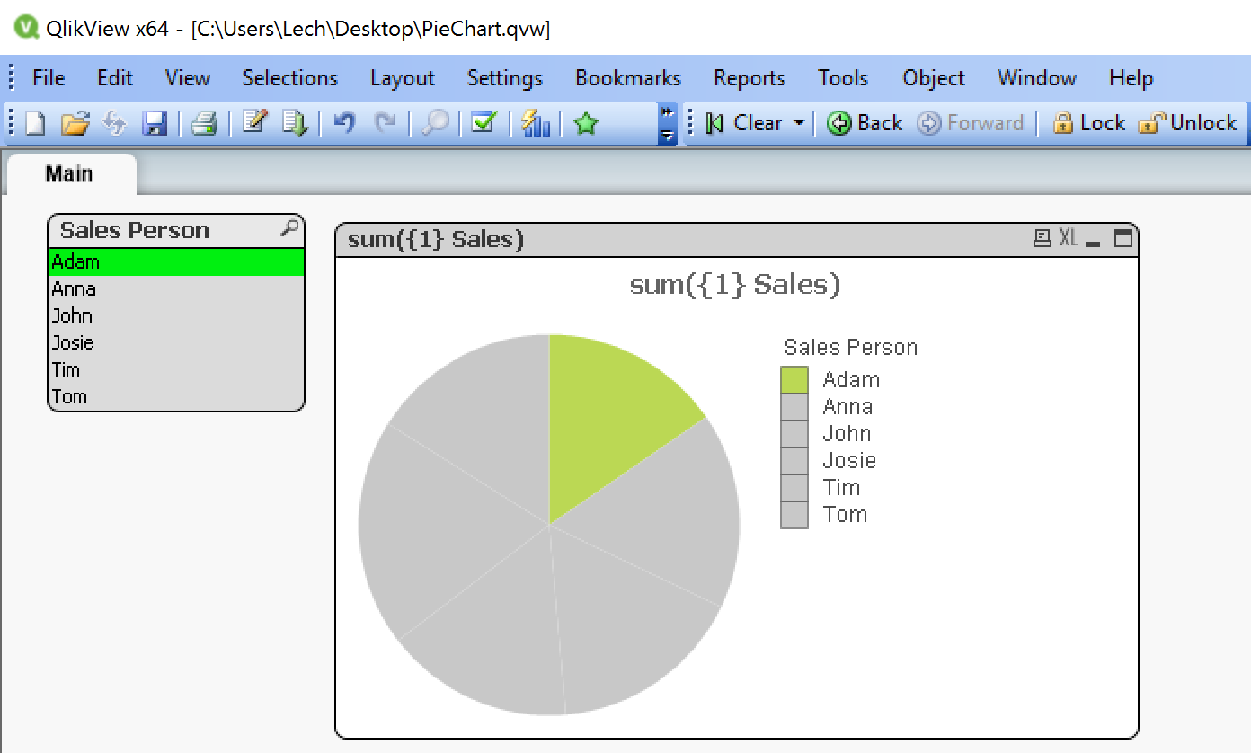
I made an example with following steps:
- Made a pie chart
- Setup dimensions ( show all values & suppress when value is null)
- Expression with {1} set modifier to always show whole chart (this may need tweaking depending how you want to filter this chart) so it could be also like:
- Sum({<[Sales Person]=>}Sales) - this would ignore Sales person filter and apply any other filters on chart
- Color for expression sensitive to current selection (If(sum(Sales)=0,RGB(200,200,200),Color(FieldIndex('Sales Person',[Sales Person]))))
hope this helps
see document attached:
- Mark as New
- Bookmark
- Subscribe
- Mute
- Subscribe to RSS Feed
- Permalink
- Report Inappropriate Content
Lech,
Thank you so very much for the response. I think it's on the right track but not quite there yet. After tinkering with your idea, looking at my data model and looking at my example model in this thread, I realized I didn't explain part of it very well.
You use the Expression " sum(Sales)" and modify it with set modifiers (either {1} or <[Sales Person]=> ) and I understand why. The difference is my Expression is a little more complex and that complexity may be the reason I can't replicated your solution.
For the sake of clarity, let me add a column to my example data set:
[Analyst] [Total Tickets] [SLA Assigned To] [SLA #]
Bob 500 Bob A1234
Frank 600 Frank A3456
Mary 300 Mary A9876
Bob 500 Bob A7475
Bob 500 Bob A9999
The Field "Total Tickets" is an aggregate of all tickets each analyst worked. When the [SLA Assigned To] and [SLA#] fields are added into the model, the [Total Tickets] remains static. I count either [SLA Assigned To] or [SLA#] to find the number of SLA tickets count against each Analyst. In this example, Bob has 3. So the math would be:
[Total Tickets]/count([SLA Assigned To])
or 500/3 to arrive at (in this example case) 0.006 or .6%.
Does that make sense?
This means in the Color Expression, I can't use the single sum() calculation and I think this is where I'm unable to replicate your example, I'm not sure how to correctly use Set Analysis for count([Assigned To]) / [Ticket Count] to ignore the Analyst filter.
Now if I had more control over the source data I could probably do a better job of modeling it within QlikView but I'm stuck working with what I have.
Do you have further instructions? I feel like I'm close....
- Mark as New
- Bookmark
- Subscribe
- Mute
- Subscribe to RSS Feed
- Permalink
- Report Inappropriate Content
Hi Matthew,
I have 2 fundamental questions regarding this dataset you have
Analyst] [Total Tickets] [SLA Assigned To] [SLA #]
Bob 500 Bob A1234
Frank 600 Frank A3456
Mary 300 Mary A9876
Bob 500 Bob A7475
Bob 500 Bob A9999
Lets look at Bob for instance:
He has total ticekts = 500. My understanding of this data is that you actualy have 500 lines in this dataset. If this is true total number of lines in your dataset = total number of tickets. My understanding is that full pie = 100 % = All tickets. If my understanding is right why dont you just use:
count({1} [SLA #]) as your expression
and on chart properties under expression use relative representation so you can have % representation of it. I just think you overcomplicated your expression by using second column for totals tickets. In this example we dont need it as we are always looking at all tickets and they are always there. Therefore there is always natural aggregation happening as well as relative representation (%) possible.
The only thing you may want to do is tweak your dimension so it can be "Selected vs Total" - see attached tweaked qvw file
let me know how it goes
regards
Lech
- Mark as New
- Bookmark
- Subscribe
- Mute
- Subscribe to RSS Feed
- Permalink
- Report Inappropriate Content

Ihave forgotten to ask 2 fundamental questions:
- Is sum of all rows = number of all tickets = 100% of your pie chart?
- If answer for 1 question is YES then just use following expressions:
- for expression count({1} [SLA #]) also tick a "Relative" checkbox on "Expressions" tab so you get a %
- for color: If(count([SLA #])>0, Color(FieldIndex('Sales Person',[Sales Person])),RGB(200,200,200))
Try it and let me know how it goes.
regards
Lech