Unlock a world of possibilities! Login now and discover the exclusive benefits awaiting you.
- Qlik Community
- :
- All Forums
- :
- QlikView App Dev
- :
- SET ANALYSIS
- Subscribe to RSS Feed
- Mark Topic as New
- Mark Topic as Read
- Float this Topic for Current User
- Bookmark
- Subscribe
- Mute
- Printer Friendly Page
- Mark as New
- Bookmark
- Subscribe
- Mute
- Subscribe to RSS Feed
- Permalink
- Report Inappropriate Content
SET ANALYSIS
hi all,
I have the consultant revenue and patient id .I want to find
1.the consultant who attended less patient and earned more revenue.
2.the consultant who attended more patient and earned more revenue.
3.the consultant who attended less patient and earned less revenue.
4.the consultant who attended more patient and earned less revenue.
PFA
ptid is patient id and bill net amount is the revenue.
Regards,
Joshua.
Accepted Solutions
- Mark as New
- Bookmark
- Subscribe
- Mute
- Subscribe to RSS Feed
- Permalink
- Report Inappropriate Content
- Mark as New
- Bookmark
- Subscribe
- Mute
- Subscribe to RSS Feed
- Permalink
- Report Inappropriate Content
How you want in layout orient?
- Mark as New
- Bookmark
- Subscribe
- Mute
- Subscribe to RSS Feed
- Permalink
- Report Inappropriate Content
Dear Anil,
I want display it in bar chart.
- Mark as New
- Bookmark
- Subscribe
- Mute
- Subscribe to RSS Feed
- Permalink
- Report Inappropriate Content
Can you explain the logic behind for 1 sentence atleast
- Mark as New
- Bookmark
- Subscribe
- Mute
- Subscribe to RSS Feed
- Permalink
- Report Inappropriate Content
Hello, Joshua!
Such tasks can be easily solved with scatter chart:
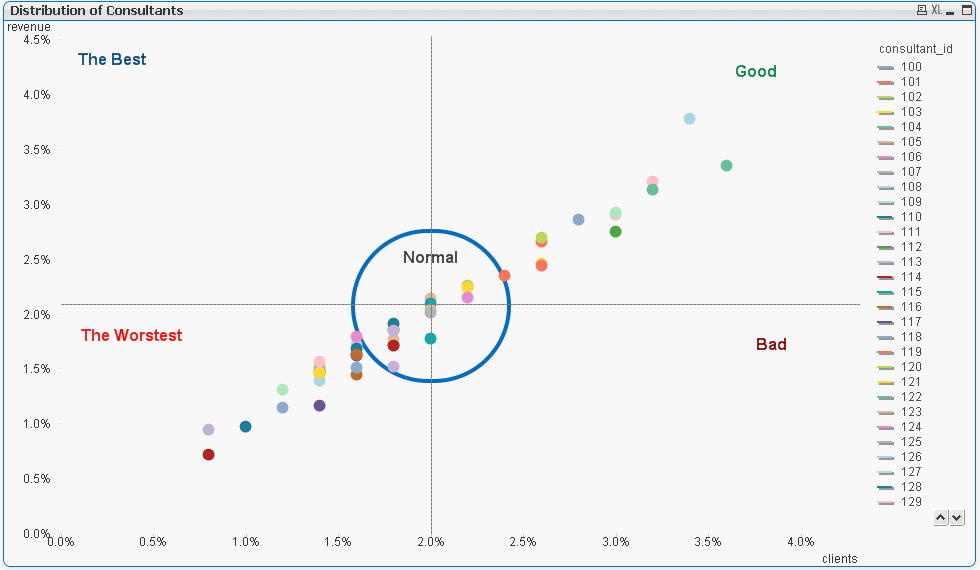
I used randomly generated data so there is a diagonal. But dimension and expressions are suits for you.
PFA
- Mark as New
- Bookmark
- Subscribe
- Mute
- Subscribe to RSS Feed
- Permalink
- Report Inappropriate Content
On your data it will be like this:
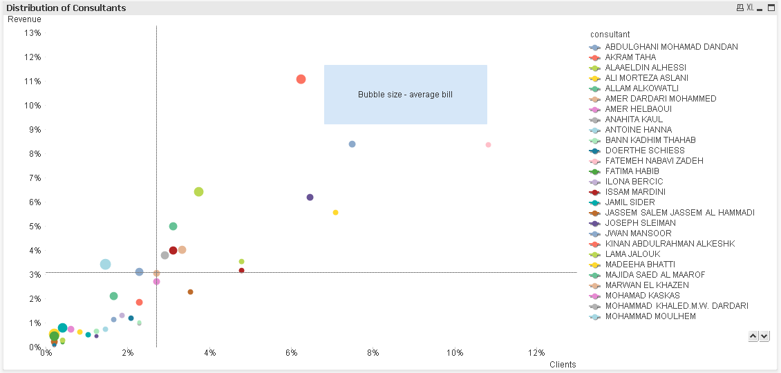
Gray lines is 66-percentile.