Unlock a world of possibilities! Login now and discover the exclusive benefits awaiting you.
- Qlik Community
- :
- All Forums
- :
- QlikView App Dev
- :
- Scatter Chart - Relative Bubble size over many sel...
- Subscribe to RSS Feed
- Mark Topic as New
- Mark Topic as Read
- Float this Topic for Current User
- Bookmark
- Subscribe
- Mute
- Printer Friendly Page
- Mark as New
- Bookmark
- Subscribe
- Mute
- Subscribe to RSS Feed
- Permalink
- Report Inappropriate Content
Scatter Chart - Relative Bubble size over many selections
Good Afternoon Everyone
I am relatively new to Qlik and I am trying to build a scatter chart - going well so far.
I have hit a snag when using three different charts with the same data - just different selections. the bubble sizes only stay relative to the current selection in each chart, so therefore across all three charts one bubble is sized the same as another - despite the fact they have completely different values.
Is there an expression or option in the chart properties I can use to keep this relative across all different charts with my different selections?
Thanks in advance
Drew
- Mark as New
- Bookmark
- Subscribe
- Mute
- Subscribe to RSS Feed
- Permalink
- Report Inappropriate Content
Drew,
What are the three (x,y,z) expressions in each chart.
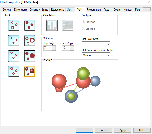
Have you chosen the proper style for varying bubble sizes?
We'll need a bit more information to try to help.
Thanks
Oscar
- Mark as New
- Bookmark
- Subscribe
- Mute
- Subscribe to RSS Feed
- Permalink
- Report Inappropriate Content
I get your pain. Like a comparison scenario using Alternate States. In one chart the values range from 1 to 100. A value of 50 gets a midpoint sized bubble. In another chart, the values range from 1 to 1000 and a 500 bubble gets the same midpoint size. You want the 500 and the 50 to be sized relative to one another.
Here's a trick. Plot all the bubbles (using set {<Dimension=>}) and color the unselected dimensions with a transparent background color. To avoid "ghost" popups when you hover over those transparent bubbles, turn off Popup labels and make your own popup as an extra expression.
See the attached QVW for a complete example. Let me know if you have questions about what's going on in there.
Another approach is to just gray out the unselected dimensions as shown in this example
Qlikview Cookbook: Focus not Filter http://qlikviewcookbook.com/recipes/download-info/focus-not-filter/
-Rob
- Mark as New
- Bookmark
- Subscribe
- Mute
- Subscribe to RSS Feed
- Permalink
- Report Inappropriate Content
Hi Oscar
Thank you for taking the time to reply. My X is just a status id, numbers 1-9. The Y-Axis AND Z-axis are a financial figure - still just a number between 1 - 100. I've used the same figure for these not based on my own choice - this is what is required from the report.
Drew
- Mark as New
- Bookmark
- Subscribe
- Mute
- Subscribe to RSS Feed
- Permalink
- Report Inappropriate Content
Hi Rob
Thank you very much for your response.
Funnily enough this is exactly what I have tried to do. However, the problem I have been having (not just with this) is getting a text pop-up to work. I have done all the right things but when I hover over the points I do not get the label. This is actually the same when I open your report
Is this potentially to do with the fact it is not in a published (very new to qlikview, don't know if that is the right nomenclature) dashboard yet? Edit: I put my report out there and it still did not work. Is this potentially a version or option issue?
Thanks again
Drew
- Mark as New
- Bookmark
- Subscribe
- Mute
- Subscribe to RSS Feed
- Permalink
- Report Inappropriate Content
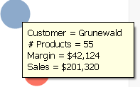
The label does not show up in the "Text as Popup" option. You have to include the Label as part of your expression. You don't see the popup in my example? Here's what I see. What do you see?
If you are not seeing a popup, I'm guessing you are using QV11.20 SR12 or earlier where the missing popup is a bug.
-Rob