Unlock a world of possibilities! Login now and discover the exclusive benefits awaiting you.
- Qlik Community
- :
- All Forums
- :
- QlikView App Dev
- :
- Set analysis modifier between two dates
- Subscribe to RSS Feed
- Mark Topic as New
- Mark Topic as Read
- Float this Topic for Current User
- Bookmark
- Subscribe
- Mute
- Printer Friendly Page
- Mark as New
- Bookmark
- Subscribe
- Mute
- Subscribe to RSS Feed
- Permalink
- Report Inappropriate Content
Set analysis modifier between two dates
Hello folks,
Please help me. I'm going mad.
I'm trying to do something using set analysis that I think ought to be simple, but I just can't seem to get the syntax right.
In the attached file I have two tables: calendar and event. They are linked through the date field.
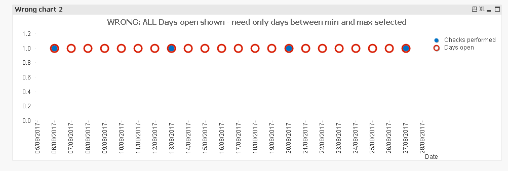
With Date as the dimension, I want to plot "Result" from the Event table as a dot, and "Open" from the Calendar table as a circle. So that every available day is shown on the chart, with a dot for every event that occurred.
I want to be able to select a month from Calendar and an Event type from events and see a circle for every day that month and a dot for every event.
I think I need something like
=avg( {1 <Date={"<max(Date)>min(Date)"} } Open)
but I can't get it right. There needs to be a dollar or two in there and I can't figure out where!
I even messed with the P() function, but ended up confusing myself.
Any help greatly appreciated!
Karen
Accepted Solutions
- Mark as New
- Bookmark
- Subscribe
- Mute
- Subscribe to RSS Feed
- Permalink
- Report Inappropriate Content
May be this
=Avg({1<Date = {"$(='>=' & Min(Date) & '<=' & Max(Date))"}>}Open)
- Mark as New
- Bookmark
- Subscribe
- Mute
- Subscribe to RSS Feed
- Permalink
- Report Inappropriate Content
May be this
=Avg({1<Date = p(Date)>}Open)
- Mark as New
- Bookmark
- Subscribe
- Mute
- Subscribe to RSS Feed
- Permalink
- Report Inappropriate Content
Thank you Sunny.
That's not quite what I need. It plots only the Dates in the current selection. I want ALL the Dates, within the max and min Dates of the current selection.
Does that make sense?
- Mark as New
- Bookmark
- Subscribe
- Mute
- Subscribe to RSS Feed
- Permalink
- Report Inappropriate Content
May be this
=Avg({1<Date = {"$(='>=' & Min(Date) & '<=' & Max(Date))"}>}Open)
- Mark as New
- Bookmark
- Subscribe
- Mute
- Subscribe to RSS Feed
- Permalink
- Report Inappropriate Content
Yes!!!! Thank you so much! I lost a whole day trying to do that!