Unlock a world of possibilities! Login now and discover the exclusive benefits awaiting you.
- Qlik Community
- :
- All Forums
- :
- QlikView App Dev
- :
- Re: Show labels and results in chart
- Subscribe to RSS Feed
- Mark Topic as New
- Mark Topic as Read
- Float this Topic for Current User
- Bookmark
- Subscribe
- Mute
- Printer Friendly Page
- Mark as New
- Bookmark
- Subscribe
- Mute
- Subscribe to RSS Feed
- Permalink
- Report Inappropriate Content
Show labels and results in chart
Hi community,
Is it possible to show labels and results in chart?
Thanks,
- Tags:
- new_to_qlikview
- Mark as New
- Bookmark
- Subscribe
- Mute
- Subscribe to RSS Feed
- Permalink
- Report Inappropriate Content
Yes.
talk is cheap, supply exceeds demand
- Mark as New
- Bookmark
- Subscribe
- Mute
- Subscribe to RSS Feed
- Permalink
- Report Inappropriate Content
How can I set up it? Could share example or explain more detail?
- Mark as New
- Bookmark
- Subscribe
- Mute
- Subscribe to RSS Feed
- Permalink
- Report Inappropriate Content
Create a chart and add a dimension and an expression. Make sure the Label option is enabled for the dimension. If your expression is correct you will have a chart with labels and results.
Labels on the left, results on the right.
talk is cheap, supply exceeds demand
- Mark as New
- Bookmark
- Subscribe
- Mute
- Subscribe to RSS Feed
- Permalink
- Report Inappropriate Content
Add text in chart (presentation tab of chart properties)
- Mark as New
- Bookmark
- Subscribe
- Mute
- Subscribe to RSS Feed
- Permalink
- Report Inappropriate Content
In the dimension label option is there you can enable and for expression result you can go for presentation ---->add text there you can show results like->=Sum(sales). then result will be shown on top of y axis and have option to alignment of text.
Most important thing you can hold Ctrl+Shift keys you can get red lines .and drag for alignment of labels.
see attachments.
i hope it helps you.
regards
Mahesh T
- Mark as New
- Bookmark
- Subscribe
- Mute
- Subscribe to RSS Feed
- Permalink
- Report Inappropriate Content
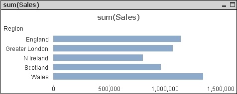
I need something like this
Value labels and results inside the chart
- Mark as New
- Bookmark
- Subscribe
- Mute
- Subscribe to RSS Feed
- Permalink
- Report Inappropriate Content
Bad idea, but if you must... suppose your chart uses DimX as dimension and Count(DimY) as expression. You can change that expresssion to dual(only(DimX) & ', ' & count(DimY), count(DimY). Disable the labels for DimX and enable Show Values on Data Points for the expression.
talk is cheap, supply exceeds demand