Unlock a world of possibilities! Login now and discover the exclusive benefits awaiting you.
- Qlik Community
- :
- All Forums
- :
- QlikView App Dev
- :
- Re: Show the % variance of dimension in a bar char...
- Subscribe to RSS Feed
- Mark Topic as New
- Mark Topic as Read
- Float this Topic for Current User
- Bookmark
- Subscribe
- Mute
- Printer Friendly Page
- Mark as New
- Bookmark
- Subscribe
- Mute
- Subscribe to RSS Feed
- Permalink
- Report Inappropriate Content
Show the % variance of dimension in a bar chart.
Hello,
I would like to create a bar chart which will compare different category sales by selected MonthYear and show the % variance of MonthYear.
I created the bar chart, but I have no idea on showing the % variance of MonthYear like below.
Thank you for all suggestions.
- Tags:
- new_to_qlikview
Accepted Solutions
- Mark as New
- Bookmark
- Subscribe
- Mute
- Subscribe to RSS Feed
- Permalink
- Report Inappropriate Content
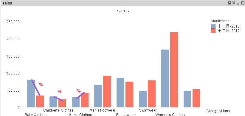
Hi Eddie,
convert the chart to a combo and add the following second expression:
=sum(Quantity*UnitPrice)/above(sum(Quantity*UnitPrice))-sum(Quantity*UnitPrice)/(sum(Quantity*UnitPrice))
set this expression to Values on data points and you end up with something like this:
You may need to play with the options, sample app attached
REgards
Andy
- Mark as New
- Bookmark
- Subscribe
- Mute
- Subscribe to RSS Feed
- Permalink
- Report Inappropriate Content
Can you load an example QVW ?
- Mark as New
- Bookmark
- Subscribe
- Mute
- Subscribe to RSS Feed
- Permalink
- Report Inappropriate Content
I have already uploaded my QVW.
- Mark as New
- Bookmark
- Subscribe
- Mute
- Subscribe to RSS Feed
- Permalink
- Report Inappropriate Content
Hi Eddie,
convert the chart to a combo and add the following second expression:
=sum(Quantity*UnitPrice)/above(sum(Quantity*UnitPrice))-sum(Quantity*UnitPrice)/(sum(Quantity*UnitPrice))
set this expression to Values on data points and you end up with something like this:
You may need to play with the options, sample app attached
REgards
Andy
- Mark as New
- Bookmark
- Subscribe
- Mute
- Subscribe to RSS Feed
- Permalink
- Report Inappropriate Content
Thank you very much Andrew
- Mark as New
- Bookmark
- Subscribe
- Mute
- Subscribe to RSS Feed
- Permalink
- Report Inappropriate Content
Hi, Can you please share qvf of the example ?
Thanks
- Mark as New
- Bookmark
- Subscribe
- Mute
- Subscribe to RSS Feed
- Permalink
- Report Inappropriate Content
- Mark as New
- Bookmark
- Subscribe
- Mute
- Subscribe to RSS Feed
- Permalink
- Report Inappropriate Content
Hi,
Can you please share Qliksense sample app as well?
Thanks