Unlock a world of possibilities! Login now and discover the exclusive benefits awaiting you.
- Qlik Community
- :
- All Forums
- :
- QlikView App Dev
- :
- Re: Showing stacked line charts based on condition...
- Subscribe to RSS Feed
- Mark Topic as New
- Mark Topic as Read
- Float this Topic for Current User
- Bookmark
- Subscribe
- Mute
- Printer Friendly Page
- Mark as New
- Bookmark
- Subscribe
- Mute
- Subscribe to RSS Feed
- Permalink
- Report Inappropriate Content
Showing stacked line charts based on conditions
Hi Qlik Experts,
Still new with Qlikview. I need to build a chart that shows network performance as a function of throughput and latency over the time.
I have data that contains a few parameters, but let's say only focuses on 4 columns,which are Time stamp, hardware ID, Latency and throughput.
I need to build stacked line chart showing number of terminals with conditions below:
- If latency is below x and throughput is below y then count number of terminal - this will be line 1
- If latency is below x and throughput is above y then count number of terminal - this will be line 2
- If latency is above x and throughput is below y then count number of terminal - this will be line 3
- If latency is above x and throughput is above y then count number of terminal - this will be line 4
So, basically to show number of terminals occurrence for each period - this will be x axis or dimension (can be vary, e.g. 5 minutes, 15 minutes or even dates) with the stacked lines each showing different bucket or quadrant.
There will be 4 stacked lines depending the range and condition. I will also need to be able to change the granularity dimensions dynamically (e.g. count over 5 minutes, 30 minutes hour or day).
It seems to be simple 4 expressions (one for each line) but I could not show the chart when applying the condition on the expression.
When tried something like this in the expression it did not show anything:
if(Latency <='600' and (([throughput])<'1000'), count ([Terminal ID]))
What would be the right expression for this? Will this be with set analysis
The attached is the sample of the data.
Thanks for help.
- « Previous Replies
-
- 1
- 2
- Next Replies »
- Mark as New
- Bookmark
- Subscribe
- Mute
- Subscribe to RSS Feed
- Permalink
- Report Inappropriate Content
Hi Qlikview Experts,
Is there any suggestion on what would be the right expression for this?
I tried if(Latency <='600' and (([throughput])<'1000'), count ([Terminal ID])) and other ranges but none showing any chart. Only worked without condition (e.g. count ([Terminal ID]).
The conditions that I'd like to apply is as follows:
if(Latency <='600' and (([throughput])<'1000'), count ([Terminal ID])) - expression 1
if(Latency > '600' and (([throughput])<'1000'), count ([Terminal ID])) - expression 2
if(Latency <='600' and (([throughput])>'1000'), count ([Terminal ID])) - expression 3
if(Latency .>'600' and (([throughput])>'1000'), count ([Terminal ID])) - expression 4
Any help on this would be very useful to me. Still new to Qlikview...
- Mark as New
- Bookmark
- Subscribe
- Mute
- Subscribe to RSS Feed
- Permalink
- Report Inappropriate Content
Something like this?

Expressions:
1) Count({<Latency = {'<600'}, [Throughput (Kbps)] = {'<1000'}>}DISTINCT [Hardware Id])
2) Count({<Latency = {'<600'}, [Throughput (Kbps)] = {'>=1000'}>}DISTINCT [Hardware Id])
3) Count({<Latency = {'>=600'}, [Throughput (Kbps)] = {'<1000'}>}DISTINCT [Hardware Id])
4) Count({<Latency = {'>=600'}, [Throughput (Kbps)] = {'>=1000'}>}DISTINCT [Hardware Id])
- Mark as New
- Bookmark
- Subscribe
- Mute
- Subscribe to RSS Feed
- Permalink
- Report Inappropriate Content
Further you can use variables to drive Latency and Throughput values using input box or slider object
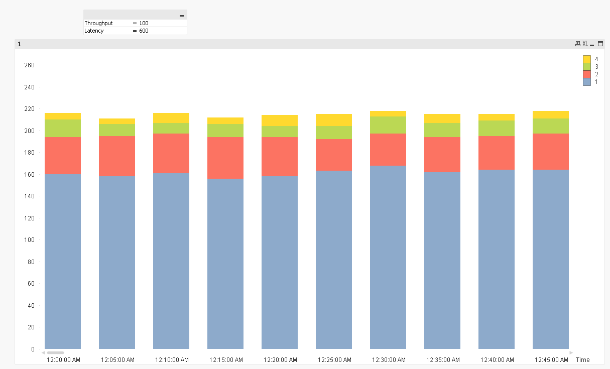
Expressions:
Count({<Latency = {'<$(=vLatency)'}, [Throughput (Kbps)] = {'<$(=vThroughput)'}>}DISTINCT [Hardware Id])
Count({<Latency = {'<$(=vLatency)'}, [Throughput (Kbps)] = {'>=$(=vThroughput)'}>}DISTINCT [Hardware Id])
Count({<Latency = {'>=$(=vLatency)'}, [Throughput (Kbps)] = {'<$(=vThroughput)'}>}DISTINCT [Hardware Id])
Count({<Latency = {'>=$(=vLatency)'}, [Throughput (Kbps)] = {'>=$(=vThroughput)'}>}DISTINCT [Hardware Id])
- Mark as New
- Bookmark
- Subscribe
- Mute
- Subscribe to RSS Feed
- Permalink
- Report Inappropriate Content
Hi Sunny,
Many Thanks for this. Very helpful!
I'd like to take a bit further on the chart. I'd like to plot a scatter chart and showing relationship between latency and throughput for each terminal.
This is what I did with the scatter chart:
Dimension : Time Stamp and hardware ID
Expression: X axis is latency and y axis is avg(throughput)
I was able to show the scatter chart as shown below
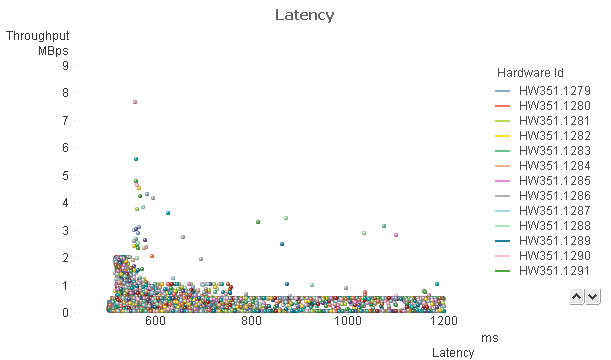
The above chart is OK but I'd like to make a chart showing number of distinct hardware, not only number of occurrences.
I believe the above shows number of occurrences for each hardware. When I changed the dimension with calculated value no data was shown.
Additionally, I'd like to also show bubble chart based on number of occurrences. Tried to use count (Hardware ID) in Z-axis but nothing showed up on the chart.
Any hint?
- Mark as New
- Bookmark
- Subscribe
- Mute
- Subscribe to RSS Feed
- Permalink
- Report Inappropriate Content
I am going to be out for the day. May be Stefan might offer some help in the mean time 
- Mark as New
- Bookmark
- Subscribe
- Mute
- Subscribe to RSS Feed
- Permalink
- Report Inappropriate Content
I was unable to replicate the chart that you have above. Would you be able to share the qvw file where you have this and I might be able to help.
- Mark as New
- Bookmark
- Subscribe
- Mute
- Subscribe to RSS Feed
- Permalink
- Report Inappropriate Content
Please find attached the qvw file
- Mark as New
- Bookmark
- Subscribe
- Mute
- Subscribe to RSS Feed
- Permalink
- Report Inappropriate Content
Hi Qlik experts, is there any to use calculated dimension for the XY or scatter chart?
Basically, I'd like to count distinct hardware Id instead of just use Hardware Id in the dimension.
- Mark as New
- Bookmark
- Subscribe
- Mute
- Subscribe to RSS Feed
- Permalink
- Report Inappropriate Content
Distinct count on what dimension?
- « Previous Replies
-
- 1
- 2
- Next Replies »