Unlock a world of possibilities! Login now and discover the exclusive benefits awaiting you.
- Qlik Community
- :
- All Forums
- :
- QlikView App Dev
- :
- Re: Stacked Bar Chart
- Subscribe to RSS Feed
- Mark Topic as New
- Mark Topic as Read
- Float this Topic for Current User
- Bookmark
- Subscribe
- Mute
- Printer Friendly Page
- Mark as New
- Bookmark
- Subscribe
- Mute
- Subscribe to RSS Feed
- Permalink
- Report Inappropriate Content
Stacked Bar Chart
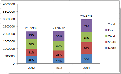
I want to have my chart like this:
Accepted Solutions
- Mark as New
- Bookmark
- Subscribe
- Mute
- Subscribe to RSS Feed
- Permalink
- Report Inappropriate Content
- Mark as New
- Bookmark
- Subscribe
- Mute
- Subscribe to RSS Feed
- Permalink
- Report Inappropriate Content
Hi Peter,
Please find attached demo file for your reference.
Regards,
Akshaya
- Mark as New
- Bookmark
- Subscribe
- Mute
- Subscribe to RSS Feed
- Permalink
- Report Inappropriate Content
Try to change your expressions like:
You would do this with the TOTAL function, so if your expression is sum(Value) percentage would be:
sum(Value) / sum(TOTAL Value)
Where the TOTAL causes the divisor to calculate across all dimensions. If you have two dimensions in your chart (say in a Pivot) you can do the total across a second dimension:
sum(Value) / sum(TOTAL <Dimension> Value)
If you want to ignore selections on a certain field (so you always look at the total, not the total of selected items) you can use set analysis to ignore some selections in the total:
sum(Value) / sum({<Dimension=}>} TOTAL Value).
After this, change the Presentation options of Bar chart.
- Mark as New
- Bookmark
- Subscribe
- Mute
- Subscribe to RSS Feed
- Permalink
- Report Inappropriate Content
Thanks for your response.
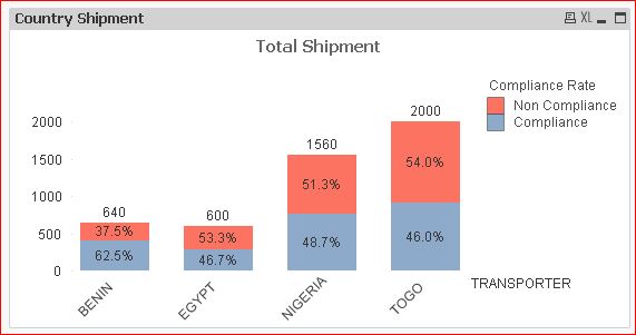
I wanted something like this:
- Mark as New
- Bookmark
- Subscribe
- Mute
- Subscribe to RSS Feed
- Permalink
- Report Inappropriate Content
I uploaded it, in case someone else needs it.