Unlock a world of possibilities! Login now and discover the exclusive benefits awaiting you.
- Qlik Community
- :
- All Forums
- :
- QlikView App Dev
- :
- Re: Standard Deviation in Chart (Bell)
- Subscribe to RSS Feed
- Mark Topic as New
- Mark Topic as Read
- Float this Topic for Current User
- Bookmark
- Subscribe
- Mute
- Printer Friendly Page
- Mark as New
- Bookmark
- Subscribe
- Mute
- Subscribe to RSS Feed
- Permalink
- Report Inappropriate Content
Standard Deviation in Chart (Bell Curve)
Hi All,
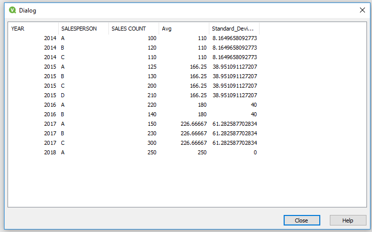
I have to calculate average and standard deviation of sales count (year wise). attached sample data here.
Could you please assist on this.
Thanks,
Nihhal.
- Mark as New
- Bookmark
- Subscribe
- Mute
- Subscribe to RSS Feed
- Permalink
- Report Inappropriate Content
Hello i am Creating Year wise Standard Deviation
and Avg
Hope So it will help you...
Data:
LOAD YEAR,
SALESPERSON,
[SALES COUNT]
FROM
[..\Downloads\Data.xlsx]
(ooxml, embedded labels, table is Sheet1);
left join(Data)
Data2:
load
YEAR,
avg([SALES COUNT]) as Avg
Resident Data
Group by YEAR;
Data3:
Load *,
Sqr([SALES COUNT]-Avg) as Sqr
Resident Data;
Drop table Data;
left join(Data3)
load YEAR,
sum(Sqr) as Sum,
Count([SALES COUNT]) as Count
Resident Data3
group by YEAR;
load *,
Sqrt(Under) as Standard_Deviation;
Data4:
load *,
(1/Count)*Sum as Under
Resident Data3; !
drop table Data3;
drop fields Sqr,Sum,Count,Under;
Find Attachment and Qvw file.......
- Mark as New
- Bookmark
- Subscribe
- Mute
- Subscribe to RSS Feed
- Permalink
- Report Inappropriate Content
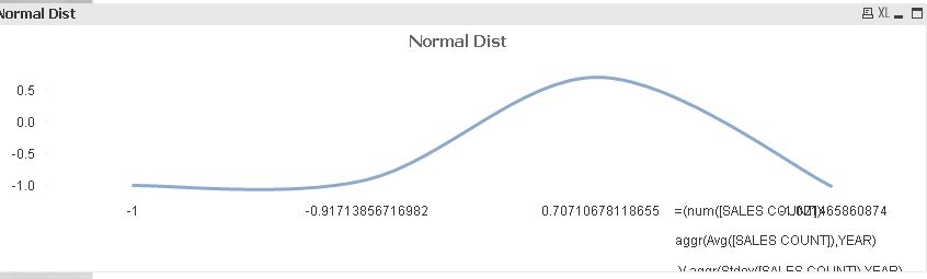
NORMAL DISTRIBUTION Is:
(value - mean)/stddev
in your case
(sales count - avg) / std dev
=(num([SALES COUNT])-
aggr(Avg([SALES COUNT]),YEAR)
)/ aggr(Stdev([SALES COUNT]),YEAR)
- Mark as New
- Bookmark
- Subscribe
- Mute
- Subscribe to RSS Feed
- Permalink
- Report Inappropriate Content
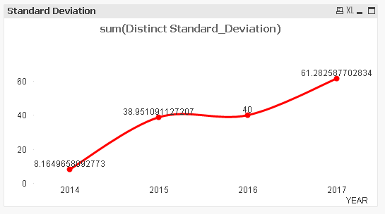
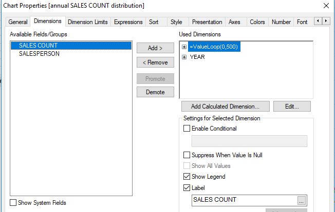
Dimesion : YEAR
Expression : Sum(Distinct Standard_Deviation)
For Above Document.
- Mark as New
- Bookmark
- Subscribe
- Mute
- Subscribe to RSS Feed
- Permalink
- Report Inappropriate Content
Hi Rodell, can you attach sample qvw for normal dist chart (which you posted) else can you share dimension for chart please.
- Mark as New
- Bookmark
- Subscribe
- Mute
- Subscribe to RSS Feed
- Permalink
- Report Inappropriate Content
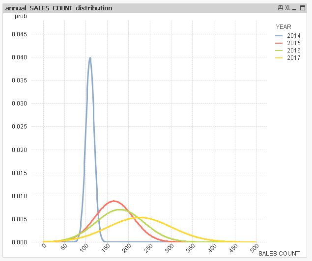
Hi Vishal, thanks for your response.
I can not go this method because need to perform loads multiple times here, i am sure performance issue will occur.
Moreover I believe chart function (stdev) is better than script functions (sqr, sqrt etc) in this scenario.
I need to show data in chart (bell curve) please see attachment.
- Mark as New
- Bookmark
- Subscribe
- Mute
- Subscribe to RSS Feed
- Permalink
- Report Inappropriate Content
Hi Vishal - Instead of doing multiple loads, we can go with stdev(SALESCOUNT) right?
Data:
LOAD YEAR,
SALESPERSON,
stdev([SALES COUNT]) as new name
FROM
[..\Downloads\Data.xlsx]
(ooxml, embedded labels, table is Sheet1) group by year, salesperson;
- Mark as New
- Bookmark
- Subscribe
- Mute
- Subscribe to RSS Feed
- Permalink
- Report Inappropriate Content
Hi,
are you looking for something like this?:
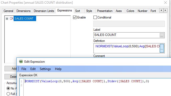
hope this helps
regards
Marco
- Mark as New
- Bookmark
- Subscribe
- Mute
- Subscribe to RSS Feed
- Permalink
- Report Inappropriate Content
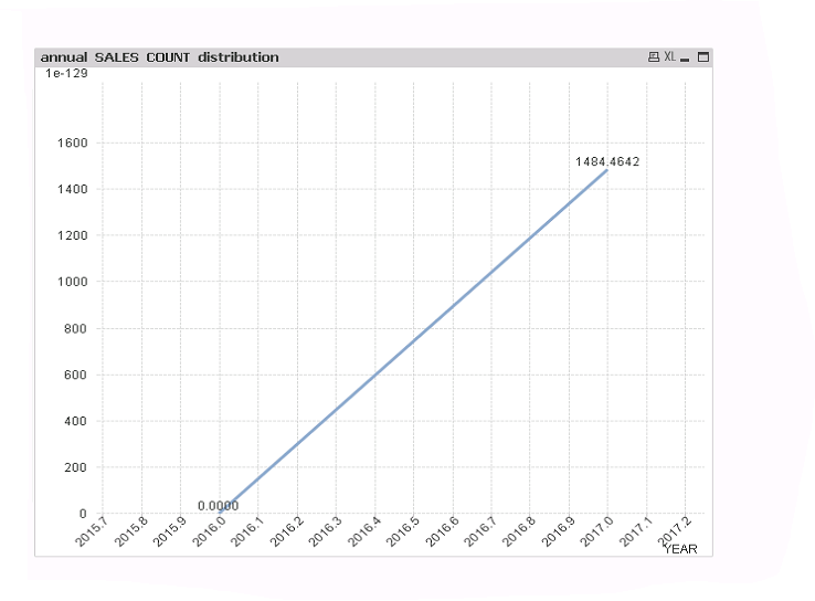
Hi Marco - Thanks for your response.
Some what its helpful. Actually i want to display YEAR at X-axis instead of (valueloop) and i tried it as :
Dim - YEAR
Expre - NORMDIST(YEAR, Avg(SALESCOUNT), Stdev(SALESCOUNT),0)
However chart is not in bell curve. could you please assist on this.
- Mark as New
- Bookmark
- Subscribe
- Mute
- Subscribe to RSS Feed
- Permalink
- Report Inappropriate Content
Hi,
I guess we should first clarify your requirement before discussing possible QlikView solutions.
Can you sketch your expected result based on your sample data?
How should a curve look like that plots the distribution of sales values over time and what information should it deliver?
Do you expect your sales to be normally distributed over time thus having a temporal maximum and to converge towards zero in the years to come?
regards
Marco
- Mark as New
- Bookmark
- Subscribe
- Mute
- Subscribe to RSS Feed
- Permalink
- Report Inappropriate Content
Hi Marco, I am attaching expected visualization.
Mid line is mean and less than mean values should display left side and greater than mean values should display right side. I think this chart is not possible through QlikView. For more details please google it as standard deviation.
Note: Just I provided sample data for this visualization. Can you say this kind of chart is possible in QlikView.?