Unlock a world of possibilities! Login now and discover the exclusive benefits awaiting you.
- Qlik Community
- :
- All Forums
- :
- QlikView App Dev
- :
- Re: Time Calender as X-axis in a Diagram
- Subscribe to RSS Feed
- Mark Topic as New
- Mark Topic as Read
- Float this Topic for Current User
- Bookmark
- Subscribe
- Mute
- Printer Friendly Page
- Mark as New
- Bookmark
- Subscribe
- Mute
- Subscribe to RSS Feed
- Permalink
- Report Inappropriate Content
Time Calender as X-axis in a Diagram
Hi, there.
I have a dataset, in which there is a column called Time. I have many times in form 'hh:mm:ss'. For every second I have 1 or some product ID. For sometime I have no product. It's a production dataset.
Now I have a Time Calender.
I want to make a Lines diagram. X-axis shows Time Calender for every second. Y-axis shows Count(ID).
That means I want to show how maný products for every second. But It not works. Attach is a test.
Thank you.
Regrads
Accepted Solutions
- Mark as New
- Bookmark
- Subscribe
- Mute
- Subscribe to RSS Feed
- Permalink
- Report Inappropriate Content
- Mark as New
- Bookmark
- Subscribe
- Mute
- Subscribe to RSS Feed
- Permalink
- Report Inappropriate Content
Have you tried unchecking 'Suppress Zero Values' from the presentation tab?
- Mark as New
- Bookmark
- Subscribe
- Mute
- Subscribe to RSS Feed
- Permalink
- Report Inappropriate Content
Thank you. I tried it. But it is not the point.
It shows only some timestamps on X-Axis. In that example, I have only 00:00:00, 00:00:13, 00:00:41, 00:00:51 .....for X-Axis in diagram. What I want is 00:00:00, 00:00:01, 00:00:02, 00:00:03 ..... every second on X-Axis.
- Mark as New
- Bookmark
- Subscribe
- Mute
- Subscribe to RSS Feed
- Permalink
- Report Inappropriate Content
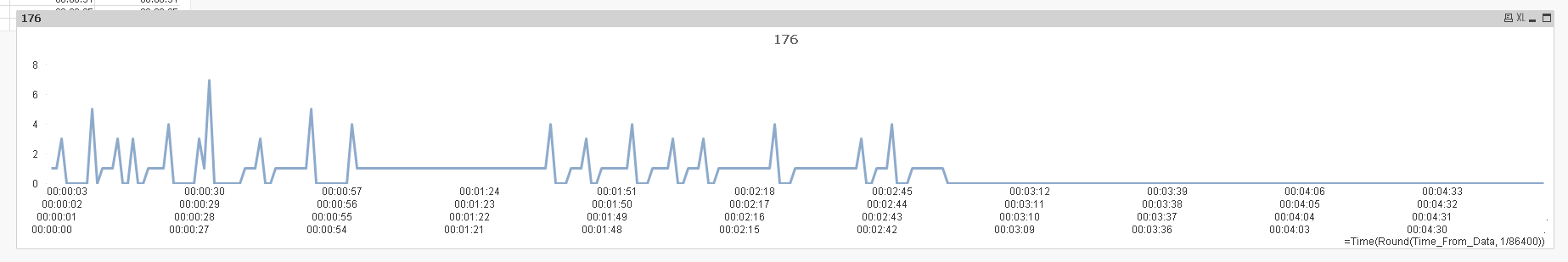
Isn't this what you want?
- Mark as New
- Bookmark
- Subscribe
- Mute
- Subscribe to RSS Feed
- Permalink
- Report Inappropriate Content
Cool. Can u explan Time(Round(Time_From_Data, 1/86400)) for me. Thank you.
- Mark as New
- Bookmark
- Subscribe
- Mute
- Subscribe to RSS Feed
- Permalink
- Report Inappropriate Content
It seems that the time from your main file might be rounded off to the seconds... which is why we were seeing two 00:00:01s (and others too)... so, in order to combine them, I just rounded it off to the closest second. and Time() is just used for formatting.